Posts

Showing posts from January, 2008

Who says nobody reads long headlines?

Image
I'll bet once you started reading this 1970 ad (from Britain's Health Education Council), you didn't stop until you reached the end.  And then maybe even went back and re-read parts of it all over again.

Advertising minimalism -- art director version

Image
Yesterday's all-type ad was more of a rarity. (By the way, just because an ad is composed of words alone doesn't make it truly minimalist; by that term, I'm referring to ads where how the type itself is set helps create the whole communication.) More often, minimalist ads take the form of a self-explanatory photo or graphic, such as the ad pictured above.  I chose this particular one over the dozens that are in books for a perhaps not so obvious reason.  Most minimalist ads suffer from lack of ambition, settling mainly for a visual pun or other non-verbal gag that really accomplishes little more than calling attention to itself and raising awareness of the product.   But Victorinox ad above tells you everything you need to know about its product with the better known name and distinctive appearance.  One Swiss Army knife does the job of a whole tool box -- notice how clunky and dubious those words sound.  But visually suggesting that same thought actually makes it more cre

Advertising minimalism - copywriter version

Image
Although clarity and simplicity has always been a goal for smart advertisers, true minimalism seemed to evolve out of Europe's need to communicate in different languages simultaneously; why struggle to say it multi-lingually if you don't have to say it at all. Thus, the one-picture-equals-a-thousand-words approach that married a striking visual to a very simple (and translatable) sentence of copy. Gaining prominence in the late '80s and early '90s, it became the all-purpose tactic for breaking through ad clutter and reaching audiences (and award-show judges) with short attention spans. Yet, despite the unified front most creative teams present to account management and clients, its possible that -- like the spouses in "Prizzi's Honor" and "Mr. and Mrs. Smith" -- art directors and copywriters are secretly plotting ways to eliminate each other from the creative process.   That's one theory, anyway, for the rise of minimalism in advertising th

Regarding Betty...

Image
No, she was never a real person, and in fact, her name preceded her face by about 15 years.  And in fact, the "Betty Crocker" who had been answering correspondence to the flour miller Washburn Crosby Co. (later known as General Mills) was a man.  But beginning in 1936, Betty was awarded full icon (and womanhood) status, beginning with the portrait you see above, an appearance that served her well for almost twenty years.  But fashion is a fickle thing, and along with Betty's numerous changes of clothing and hairstyles, the poor dear has actually had her features changed, to look younger, more contemporary, more Jackie Kennedy, more Mary Tyler Moore, more Ally Sheedy (depending on the era).   I've never been particularly fond of the periodic updating, if only because, as Betty keeps getting younger and more stylish, she seems to get less and less credible as a baking icon.  Back when she looked like your grandma, or even your mom at age 50, Betty just naturally  exuded

What the Hula Hoop taught me

Image
Richard Knerr passed away last week.  You may not know his name, but you probably know his company.  Wham-O, which Knerr founded (in a garage naturally) with boyhood friend Arthur Melin, set off national crazes like few companies, toy or otherwise, have managed before or since.  Their product line reads like a Baby Boomer's Christmas list:  The Hula Hoop, The Superball, Slip 'N' Slide, Silly String and, of course, the Frisbee (originally called the Pluto Platter when Wham-O bought the rights from from Walter Frederick Morrison). Beyond teaching us new ways to play, there are things we can learn about marketing from Wham-O, too: • Maximize Profits:  The typical Wham-O product was designed to be inexpensively priced -- yet was till five times the cost of manufacturing and promotion. • Maximize S easonality :  Knerr and Melin realized perhaps counter-intuitively, that their prime selling season wasn't Christmas, but spring and summer.  That didn't just help them sell

That's one for the clients

Image
Here's Jay Schulberg of Bozell Worldwide on presenting their new milk campaign to Charlie Decker, of the National Fluid Milk Processors: "Charile loved the milk mustache campaign but had one request.  Could you look at it using celebrities?" (From "The Milk Mustache Book: A behind-the-scenes look at America's favorite advertising campaign," 1998.  And that's actress Nastassja Kinski in the 1995 ad above, by the way.)

You can't win 'em all

Image
George Lois tells this story in his 1972 book, "George, Be Careful: A Greek Florist's Kid In The Roughhouse World of Advertising."  It takes place roughly around 1971; a struggling account executive (I'm mercifully deleting the man's name) is presenting a new marketing strategy to one of the Papert, Koenig, Lois agency's struggling clients: "Gentlemen," [the AE] said, "our research has proved that Haloid-Xerox has minimum recognition.  Our sample shows only 3 percent awareness among your key customers.  We believe a major reason is your cumbersome name.  We therefore recommend that you cut it in half. The nodded in agreement because they felt the same way.  "That's very valuable input," they said.  "And now that you have this excellent documentation, what's your recommendation?" [The AE] banged his fist against the table...as he said it crisp and clear: "Haloid!"  They sent [him] back to New York and changed

Get the picture?

Image
Any questions?  This 1981 British outdoor board makes a very simple and effective demonstration in a very confined space.  In fact, that limited amount of room actually gives the visual extra stopping power; the doubling over of the pencil is an attention getter and adds extra emphasis on how long the pencil would need to be to contain the same amount of lead.  A great example of how working within limitations doesn't have to inhibit creativity or communication.

Who are you calling crazy?

Image
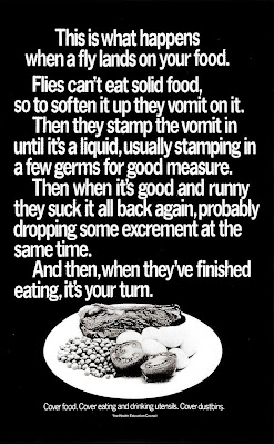
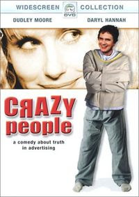
You know advertising has a problem as an industry when even a prostitute gets to be romanticized as a principled, compassionate individual (Julia Robert's recruitment film for the skin trade, "Pretty Woman."), yet we continue to be blamed for all that's wrong with modern society. In the eyes of Hollywood, we're talentless hacks at best, professional liars at worst and materialistic fools at the least.   Yes, there are rare exceptions, but generally, when someone in the movies works in advertising, you instantly know that person is going to be either vapid, vain, materialistic, manipulative, unethical, back-stabbing, glad-handing, one sedative away from a nervous breakdown, or a combo platter of all the above. And then there's "Crazy People," the 1990 movie that not only features every cliche above, but manages to wrap them into a  smug screed about the dishonesty of modern marketing. "Crazy People," purports to expose advertising as an indu

Read the ad! See the movie!

Image
We all know the impact of the above 1975 movie on Hollywood, how it ushered in the era of movie blockbusters that have given us more busts than blockbusters over the years. Less widely noted, however, is the impact of the one below. What?  Am I serious?  That miserable 1978 sequel that gave us with nothing, not even the simple satisfaction of seeing Murray "We're not closing the beaches!" Hamilton end up as a shark snack?  Yet, in it's own way, "Jaws 2" was just as much a harbinger of things to come as its predatory predecessor.  And it all started right here:   Yes, before Roy Scheider took his second dip into those shark-infested waters, taglines -- those pithy pearls of advertisingspeak -- were used only sporadically on movie posters.  Mostly, it was just flat-footed copy like what you find at the top of the first "Jaws" poster -- if there was any ad copy at all.  Sure, there were exceptions, but nothing before "Just when..." soaked i

Judging movie posters as ads

Image
Back in 2001, Premiere Magazine ran their choices for "The 50 Greatest Movie Posters Of All Time."  As you might expect, much praise was heaped upon the one-sheets of Saul Bass (including the one above), for their graphic simplicity and bold, abstract imagery.  For my money, though, while his posters were aestethically pleasing, as come-ons for the movies they were advertising, they're a little...sterile.  You can appreciate it more as art than as as something that's going to make someone want to plunk down their cash for a ticket.  For a poster that's both graphic and intriguing, take a look at this one for "Rosemary's Baby." It's as minimalist (in its own way) as a Saul Bass poster, but the silhouetted baby carriage, with its dual suggestions of innocence and mystery, backed by the ethereal image of a vulnerable Mia Farrow -- is she mid-conception or giving birth? -- makes for an eerie, disconcerting and hard-to-resist advertisement.

Which came first? The movie or the ad?

Image
Actually, this 1970 British ad preceded the Joan Rivers movie by a good 8 years.  No telling if Ms. Rivers was inspired by the ad's melancholy image; more likely it was just an extrapolation of the frequently invoked feminine observation that begins "If men had babies, then..."  Joan Rivers wrote and directed the movie, and packed the cast with a comedic Who's Who of the late 1970s: Imogene Coca, Norman Fell, Paul Lynde, Tom Poston and Jimmy Walker (What?  No Charles Nelson Reilly?).   You know the classic movie put-down the the book was better?  Well, in this case, the ad was better.

A kinder, gentler ad

Image
Here's an ad with a sell that's so soft, it's almost non-existent.  That little teeny-tiny line of type waaaaay at the bottom identifies the sponsor as United Technologies Corporation, a multi-national manufacturer of aircraft engines, fuel cells, elevators and missile systems, among other products.  Maybe with such a diverse product line, the company simply gave up trying to find a unifying message and instead went for a series of motivational messages that ran in the Wall Street Journal during 1982-83. This is one of my favorites.  Like the other ads in the series, it has a simple layout, simple headline and short, simple sentences, all to put across a simple a message with universal appeal (one of the other ads, in fact, advised to "Keep It Simple.").  If they had pictures of humpback whales and primeval forests, you'd probably still see them posted in corporate cubes today.   Of course, whether this spurred manufacturers to line up to buy jet engines is an

From the adman's bookshelf

Image
"I think advertising's had it.  I don't think people believe in it anymore.  I think it's a waste of money.  I'm not even sure it's moral." So opines one character (in a new business presentation no less) in Jack Dillon's 1972 novel, "The Advertising Man."  Though set a decade later than AMC's "Mad Men" series, it covers a lot of the same territory, including creative turf wars, double-dealing management and marital discord in the Connecticut suburbs.  And lots and lots of creative angst by people who are convinced they're last line of defense against creeping mediocrity, even as battle fatigue is taking its toll.   (Some things never change.) Written with empathy and perceptiveness about day-to-day ad agency life (few big explosions, lots of little implosions) -- which isn't surprising, since the author was a V.P./creative management supervisor at legendary creative powerhouse Doyle Dane Bernbach.

More proof that copywriters are frustrated novelists

Image
"...he murdered them too. "  So begins the copy in this 1983 ad for an article on the insanity defense, and you'd be forgiven for thinking that the copywriter had perhaps flipped his lid, too.  A  28-word headline?  That's more words than the entire copy in most ads nowadays.  Twenty-eight words, and yet there's neither an extraneous or wasted word among them.  You've got human interest, sensationalism, drama, irony, dread and when you finally get to that last word -- "Then..."  -- well, who's not going to keep on reading? Reader's Digest ran a series of ads like these that relied on little more than intriguing copy to draw readers in.  Now that's what I call being true to the product.