Posts

Showing posts from November, 2009

Dress for the trip

Image
This 1969 ad for a line of jeans doesn't just speak the visual language of its intended audience, along with the Vaughn Bode -like graphics and griffiti-inspired typefaces, those hipsters at LB lay it on the line with this barely-veiled reference: Indeed.

The few. The proud. The mistresses.

Image
I had no idea that being somebody's mistress was so demanding. I thought you just had to put up with sporadic, last-minute trysts and holidays and birthdays spent alone. But apparently, you've got to have a passion for Fibber McGee and own an ocelot, among other things. This whole 1974 ad bears reading. I guess its somebody's idealized image of a mistress, but even with tongue-in-cheek (I assume), the insecurity and cruelty of the situation for women is perhaps unintentionally touched on with the line about her "seeing a psychiatrist by your giggling at her striptease." It's almost like a "scared straight" thing for The Other Woman. Click on it to enlarge:

Do it like Ditko

Image
Nothing too interesting about the message of this 1959 ad (except that the need to push wood floors as a decorating option seems to be in response to the post-World War II growth of "wall to wall" carpet, plastics and laminate furniture), except for the surreal, deconstructed representation of a home... ...which could well have inspired (or been inspired by) the surreal, deconstructed images of 1950s/60s comic book artist (and later Spider-Man co-creator) Steve Ditko :

They don't make ads like this anymore...

Image
...because they can't -- not with today's cookie-cutter car models. From 1957:

Racial sensitivity in 1969

Image
In 1969, this is what passed for racial sensitivity at ABC: Meanwhile, over at the Tiffany Network, CBS took a more sobering, more provocative approach in their 1968 ad on their coverage of similar cultural issues: (The CBS ad, by the way, is the work of legendary designer, Lou Dorfsman .)

"Bureau, Wool Bureau."

Image
I know I should just chalk this up to a coincidence, or a parallelism that only I see, but come on! The veddy British fashion, the converging lines of the background, and the year of this advertisement, 1964... ...isn't it possible, just possible that the designer was inspired by the opening credits of this movie franchise, in its third installment by that same year:

Weird about beards

Image
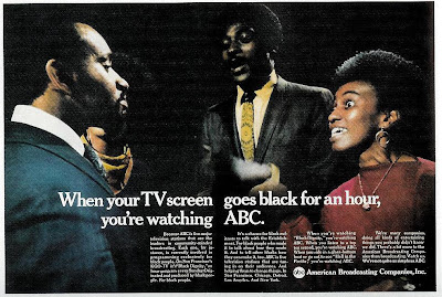
The wording is a bit confusing (is Dad talking about himself?), but that's the least of the curiosities in this 1969 ad for Oneida: Once again, Madison Avenue attempts to engage the counterculture , with the awkwardness typical of the time. Here, the beau with the neatly trimmed beard seems neither beatnik nor hippie. In fact, his facial hair seems almost professorial; it's the Beatlesque mop atop his head that would seem more likely to raise Dad's hackles. But while the copy insists "what a groovy guy he is," the kid seems more like a budding member of The Establishment than a Timothy Leary devotee, considering That he was captain of the soccer team for three years straight and worked on the Cultural Center Committee. So in the end, it's not a plea for understanding of the younger generation, it's just another reinforcement of the values of the older generation, dressed up in a "can't judge a book by its cover" homily. And if Dad is suc