Posts

Showing posts from November, 2010

Way-out fashion

Image
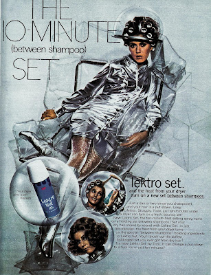
Here's a futuristic hair product ad from 1969. And how do we know it's futuristic? Obviously, from the silvery apparel the model is wearing, based on the aluminum-coated nylon spacesuits of the Mercury U.S. Space Program (which was put the first human in orbit around the earth). Even though the Mercury Program (and its distinctive Mark IV space suits ) had ended 6 years earlier, the look was just too iconic to be simply cast aside for the bulkier more utilitarian-looking suits of the Gemini and Apollo programs. In fact, the Mercury look" was perfect for mid-'60s TV shows that wanted to seem other-worldly or futuristic. (That's "My Favorite Martian" and "Lost In Space," for you non-boomers.)

Confusing hair day

Image
This 1969 ad isn't first to observe that, "Once upon a time, it was easy to tell the girls from the boys." In fact, in the years since the Beatles popularized the shag cut (and long hair became the hippie style of choice), that had long since become a stock punchline among the Bob Hope/Johnny Carson set. But this ad seems even more confused than most: We get it, we get it. Seen from behind, boys in long hair look like girls. But the copy goes on, Once upon a time, all you had to do was look. Today, it's not so easy. So today, more than ever, a feminine fragrance is all but essential... Wait a second. Is the problem long hair on men or does it have something to do with males having androgynous features? And is this a fear that women of that era were supposed to relate to? That men weren't approaching them because of the mistaken assumption that they were men, too? On the other hand, maybe that fragrance was to help the both of them identify who was who in the

Another all-too-typical '60s airline ad...

Image
Smiling and dapper business traveler, check. Sleek and luxurious symbol of the modern world of travel, check. So what's missing? Oh, right, this: No doubt he's just considering her "speed, splendor and spectacular performance."

Who's under the trench coat?

Image
Back in the glamorous heyday of airline travel, airlines often tried to sell you tickets based the idea of exotic travel as a way of resuscitating your relationships, and more frequently, by subtly (and no so subtly ) dangling the fantasy of a romantic liaison with one of their young and shapely (but with a girl-next-door appeal, naturally) fight attendants. This 1963 ad from Germany's Lufthansa Airlines cleverly manages to do both: Are they husband and wife, or passenger and stewardess? Don't look to the ad copy to give you any clues: Happens often in Bavaria. You'll notice it in the most surprising places...in the most surprising ways. Something in Germany's air, no doubt, has a wonderfully stimulating effect on the feelings and spirits of visitors. Make of it what (and who) you will. But given the airline-branded bag the woman's carrying, the coy ingenue-like turning in of her feet as she's (presumably) being kissed, and the business attire of the man, an

Blondes have more puns

Image
Hmmmm. Do I detect a bit of innuendo here? Of course, what else would you expect from the company that introduced the first one-step home hair-color formula five years earlier with this memorable teaser: The 1969 ad at top, for a coloring formula with deceptive but irresistible name, "Born Blonde," foregoes that coy innuendo of an earlier era for a more leering come-on befitting the late-'60s sexual revolution (complete with the faux-psychedelic typeface of the free-love generation). As Wikipedia explains, "In contemporary popular culture, it is often stereotyped that men find blonde women more attractive... Anita Loos popularized this idea in her 1925 novel, "Gentlemen Prefer Blondes." (And of course, it helps when the film adaptation of said novel starred Marilyn Monroe.) Clairol took that idea of the special appeal, and really ran with it, with headlines like "If I have only one life, let me live it as a blonde." and this one, which, later s

It happened one ad...

Image
Here's a pretty innocuous, run-of-the-mill 1950 ad from Jockey, with the typical over-inflated claim. But there's something intriguing of about the illustrated model with the weathered but still handsome looks and that insouciant smile. Could it be--? You decide. Here's a side by side comparison between the man from the Jockey ad and silver screen legend Clark Gable : Coincidence? Maybe, but it sure seems an intentional homage, doesn't it? If so, then the question that naturally follows is, why? I'm guessing it was a bit of an in-joke between the illustrator and client, referencing Gable in 1934's " It Happened One Night ." According to pop culture lore, when Gable took off his shirt in that film and revealed a bare chest, undershirt sales supposedly plummeted by 75%. Could be the ad-makers, needing a face for their model, found it funny to show a Clark Gablesque fellow in both undershirt and underwear -- poetic justice, I suppose for his inadver

Talking back to "The Man"

Image
Several months back, this blog looked at a couple of ads from the 1960s that grappled with the social upheaval of the period by trying to see things (if occasionally awkwardly) from the "black perspective." Today, let's see how the media addressed similar topics when speaking more to their "white" audience. And right off the bat, we see a more confrontational attitude designed to put the reader on the defensive: The above 1963 New York Herald Tribune ad begins with the statement that "Whites do a lot of talking about Negros, but hardly ever listen to them. The copy continues its aggressive tone by telling us what not to expect: You don't get comfortable, White cliches about Negro life. Instead, you get what Negros themselves think, and get it in their own words. (Don't be offended by racial labels; those were the terms of the times.) Almost a decade later, society's continuing struggle with racial issues (along with family and sexuality is