Posts

What's it like to work in advertising? It's like this.
Image
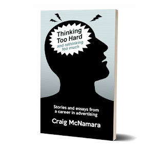
What's it like to create advertising for a living? What’s it like to work at an ad agency?  What’s to like – or not like – about certain ad campaigns?  What do I like in how advertising in portrayed in movies and TV?   Find out here, in essays, articles, podcast scripts, and blog posts – nothing too heavy and written with wit and style.  Like the writing on this blog?  It's like that, and more. $9.99 softcover – $4.99 ebook Read excerpts and order  here .

"Thinking Too Hard" essay: Zeitgeist brands

Image
What's a Zeitgeist brand? Find out in this essay   –  which you can listen to me read or just read on your own  –  from my book, "Thinking Too Hard and Rethinking Too Much: Stories and Essays from a Career in Advertising." Craig McNamara 3 · Zeitgeist Brands by Craig McNamara Every once in a while, the right brand appears at just the right time, when larger events in the world or culture add a special resonance to the product. To me, they're "Zeitgeist Brands" – after the German word that translates to "spirit of the age." It's one of the most powerful marketing tools available, but almost by definition, it's one of the most unpredictable. Hard to create and usually impossible to duplicate. Sometimes it happens by accident, but it can be planned, too. Apple's 1984 TV spot, for example, played off the cultural fascination with reaching the titular year of Aldous Huxley's dystopian novel. But that was more about making

Storytelling in advertising, reincarnated

Image
We know storytelling is all the rage now in marketing. And like most fashionable things, there’s usually some precedent in the past. Why else do we have the phrase, “Everything old is new again”? Still, you’re not likely to come across a story today like the one in this 1938 Arrow Shirts ad. If authenticity is all, this is more, well, horseplay: It was written by  George Gribbin  of Young & Rubicam, who was  recalled  as saying,  "One of the great assets of this agency is that a man here feels he can express himself as a writer."  Certainly, he accomplished that here; sixty years later, the ad was still well remembered, ranking 98 th  of the Top 100 Ads according to Advertising Age magazine in 1999. It begins,   Joe always said when he died, he’d like to become a horse.    One day Joe died.    Early this May, I saw a horse that looked like Joe drawing a milk wagon. “I sneaked up to him and whispered, “Is it you, Joe?”    He said “Yes, and am I happy!” I said, “Why?” He sa

The eye has it

Image
Not just a vivid poster here. A vivid lesson in the impact of good cropping. I was reading an article on the movie-poster art of Al Kallis for American International Pictures. AIP was, per Wikipedia ,  "the first company to use focus groups, polling American teenagers about what they would like to see and using their responses to determine titles, stars, and story content. … a typical production involved creating a great title, getting an artist such as Albert Kallis who supervised all AIP artwork from 1955 to 1973 to create a dynamic, eye-catching poster, then raising the cash, and finally writing and casting the film.” Kallis had the pedigree. Along with his previous work as a poster layout artist for the influential Saul Bass, Kallis was the son of Maurice Kallis, a famed movie poster artist himself.   Perusing the work of Kallis the younger, I have to assume that his posters were likely more effective at evoking terror and dread than the movies themselves. His artwork and co

I wanted to like this ad, I really did

Image
When I first came across it, I (wrongly) assumed it was the work of Doyle Dane Bernbach, using a very minimalist layout to catch attention and evoke emotion, sort of like they did with the Polaroid ads in the ‘60s . No logo, just a simple headline, and an intriguing illustration that tells you nothing about the product, only the elation it will inspire in the woman in the your life. What an incredible way to portray a woman leaping into the arms of her man, I thought, showing only what’s necessary to imply the situation, spurring the reader to imagine the embrace, the eyes, the kiss.   Brilliant, I thought. Then I read the headline.    “Wear an Arrow Shirt and you'll simply sweep her off her feet!”   No.   No, I don’t believe this ad, even for a minute.    The only way to sell this scenario is if the emotion implied feels true. Even in 1949, it’s hard to imagine anyone got this excited about a dress shirt. Unless he just got home from the service and this is the first time in years

Rebranding a movie

Image
It’s not unusual for a product to undergo rebranding. In fact, one of the most successful was covered on this very blog .    But in this case, the product in need of a new image wasn’t found on a store shelf. It was projected on the silver screen.   In 1973, United Artists released its movie,  The Long Goodbye  to theatres in Los Angeles, Chicago, Philadelphia and Miami. The movie re-teamed director Robert Altman and star Elliot Gould of the box-office hit  M*A*S*H  three years earlier, in an adaptation of the Raymond Chandler noir novel.    “Nothing says goodbye like a bullet,” the movie poster announced, Elliot Gould brandishing a cigarette and pistol, looking as hard-boiled as Humphrey Bogart’s Marlowe in 1946’s  The Big Sleep.   And the audience stayed away in droves.    When the limited release ended, United Artists pulled the film from its next opening in New York and, baffled by the apathy of audiences (and the hostility of critics), over the next 6 months, tried to figure out w

The focus group loses focus

Image
Although Santa Claus has been around in different forms for centuries, much of how we think of that Jolly Old Elf today was established in 1822 by Clement Clark Moore’s poem, “’Twas The Night Before Christmas.”   But what would Santa Claus be like if he was created today?  How would today’s culture shape his personality and modus operandi?   First, let’s consider Santa himself: an older, whiskered, rotund fellow.  This is never going to fly (so to speak). After all, ours is a society that worships youth and is obsessed with fitness. As for the facial hair, well, maybe if you’re Paul Bunyan, okay, but not for someone on whose lap we’re going to place little Dylan and Brittany. He’ll have to lose the beard, a few pounds and a lot of years.   And isn’t Santa just a little too much of goody two-shoes for today’s tastes?  Sure, we still want heroes, but we like them a bit less than pure. Makes them easier to relate to. So let’s give him a rough exterior, but keep the inner goodness.   The “

Making the ad space part of the ad concept

Image
Yes, yes, I know, print advertising is dead, especially newspaper advertising – but ads still use space in other mediums, so apply these observations as you will.   Make the height of the ad part of the concept Look how this 1966 Mobil ad really sells the comparison of car collision at 80 mph with the impact of a car dropped from a ten-story building. You could have used a rooftop shot of the car going over; you could have shown a tighter shot of a car falling past a row of windows; you could have shown the crushed car at the base of the building; but Len Sirowitz of Doyle Dane Bernbach used the height of the newspaper space to show the full size of building, inviting us the imagine the long fall of the automobile and what happens when it hits the ground. And making a static photo feel as dramatic as the same demonstration in the accompanying TV commercial .    (The layout is even more brilliant when you consider that the ad was likely encountered by people reading the newspaper by hol