Posts

Showing posts with the label The 50s

The caveman at mid-century

Image
The mid-century, it seems, was the heyday for advertising that traded on the trope of the caveman dragging off a mate by her locks.  As eye-catching, evocative imagery, it was just too potent for ad men to resist -- especially when it could be presented with an anachronistic twist. Thus, we have this 1949 Arrow ad which gives women the upper hand in the mating ritual, informing us that "A man hasn't a chance in an Arrow White Shirt."    "Correct, young-man-about-to-live-in-a-cave!" the copy confirms, "Their handsome, perfect-fitting collars are irresistible." (And don't worry about their mismatched clothing. By the time she's finished dragging him home, that white shirt will be a memory, in dirty, ragged shreds.) In 1956, the scenario again made an appearance, with men and women back in their traditional roles, this time to cast bone-ribbed girdles as something out the stone age ... or something very much like it. "Come out of the bone age...

The eye has it

Image
Not just a vivid poster here. A vivid lesson in the impact of good cropping. I was reading an article on the movie-poster art of Al Kallis for American International Pictures. AIP was, per Wikipedia ,  "the first company to use focus groups, polling American teenagers about what they would like to see and using their responses to determine titles, stars, and story content. … a typical production involved creating a great title, getting an artist such as Albert Kallis who supervised all AIP artwork from 1955 to 1973 to create a dynamic, eye-catching poster, then raising the cash, and finally writing and casting the film.” Kallis had the pedigree. Along with his previous work as a poster layout artist for the influential Saul Bass, Kallis was the son of Maurice Kallis, a famed movie poster artist himself.   Perusing the work of Kallis the younger, I have to assume that his posters were likely more effective at evoking terror and dread than the movies themselves....

I wanted to like this ad, I really did

Image
When I first came across it, I (wrongly) assumed it was the work of Doyle Dane Bernbach, using a very minimalist layout to catch attention and evoke emotion, sort of like they did with the Polaroid ads in the ‘60s . No logo, just a simple headline, and an intriguing illustration that tells you nothing about the product, only the elation it will inspire in the woman in the your life. What an incredible way to portray a woman leaping into the arms of her man, I thought, showing only what’s necessary to imply the situation, spurring the reader to imagine the embrace, the eyes, the kiss.   Brilliant, I thought. Then I read the headline.    “Wear an Arrow Shirt and you'll simply sweep her off her feet!”   No.   No, I don’t believe this ad, even for a minute.    The only way to sell this scenario is if the emotion implied feels true. Even in 1949, it’s hard to imagine anyone got this excited about a dress shirt. Unless he just got home from the service and t...

Bob & Ray, Ad Men Extraordinare

Image
During their 5 decades of performing together on radio and TV programs, Bob Elliot and Ray Goulding have portrayed befuddled newsmen, quirky interview subjects, didactic soap opera characters another media mainstays.  But of all the targets of their deadpan, underplayed style, one the best has been their commercial parodies.  Sure, that sounds like faint praise, what with the glut of commercial parodies all over TV and the internet these days, but Bob & Ray appropriated the language of advertising with an insightfulness that's easy to miss while you're laughing at their off-kilter dialogue. Their commercials for fictitious sponsor Monongahela Metal Foundry -- "Casting Steel Ingots With The Housewife In Mind"  -- make a mockery of advertisers' attempts at consumer relevance.    Their Einbinder Flypaper slogan -- "The Brand You've Gradually Grown To Trust Over The Course Of Three Generations" -- was a typical heritage-hyping appeal and yet resonat...

Those crazy teenagers...

Image
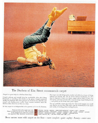
This seems to be the default pose to use when picturing Those Crazy Teens in the '50s... I guess her pose is supposed to symbolize the playfulness and nonconformity of youth, and perhaps the rejection of the staid societal norms of the previous generations. Then again, maybe she's just wearing antigravity socks. Actually, in the 1956 ad above, her inverted body actually serves the product in that it shows how comfortable it is to lie directly on a carpeted floor. The same pose is also found in this 1951 ad, coupled with some hip teen lingo to show how "with it" Post Toasties are, Daddio: The pose probably reached its apotheosis in 1963, when uber-teen Ann Margaret lolled on her back for all of America to publicize the movie version of "Bye Bye Birdie."

It happened one ad...

Image
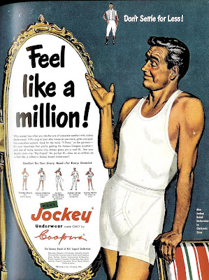
Here's a pretty innocuous, run-of-the-mill 1950 ad from Jockey, with the typical over-inflated claim. But there's something intriguing of about the illustrated model with the weathered but still handsome looks and that insouciant smile. Could it be--? You decide. Here's a side by side comparison between the man from the Jockey ad and silver screen legend Clark Gable : Coincidence? Maybe, but it sure seems an intentional homage, doesn't it? If so, then the question that naturally follows is, why? I'm guessing it was a bit of an in-joke between the illustrator and client, referencing Gable in 1934's " It Happened One Night ." According to pop culture lore, when Gable took off his shirt in that film and revealed a bare chest, undershirt sales supposedly plummeted by 75%. Could be the ad-makers, needing a face for their model, found it funny to show a Clark Gablesque fellow in both undershirt and underwear -- poetic justice, I suppose for his inadver...

Hartog barely there

Image
That Maidenform woman ... you never know where she's going to turn up. Even in these ads from another clothier entirely... "People barely vote for anything but hartog." or so the headline of this 1957 ad quips. According to this site, Hartog of California was "the leader of cool surfer style in the '60s," but frankly, it's hard to tell from this ad what they specialized in except labored puns about political cynicism and nudity. If you read to the bottom, you'll see the word shirts, but I doubt most readers of the era ever took their eyes off the shapely woman doing the Voting Dance of the Single Veil. This other ad in the series doesn't make things much clearer, except now the strained attempt at cleverness seems to reference ogling topless ingenues while simultaneously warning against sexually transmitted diseases. To put it another way, while the models who are showing lots of skin, it's really Hartog who's barely there.