Posts

Showing posts with the label History

"Thinking Too Hard" essay: Zeitgeist brands

Image
What's a Zeitgeist brand? Find out in this essay   –  which you can listen to me read or just read on your own  –  from my book, "Thinking Too Hard and Rethinking Too Much: Stories and Essays from a Career in Advertising." Craig McNamara 3 · Zeitgeist Brands by Craig McNamara Every once in a while, the right brand appears at just the right time, when larger events in the world or culture add a special resonance to the product. To me, they're "Zeitgeist Brands" – after the German word that translates to "spirit of the age." It's one of the most powerful marketing tools available, but almost by definition, it's one of the most unpredictable. Hard to create and usually impossible to duplicate. Sometimes it happens by accident, but it can be planned, too. Apple's 1984 TV spot, for example, played off the cultural fascination with reaching the titular year of Aldous Huxley's dystopian novel. But that was more about making ...

Keeping informed and carrying on

Image
I am fascinated by this simple piece of communication from the British government: Today, the message seems almost like a parody of the British "stiff upper lip" -- probably the reason that reproductions of the poster have become so popular since it resurfaced in 2000 -- but there's a surprising sense of urgency and resolve behind that basic sans-serif typeface and its iconic crown image. To put it in true context, you need only to realize that it this poster was created by the Ministry of Information in 1939 at the beginning of World War II with the intent of strengthening the morale of the British public in the event of an invasion by Germany. Try to imagine, if you can, the uncertainty and panic you'd feel when faced with the possibility that your country, your city -- very neighborhood -- could soon be under control of a foreign military. What would you do? Who could you trust? How would you stay safe? These are the kind of life-or-death questions this poster had ...

The moon shot heard round the 'world...

Image
What's the thinking behind this fanciful ad for True Temper golf clubs? Is it the allure of the moon, pock-marked with craters, as a kind of ready-made planetary golf course? In the second column, the copy makes a more grounded connection: ...the True Temper aluminum shafts, used by the leading club makers, are fabricated of an aluminum alloy recently developed for aviation and aerospace projects. But wait. Did I call this ad fanciful? Apollo 14 astronaut Alan Shepard, walking on the moon, actually did swing a club at two golf balls. Talking by radio to NASA at the time, Shepard said, " you might recognize what I have in my hand as the handle for the contingency sample return; it just so happens to have a genuine six iron on the bottom of it ... Unfortunately, the suit is so stiff, I can't do this with two hands, but I'm going to try a little sand-trap shot here." Though he initially said that the second shot went "miles and miles and miles" in the m...

Way-out fashion

Image
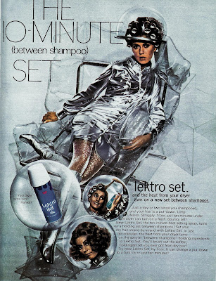
Here's a futuristic hair product ad from 1969. And how do we know it's futuristic? Obviously, from the silvery apparel the model is wearing, based on the aluminum-coated nylon spacesuits of the Mercury U.S. Space Program (which was put the first human in orbit around the earth). Even though the Mercury Program (and its distinctive Mark IV space suits ) had ended 6 years earlier, the look was just too iconic to be simply cast aside for the bulkier more utilitarian-looking suits of the Gemini and Apollo programs. In fact, the Mercury look" was perfect for mid-'60s TV shows that wanted to seem other-worldly or futuristic. (That's "My Favorite Martian" and "Lost In Space," for you non-boomers.)

The artist approves...

Image
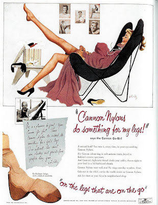
Panty hose may be sold to women, but they're really made for men -- or so this 1951 ad campaign seems to be admitting: "Cannon nylons do something for my legs" gushes the headline -- but despite the first-person voice, the real testimonial comes from the artist who illustrated those shapely gams: I can't decipher the artist's signature (or recognize his photo), but based on other ads in the series, I'm pretty sure he was one of the popular " pin-up girl " illustrators of the era. And as such, a pop-cultural authority, I guess, on how a well-turned leg should appear. An interesting idea, and well executed. Despite adapting an art form that was created pretty much exclusively for men, the artist's style -- here, equal parts sensual and "girl next door" -- seems non-threatening to women while showing them an idealized version of the appearance they want. Other ads in the series feature more easily identifiable pin-up artists, including F...

The Small Business Computer, 1956

Image
  Let's see that compact workstation close up: Look!  It no longer takes up a whole floor!  Now that's progress!

Waiting to exhale

Image
It's really too easy to play "hindsight is 20/20" and have a few cheap laughs at the expense of ads of bygone eras, especially when the subject is cigarettes and smoking.  This 1926 Chesterfield ad, however, is too politically incorrect by today's culture not to give it special note here: There's more to this scene than just a romantic appeal to women, though.  Back then, showing women smoking in ads was frowned on as much as women smoking in public.  Instead, consumers of the '20s were given coy come-ons like this one: Is she enthralled by the man -- or the cigarette?  Only her tobacconist knows for sure.

The last home you'll ever own (?)

Image
Houses for the Atomic Age! trumpets this 1955 ad.  But are they referring to the sleek, geometric styling of era?  Not exactly. To get the full picture, read into the copy a bit: The blast-resistant house design is based on principals learned at Hiroshima and Nagasaki...a rigidly integrated house that the engineers calculate will resist blast pressures 40% closer to bursts than conventionally built houses.   Only 40%?  Oh, wait, there's more: A special shelter has been provided in the basement to protect occupants from blast pressures expected at distances as close as 3,600 feet from ground zero of a bomb with an explosive force equivalent to 20,000 tons of TNT...affords protection from radiation, fire and flying debris as well. This certainly paints a different picture of suburbia than the usual illustrations of the time: But it's understandable, given that just underneath the surface of shiny optimism about the promise of nuclear energy to reshape our society... ...was the lo...

Context is everything

Image
That's probably as good as explanation as any of why nobody remembers this Kotex ad from 1970: But for those who were around in 1975, this is unforgettable: (Quick remedial history lesson here , if you need it.) Elsewhere:  Check out AdBroad for her answer to the inevitable question, "How can I work in advertising?"

His way for the highway

Image
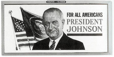
"I want to make sure that the America we see from these major highways is a beautiful America." So proclaimed President Lyndon Johnson in 1965, announcing the America The Beautful Initiative, designed to clean up eyesores along the growing federal interstate highway system. Key to this effort was The Highway Beautification Act, which attempted to control outdoor advertising by prohibiting certain kinds of signs and regulating the places they could be posted. As reported on the Federal Highway Administration web site : The signing ceremony took place 2 weeks after the President had surgery to remove his gall bladder and a kidney stone at Bethesda Naval Hospital. Although he had returned to the White House only the day before, President Johnson seemed to be in an expansive mood as he recalled the drive from the hospital to the White House along the George Washington Memorial Parkway: "I saw Nature at its purest. The dogwoods had turned red. The maple leaves were scarlet a...