Posts

Showing posts with the label Copywriting

Doing the Shark Dance

Image
So there I was, on the sands of a Florida beach, surrounded by a group of young people in swimwear, all eyes on me as I instructed them in the dance they were about to perform. The dance I was still coming up with barely five minutes earlier. The Shark Dance.   In 1994, I was a writer at an ad agency in Minneapolis, where one of my projects was the launch of that year’s Tigershark personal watercraft models made by Arctic Cat. Along with writing the ads and brochure, I would be going down to Florida to help supervise the film shoot of people riding Tigersharks in the gulf.    That included a riff on  Jaws , where beachgoers are panicked by a kid yelling “Shark!” as he spots a guy on a Tigershark. And later, the four Tigershark models zooming left to right across the screen, followed by a large shark fin we had made that was pulled through the water on a submerged rig. The fin was convincing enough that two riders unconnected to our shoot darted over and started yelli...

Red-Nosed Drunk – the audio play

Image
  It's Christmas Eve in a dive bar, where Santa's most famous reindeer has a lot to say about "The Big Guy," commercialism, and his role as a holiday icon. I wrote this in response to the Theatrical Shenanigans podcast’s call for holiday plays.  Since this would be an audio production, I realized I could adapt (and extend) my 2003 short essay about a conversation between a bartender and grumbling Rudolph the Red-Nosed Reindeer and not have to worry about costuming.  Produced by the podcast for their "12 Plays of Christmas" Special, December, 2024. (The title graphic for the play was created by me.)

Who is Mr. Thomson and why can't he keep his hands to himself?

Image
An oddly intriguing 1960s-era campaign I stumbled across recently.  Let’s handle this part right up front: Obviously, seen through modern eyes, it’s sexist as all get-out – but if you just want to reinforce your disgust at the ads, there are other web sites out there that will indulge you.    Here, I’m more interested in examining these ads as an  ad campaign  – what made them attention-getting, recognizable, and endlessly reproducible, as well as how they channeled the zeitgeist (for better and worse). So who is this Mr. Thomson with the audacity to feature himself as a handsy designer of women’s apparel?    The internet is surprisingly barren when it comes to The Thomson Company , the textile manufacturer behind the ads, the brand, and the exclamation – but digging deep, here’s what I’ve been able to find out and suss out. Though he was the public face (so to speak) of the company, our Mr. Thomson was, in fact, an advertising creation, as fictitious ...

"Thinking Too Hard" essay: Zeitgeist brands

Image
What's a Zeitgeist brand? Find out in this essay   –  which you can listen to me read or just read on your own  –  from my book, "Thinking Too Hard and Rethinking Too Much: Stories and Essays from a Career in Advertising." Craig McNamara 3 · Zeitgeist Brands by Craig McNamara Every once in a while, the right brand appears at just the right time, when larger events in the world or culture add a special resonance to the product. To me, they're "Zeitgeist Brands" – after the German word that translates to "spirit of the age." It's one of the most powerful marketing tools available, but almost by definition, it's one of the most unpredictable. Hard to create and usually impossible to duplicate. Sometimes it happens by accident, but it can be planned, too. Apple's 1984 TV spot, for example, played off the cultural fascination with reaching the titular year of Aldous Huxley's dystopian novel. But that was more about making ...

Storytelling in advertising, reincarnated

Image
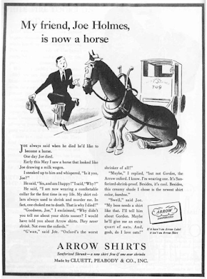
We know storytelling is all the rage now in marketing. And like most fashionable things, there’s usually some precedent in the past. Why else do we have the phrase, “Everything old is new again”? Still, you’re not likely to come across a story today like the one in this 1938 Arrow Shirts ad. If authenticity is all, this is more, well, horseplay: It was written by  George Gribbin  of Young & Rubicam, who was  recalled  as saying,  "One of the great assets of this agency is that a man here feels he can express himself as a writer."  Certainly, he accomplished that here; sixty years later, the ad was still well remembered, ranking 98 th  of the Top 100 Ads according to Advertising Age magazine in 1999. It begins,   Joe always said when he died, he’d like to become a horse.    One day Joe died.    Early this May, I saw a horse that looked like Joe drawing a milk wagon. “I sneaked up to him and whispered, “Is it you, Joe?” ...

I wanted to like this ad, I really did

Image
When I first came across it, I (wrongly) assumed it was the work of Doyle Dane Bernbach, using a very minimalist layout to catch attention and evoke emotion, sort of like they did with the Polaroid ads in the ‘60s . No logo, just a simple headline, and an intriguing illustration that tells you nothing about the product, only the elation it will inspire in the woman in the your life. What an incredible way to portray a woman leaping into the arms of her man, I thought, showing only what’s necessary to imply the situation, spurring the reader to imagine the embrace, the eyes, the kiss.   Brilliant, I thought. Then I read the headline.    “Wear an Arrow Shirt and you'll simply sweep her off her feet!”   No.   No, I don’t believe this ad, even for a minute.    The only way to sell this scenario is if the emotion implied feels true. Even in 1949, it’s hard to imagine anyone got this excited about a dress shirt. Unless he just got home from the service and t...

Making the ad space part of the ad concept

Image
Yes, yes, I know, print advertising is dead, especially newspaper advertising – but ads still use space in other mediums, so apply these observations as you will.   Make the height of the ad part of the concept Look how this 1966 Mobil ad really sells the comparison of car collision at 80 mph with the impact of a car dropped from a ten-story building. You could have used a rooftop shot of the car going over; you could have shown a tighter shot of a car falling past a row of windows; you could have shown the crushed car at the base of the building; but Len Sirowitz of Doyle Dane Bernbach used the height of the newspaper space to show the full size of building, inviting us the imagine the long fall of the automobile and what happens when it hits the ground. And making a static photo feel as dramatic as the same demonstration in the accompanying TV commercial .    (The layout is even more brilliant when you consider that the ad was likely encountered by people reading the ne...

Happiness is a warm television

Image
Authentic. Genuine. Truthful. These are the qualities above all that modern advertising aspires to – or claims to aspire to. Consumers today are too savvy, too cynical, the thinking goes, to be beguiled by unrealistic depictions and unattainable expectations. Yet despite this emphasis on realism, advertising largely remains an aspirational medium. Even the earthiest, unadorned people you see in ads still tend to be stylishly photographed and romanticized, still appealing to how we wish to see ourselves, even if that wish is a bit less lofty.  So unlike the scrubbed, idealized images Madison Avenue sold us during the ‘50s and ‘60s. And that’s largely true – but when it comes to authenticity, nothing I’ve seen in recent years comes close to this mid-1960s campaign for Sony’s new concept of “portable” televisions. Created by the celebrated “Think small”/”When you’re number two, you try harder” ad agency, Doyle Dane Bernbach , these 1965 ads present something that's largely vanished fr...

Being seen versus being clutter

Image
"How can outdoor advertising avoid clutter and visual pollution in public spaces?"  asked LinkedIn for a recent  collaborative article on their site. "Be creative and context-aware," they advised. "Find ways to integrate your ads with the environment, the culture, and the audience … make your ads more engaging, memorable, and respectful, while avoiding the risk of being intrusive or offensive. As one of the "select group of experts" who were invited to contribute, I added this to the discussion: By definition, you want your ad to be noticed; disrupting the environment is pretty much how it happens. Merging into the background means you’re not being seen. Yes, engaging viewers with a clever idea or visual can make the intrusiveness sting less.    But maybe the question we should be asking is how much the potential for attracting eyes justifies the potential for distracting drivers.    I was once tasked by a highway safety group to write outdoor messag...

Just re-do it

Image
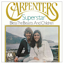
What’s your favorite song by The Carpenters? That would seem to be a simple enough question – but when it comes to the ‘70s sister-and-brother duo, it can be a little more complicated. Because often, you don’t just have to choose a song, you have a choose a version. Richard Carpenter didn’t just sing harmony to his Karen’s lead vocals. As producer,  arranger, lyricist, and composer, he was deeply involved in the production of the tracks – and a bit of a perfectionist. So over the years, as their hits have been re-released, he’s used the opportunity to remix many tracks  to improve sound quality and add new instrumentation and flourishes – on songs like  Ticket to Ride ,  Top of the World , and  Superstar . And it hasn't been just Richard Carpenter re-doing works long after they’ve been completed. Think of Neil Sedaka, re-recording his 1962 bubblegum hit,  Breaking Up is Hard To Do  as a soulful piano ballad in 1975. Or the group Chicago, re-arranging t...

The Other Legacy of Braniff Airlines

Image
Before founding the agency that carried her name,  Mary Wells (later Wells Lawrence) was part of Jack Tinker & Partners , where she was first recognized for bringing a theatricality to advertising, a more cinematic and story-driven approach to her commercials.    Given the fledgling Braniff account, Ms. Wells re-introduced the carrier to the world by breaking out of the dull monochrome world that air travel was circa 1965. She splashed color outside and inside the planes and outfitted the "hostesses" (sorry, the "flight attendant" name was still years away) in stylish Emilio Pucci designs.   It was "The end of the plain plane," as the campaign put it, and it kept Braniff in the news for months on end.     This commercial may not be the showiest example of a Mary Wells Lawrence production, but the announcement it made was strong enough to make up for the commercial's deficiencies (though the droll "cha cha cha" is a nice touch).   Realizi...