Posts

Showing posts from 2010

Things go better with Santa

Image
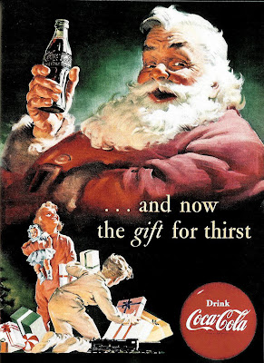
Recognize this jolly gent? If so, you can thank (in part) the Coca-Cola company, whose 1930s holiday ads illustrated by Haddon Sundblom helped popularize the image of Santa as a rotund, ruddy elf dressed in red from head to toe. Thanks for your visits in 2010. The deconstructing will continue in 2011. Happy New Year!

Koss, the Owl & the Pussycat

Image
What's going on in this 1971 ad from Koss? Is it a couple of middle-agers dabbling in the '60s sexual revolution, and ending up indulging other passions instead (his, high-brow music, hers low-brow TV and bon-bons)? "No two people really enjoy all the same things," the ad begins. "What turns one on may very well turn the other off." And so we get that staple of the '60s movie and TV relationships, the sexed-up woman and the oblivious man. The innuendo aside, it's an interesting choice for portraying domestic differences. Assuming it even is a domestic scene. Who's to say it isn't some misguided post-coital scene of a, shall we say, more professional transaction? It's up the reader to decide, but I'm pretty sure the ad creators were inspired by this hit movie from the year before: " The Owl and the Pussycat " was based on a Broadway play (and not the 1871 children's poem by Edward Lear) and adapted to a film starring

Off by 30+ years (but who's counting?)

Image
Automatic highways. Computerized kitchens. Person to person television. Food from under the sea. And all in just ten years! Or not. We're getting closer to the realities predicted in this 1969 ad -- some 30 years behind schedule -- but we're still not all the way there yet. (click for a better view of the future we're still waiting for) Check back in another decade or so.

AH and the LBD

Image
A bit of wishful thinking -- or perhaps desperate wishing -- in this 1962 ad from this acrylic fiber maker: "What ever become of the little black dress?" the headline muses, apparently unaware that it never really went out of style. The so-called little black dress (also known as LBD), whose simple elegance enables it to be accessorized for both day wear and evening wear, has been a woman's wardrobe essential since it was first popularized in 1926 by Coco Chanel in the pages of Vogue magazine. Its ubiquity continued through the years of the Great Depression and even World War II, and was given new life in the 1960s, most notably by Audrey Hepburn's wearing of the LBD in "Breakfast At Tiffany's"... ...a film which, probably not coincidentally, was released the year before the ad above. Makes you wonder why, if the manufacturer's goal is to expand the acceptance of acrylic fiber, the ad chose to position itself against the little black dress instead

Revlon goes barbaric

Image
Maybe it's just me, but I when I look at this 1969 Revlon ad -- with its apocalyptic sky, blasted landscape and the woman's vaguely futuristic barbarian getup -- I can't help thinking this: That's Barbarella, the Jane Fonda sexploitation movie that came out the year before. Though it was as critical and box office flop, it seems plausible that, given the need to draw attention to Revlon's "action-now" skincare product, the ad designers would turn to cinematic images of "action heroines" -- though, frankly, the culture at the time didn't offer all that much choose from. It was either Jane Fonda in a space bikini... ...or maybe Raquel Welch in a fur bikini, circa 1966: Am I hallucinating? Do a side-by-side comparison and you decide:

The moon shot heard round the 'world...

Image
What's the thinking behind this fanciful ad for True Temper golf clubs? Is it the allure of the moon, pock-marked with craters, as a kind of ready-made planetary golf course? In the second column, the copy makes a more grounded connection: ...the True Temper aluminum shafts, used by the leading club makers, are fabricated of an aluminum alloy recently developed for aviation and aerospace projects. But wait. Did I call this ad fanciful? Apollo 14 astronaut Alan Shepard, walking on the moon, actually did swing a club at two golf balls. Talking by radio to NASA at the time, Shepard said, " you might recognize what I have in my hand as the handle for the contingency sample return; it just so happens to have a genuine six iron on the bottom of it ... Unfortunately, the suit is so stiff, I can't do this with two hands, but I'm going to try a little sand-trap shot here." Though he initially said that the second shot went "miles and miles and miles" in the m

Way-out fashion

Image
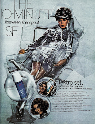
Here's a futuristic hair product ad from 1969. And how do we know it's futuristic? Obviously, from the silvery apparel the model is wearing, based on the aluminum-coated nylon spacesuits of the Mercury U.S. Space Program (which was put the first human in orbit around the earth). Even though the Mercury Program (and its distinctive Mark IV space suits ) had ended 6 years earlier, the look was just too iconic to be simply cast aside for the bulkier more utilitarian-looking suits of the Gemini and Apollo programs. In fact, the Mercury look" was perfect for mid-'60s TV shows that wanted to seem other-worldly or futuristic. (That's "My Favorite Martian" and "Lost In Space," for you non-boomers.)

Confusing hair day

Image
This 1969 ad isn't first to observe that, "Once upon a time, it was easy to tell the girls from the boys." In fact, in the years since the Beatles popularized the shag cut (and long hair became the hippie style of choice), that had long since become a stock punchline among the Bob Hope/Johnny Carson set. But this ad seems even more confused than most: We get it, we get it. Seen from behind, boys in long hair look like girls. But the copy goes on, Once upon a time, all you had to do was look. Today, it's not so easy. So today, more than ever, a feminine fragrance is all but essential... Wait a second. Is the problem long hair on men or does it have something to do with males having androgynous features? And is this a fear that women of that era were supposed to relate to? That men weren't approaching them because of the mistaken assumption that they were men, too? On the other hand, maybe that fragrance was to help the both of them identify who was who in the

Another all-too-typical '60s airline ad...

Image
Smiling and dapper business traveler, check. Sleek and luxurious symbol of the modern world of travel, check. So what's missing? Oh, right, this: No doubt he's just considering her "speed, splendor and spectacular performance."

Who's under the trench coat?

Image
Back in the glamorous heyday of airline travel, airlines often tried to sell you tickets based the idea of exotic travel as a way of resuscitating your relationships, and more frequently, by subtly (and no so subtly ) dangling the fantasy of a romantic liaison with one of their young and shapely (but with a girl-next-door appeal, naturally) fight attendants. This 1963 ad from Germany's Lufthansa Airlines cleverly manages to do both: Are they husband and wife, or passenger and stewardess? Don't look to the ad copy to give you any clues: Happens often in Bavaria. You'll notice it in the most surprising places...in the most surprising ways. Something in Germany's air, no doubt, has a wonderfully stimulating effect on the feelings and spirits of visitors. Make of it what (and who) you will. But given the airline-branded bag the woman's carrying, the coy ingenue-like turning in of her feet as she's (presumably) being kissed, and the business attire of the man, an

Blondes have more puns

Image
Hmmmm. Do I detect a bit of innuendo here? Of course, what else would you expect from the company that introduced the first one-step home hair-color formula five years earlier with this memorable teaser: The 1969 ad at top, for a coloring formula with deceptive but irresistible name, "Born Blonde," foregoes that coy innuendo of an earlier era for a more leering come-on befitting the late-'60s sexual revolution (complete with the faux-psychedelic typeface of the free-love generation). As Wikipedia explains, "In contemporary popular culture, it is often stereotyped that men find blonde women more attractive... Anita Loos popularized this idea in her 1925 novel, "Gentlemen Prefer Blondes." (And of course, it helps when the film adaptation of said novel starred Marilyn Monroe.) Clairol took that idea of the special appeal, and really ran with it, with headlines like "If I have only one life, let me live it as a blonde." and this one, which, later s

It happened one ad...

Image
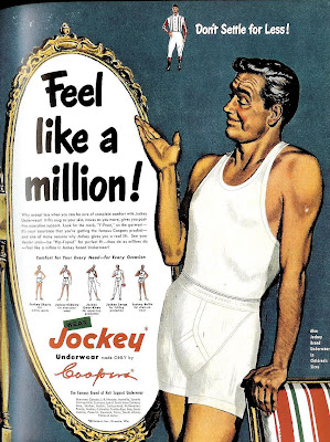
Here's a pretty innocuous, run-of-the-mill 1950 ad from Jockey, with the typical over-inflated claim. But there's something intriguing of about the illustrated model with the weathered but still handsome looks and that insouciant smile. Could it be--? You decide. Here's a side by side comparison between the man from the Jockey ad and silver screen legend Clark Gable : Coincidence? Maybe, but it sure seems an intentional homage, doesn't it? If so, then the question that naturally follows is, why? I'm guessing it was a bit of an in-joke between the illustrator and client, referencing Gable in 1934's " It Happened One Night ." According to pop culture lore, when Gable took off his shirt in that film and revealed a bare chest, undershirt sales supposedly plummeted by 75%. Could be the ad-makers, needing a face for their model, found it funny to show a Clark Gablesque fellow in both undershirt and underwear -- poetic justice, I suppose for his inadver

Talking back to "The Man"

Image
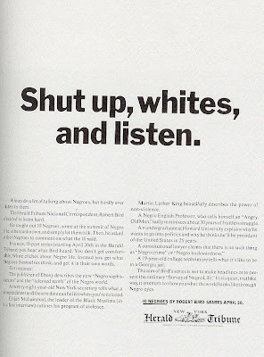
Several months back, this blog looked at a couple of ads from the 1960s that grappled with the social upheaval of the period by trying to see things (if occasionally awkwardly) from the "black perspective." Today, let's see how the media addressed similar topics when speaking more to their "white" audience. And right off the bat, we see a more confrontational attitude designed to put the reader on the defensive: The above 1963 New York Herald Tribune ad begins with the statement that "Whites do a lot of talking about Negros, but hardly ever listen to them. The copy continues its aggressive tone by telling us what not to expect: You don't get comfortable, White cliches about Negro life. Instead, you get what Negros themselves think, and get it in their own words. (Don't be offended by racial labels; those were the terms of the times.) Almost a decade later, society's continuing struggle with racial issues (along with family and sexuality is

Got deja vu?

Image
Here's a visually clever outdoor board from back in 1963. Remind you of anything? (As if I really had to tell you. ) Here's one of that campaign's more recent examples, fuzzy upper lip and all: But wait, we're not through with our confluence of coincidences yet. Because this parodic ad appeared in the late '90s, bringing the concept more or less full circle after about 25 years:

Art appreciation (from an unlikely source)

Image
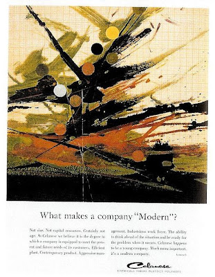
Abstract expressionism has all too frequently been the butt of jokes in popular culture. Garnering only a portion of the respect it holds in the art world, abstract works have inspired endless "my kid could've painted that for free" quips in television and movies -- and in all likihood, advertising as well. But not here: This 1963 ad from the chemical manufacturer Celanese isn't interested in the typical "it looks like the artist exploded" style of one-liners. Instead, they use an example of abstract expressionism to symbolize "modernism" and it would appear that their intentions are straightforward. Any suggestion that the art style was less than legitimate would undermine the ad's entire argument. "Celanese happens to be a young company. Much more important, it's a modern company." the ad assures us rather defensively. It seems to be in response to more established competitors (or perhaps less established upstarts); at any

Red is...what?

Image
Here's an interesting late-1960s CBS programming ad by the celebrated designer, Lou Dorfsman : Hmm. Odd bit of hyperbole there. At the height of his popularity, the comedian Red Skelton could be described as clever...a gifted mime...or even, as the ad says, "screamingly funny" (I said he could be, I didn't say everyone would agree)...but beautiful? Actually, it makes a bit more sense when you consider the era in which the ad was created and ran. " Black is Beautiful " was the theme if you will, of the late 1960s U.S. cultural movement that countered traditional "Caucasian-centric" views of desirability, and the phrase was on was more likely to come up on the news or talk shows than in entertainment programs (such as, not surprisingly, the show in question). So was CBS being insensitive in the co-opting of the phrase? Maybe, but they weren't the only ones to do it. (The above ad, I suppose, at least has the virtue of being sincere about it

Hartog barely there

Image
That Maidenform woman ... you never know where she's going to turn up. Even in these ads from another clothier entirely... "People barely vote for anything but hartog." or so the headline of this 1957 ad quips. According to this site, Hartog of California was "the leader of cool surfer style in the '60s," but frankly, it's hard to tell from this ad what they specialized in except labored puns about political cynicism and nudity. If you read to the bottom, you'll see the word shirts, but I doubt most readers of the era ever took their eyes off the shapely woman doing the Voting Dance of the Single Veil. This other ad in the series doesn't make things much clearer, except now the strained attempt at cleverness seems to reference ogling topless ingenues while simultaneously warning against sexually transmitted diseases. To put it another way, while the models who are showing lots of skin, it's really Hartog who's barely there.

Deja Vertigo?

Image
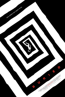
Just noticed this poster for this upcoming movie... Very simply and dramatically suggests the terror and disorientation of someone apparently buried alive. But even more, it shows the obvious influence of the movie poster work of seminal graphic designer, Saul Bass -- this one in particular:

Innuendo -- It's the American way

Image
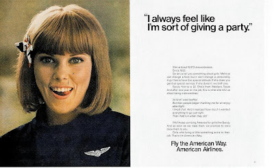
I've discussed American Airline's "Fly Me" campaign previously , but this ad deserves special mention. It seems to be created for those for whom the "stewardesses" with the come-hither come-ons ("I'm Cheryl. Fly Me.") was a bit too subtle: The "giving a party" headline, the knowing eyes, the tongue definitely not in cheek -- you'd be forgiven for mistaking this for an ad for some kind of in-flight escort service. The copy isn't going to give you much help, either: "At first I was bashful. But then people began thanking me for an enjoyable flight. I liked that. And I realized how much I wanted everything to go just right. That I had fun when they did." And like a good procurer, American Airlines ends by promising We'll keep combing America for girls like Sandy. And as soon as we meet them, we promise to introduce them to you. And you wonder how that "Swinging Stewardess" image became so embedded in pop

The artist approves...

Image
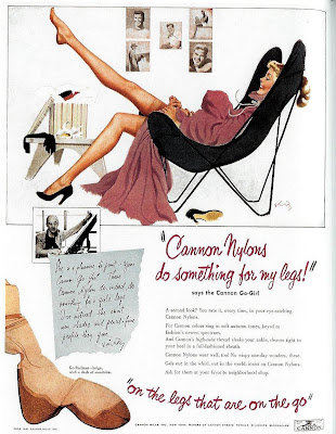
Panty hose may be sold to women, but they're really made for men -- or so this 1951 ad campaign seems to be admitting: "Cannon nylons do something for my legs" gushes the headline -- but despite the first-person voice, the real testimonial comes from the artist who illustrated those shapely gams: I can't decipher the artist's signature (or recognize his photo), but based on other ads in the series, I'm pretty sure he was one of the popular " pin-up girl " illustrators of the era. And as such, a pop-cultural authority, I guess, on how a well-turned leg should appear. An interesting idea, and well executed. Despite adapting an art form that was created pretty much exclusively for men, the artist's style -- here, equal parts sensual and "girl next door" -- seems non-threatening to women while showing them an idealized version of the appearance they want. Other ads in the series feature more easily identifiable pin-up artists, including F