Posts

Showing posts with the label Culture

1 play, 2 theaters, 21 performances

Image
A casual apology during coffee between friends leads a series of surprising confessions. That's my 10-minute play, The Besting of Friends , inspired by an occurrence in my life.  (Yes, I inadvertently lost a childhood friend's action figure. Yes, he had totally forgotten the incident when I replaced the figure decades later. No, nothing else that follows actually happened.) Over the last two years I've racked up a lot of rejections for plays I've submitted to various short-play festivals. (Part of the process, and a career in advertising has given me lots of experience in having ideas rejected.) So, at best, I was hoping that The Besting of Friends would at least make it into one of the many competitions in which it was entered. I was pleasantly surprised that it was produced  by two different theatre companies in the same month, February 2025.  The Rainy Day Artistic Collective, based in Seattle, included my play in their New Works New Writers 2025 showcase that was s...

The caveman at mid-century

Image
The mid-century, it seems, was the heyday for advertising that traded on the trope of the caveman dragging off a mate by her locks.  As eye-catching, evocative imagery, it was just too potent for ad men to resist -- especially when it could be presented with an anachronistic twist. Thus, we have this 1949 Arrow ad which gives women the upper hand in the mating ritual, informing us that "A man hasn't a chance in an Arrow White Shirt."    "Correct, young-man-about-to-live-in-a-cave!" the copy confirms, "Their handsome, perfect-fitting collars are irresistible." (And don't worry about their mismatched clothing. By the time she's finished dragging him home, that white shirt will be a memory, in dirty, ragged shreds.) In 1956, the scenario again made an appearance, with men and women back in their traditional roles, this time to cast bone-ribbed girdles as something out the stone age ... or something very much like it. "Come out of the bone age...

"Thinking Too Hard" essay: Zeitgeist brands

Image
What's a Zeitgeist brand? Find out in this essay   –  which you can listen to me read or just read on your own  –  from my book, "Thinking Too Hard and Rethinking Too Much: Stories and Essays from a Career in Advertising." Craig McNamara 3 · Zeitgeist Brands by Craig McNamara Every once in a while, the right brand appears at just the right time, when larger events in the world or culture add a special resonance to the product. To me, they're "Zeitgeist Brands" – after the German word that translates to "spirit of the age." It's one of the most powerful marketing tools available, but almost by definition, it's one of the most unpredictable. Hard to create and usually impossible to duplicate. Sometimes it happens by accident, but it can be planned, too. Apple's 1984 TV spot, for example, played off the cultural fascination with reaching the titular year of Aldous Huxley's dystopian novel. But that was more about making ...

Red-Nosed Drunk

Image
A hoof banged on the bar. “Hit me again, Joe.”   “Don’t you think you’ve had enough for one night, pal?” the bartender replied coolly.  “I can smell the nut meg on your breath from here.”   “Hey, my nose always is always red,” Rudolph snorted back. “I can handle my egg nog.”   “Something bothering you, Rudy?”   The reindeer lowered his dewy eyes to the bar. “Sorry, Joe. It’s the holiday, you know? Sometimes, it just gets me down. All this rampant commercialism, the runaway materialism. I mean, where’s it going to end?"    “Isn’t your attitude a little hypocritical, Rudolph? You know, given where you came from.”   “What are you talking about?” the reindeer snorted. His nose momentarily flared bright red in the smoky dimness of the bar, as if inflamed by his annoyance.   The bartender considered his next words carefully. “You know about Montgomery Wards, right? The department store? Some copywriter there made you up for a giveaway booklet ...

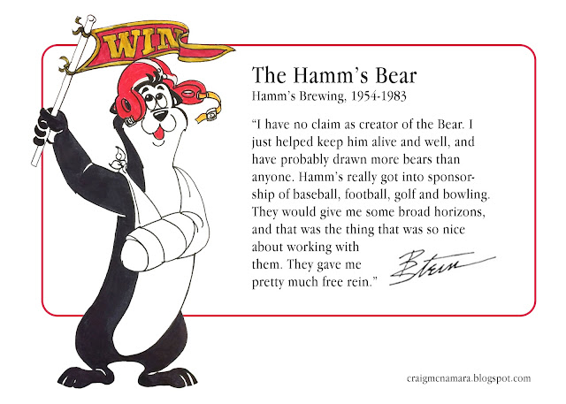
Bill Stein: Critters & Creatures

Image
In 2016, I was helping my father-in-law, commercial artist Bill Stein (1923- 2020), prepare for a move by sorting through his flat files of artwork and sketches accumulated over his 60+ year career. Lots of Hamm’s work, naturally, and a drawer filled with Inky Lou posters. But there were other critters and creatures, too – animal and human, whimsical and fantastical.  I hadn't realized how many times Bill had to help brand a company through the personality and antics of an advertising mascot. I put together a booklet for him, "Critters & Creatures," that compiled examples of the characters that Bill had drawn (and in several cases, created), along with his brief memories about each of them. This is my introduction to the collection, along with four of the best-known mascots. * * * In the world of advertising, they’re known as “critters,” the popular pitchmen of the Leo Burnett Company . The Chicago ad agency was behind such 20th Century marketing icons as Tony the Ti...

Gorilla or Guerrilla?

Image
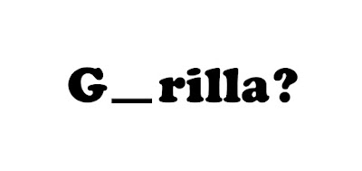
An interesting error I've seen made more than once in this business:  In emails or memos that reference the tactic of "guerrilla marketing" – eschewing traditional media for unconventional, attention-getting, and relatively cheaper message placements – the unknowing writer has misspelled it as  gorilla  marketing.   That, ironically, brings to mind the old "800-pound gorilla" designation for the biggest, most powerful brand in a given industry – one whose advertising budgets dwarfed their competitors' miniscule marketing dollars and thus had little for need for the cleverness of guerrilla advertising.   The term, incidentally, was coined by author Jay Conrad Levinson in his 1984 book,  Guerrilla Marketing . He based it, of course, on the concept of guerrilla warfare, i.e, small independent groups using ambush, surprise, and mobility to effectively battle against larger forces.    Going back one step further, guerrilla is derived from the Spanish w...

Binge/Purge TV

Image
I’ve been known to sum up my past co-dependent relationship with television by telling others that my parents used to say, “It’s such a nice day, Craig – why don’t you take the TV outdoors?”   Yes, I’m exaggerating – but only a little. I freely admit, I watched way too much TV growing up. Given that, you might think our modern era of “Peak TV, with streaming services multiplying like rabbits on Spanish Fly, would be a dream come true for me, right?    Let’s press pause and think about that for a second.   Now, don’t get me wrong, I’m all for the freedom to consume entertainment programs on my own schedule without having to wait a week between installments or broken up by commercials. And I won’t argue the point that we’re in a Second Golden Age of Television, with more shows than ever before of high quality, diverse subject matter, and involving storytelling – The Sopranos, Mad Men, Breaking Bad, Game of Thrones, et al.   But here’s the thing: If you’ve ever own...

What's it like to work in advertising? It's like this.

Image
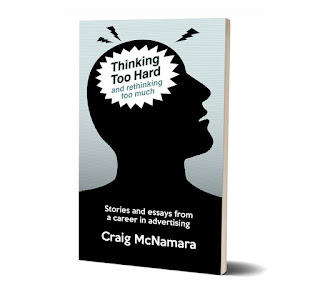
What's it like to create advertising for a living? What’s it like to work at an ad agency?  What’s to like – or not like – about certain ad campaigns?  What do I like in how advertising in portrayed in movies and TV?   Find out here, in essays, articles, podcast scripts, and blog posts – nothing too heavy and written with wit and style.  Like the writing on this blog?  It's like that, and more. $9.99 softcover – $4.99 ebook Read excerpts and order  here .

What's really behind the smoke?

Image
Here's an early-1970s ad that seems to have sparked a lot of "outrageously outrageous outrage" on some sites around the web: "It's rude/it's sexist/it's unhealthy" goes the shocked, shocked criticism of this ad -- which, seen in the context of the times, seems as about as pointless as sneering at it for its pro-smoking advocacy. What I found interesting was reference point for the headline. "Blow in her face and she'll follow you anywhere" wasn't just referring to the fruit-flavored tobacco (which, the ad presumes, she'll find aromatic). It's a paraphrasing of a catchy come-on -- "Blow in my ear and I'll follow you anywhere" -- that was popularized by 1969's and 1970's #1 TV show, " Laugh-In ." Used as both a pickup line and a punchline, I seem to recall even Dick Martin using it in his routines with partner Dan Rowan. Finally, before we leave this Tipalet ad behind, in its defense, may I...

Confusing hair day

Image
This 1969 ad isn't first to observe that, "Once upon a time, it was easy to tell the girls from the boys." In fact, in the years since the Beatles popularized the shag cut (and long hair became the hippie style of choice), that had long since become a stock punchline among the Bob Hope/Johnny Carson set. But this ad seems even more confused than most: We get it, we get it. Seen from behind, boys in long hair look like girls. But the copy goes on, Once upon a time, all you had to do was look. Today, it's not so easy. So today, more than ever, a feminine fragrance is all but essential... Wait a second. Is the problem long hair on men or does it have something to do with males having androgynous features? And is this a fear that women of that era were supposed to relate to? That men weren't approaching them because of the mistaken assumption that they were men, too? On the other hand, maybe that fragrance was to help the both of them identify who was who in the ...

Another all-too-typical '60s airline ad...

Image
Smiling and dapper business traveler, check. Sleek and luxurious symbol of the modern world of travel, check. So what's missing? Oh, right, this: No doubt he's just considering her "speed, splendor and spectacular performance."

It happened one ad...

Image
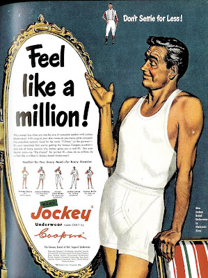
Here's a pretty innocuous, run-of-the-mill 1950 ad from Jockey, with the typical over-inflated claim. But there's something intriguing of about the illustrated model with the weathered but still handsome looks and that insouciant smile. Could it be--? You decide. Here's a side by side comparison between the man from the Jockey ad and silver screen legend Clark Gable : Coincidence? Maybe, but it sure seems an intentional homage, doesn't it? If so, then the question that naturally follows is, why? I'm guessing it was a bit of an in-joke between the illustrator and client, referencing Gable in 1934's " It Happened One Night ." According to pop culture lore, when Gable took off his shirt in that film and revealed a bare chest, undershirt sales supposedly plummeted by 75%. Could be the ad-makers, needing a face for their model, found it funny to show a Clark Gablesque fellow in both undershirt and underwear -- poetic justice, I suppose for his inadver...

Talking back to "The Man"

Image
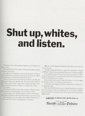
Several months back, this blog looked at a couple of ads from the 1960s that grappled with the social upheaval of the period by trying to see things (if occasionally awkwardly) from the "black perspective." Today, let's see how the media addressed similar topics when speaking more to their "white" audience. And right off the bat, we see a more confrontational attitude designed to put the reader on the defensive: The above 1963 New York Herald Tribune ad begins with the statement that "Whites do a lot of talking about Negros, but hardly ever listen to them. The copy continues its aggressive tone by telling us what not to expect: You don't get comfortable, White cliches about Negro life. Instead, you get what Negros themselves think, and get it in their own words. (Don't be offended by racial labels; those were the terms of the times.) Almost a decade later, society's continuing struggle with racial issues (along with family and sexuality is...

The few. The proud. The mistresses.

Image
I had no idea that being somebody's mistress was so demanding. I thought you just had to put up with sporadic, last-minute trysts and holidays and birthdays spent alone. But apparently, you've got to have a passion for Fibber McGee and own an ocelot, among other things. This whole 1974 ad bears reading. I guess its somebody's idealized image of a mistress, but even with tongue-in-cheek (I assume), the insecurity and cruelty of the situation for women is perhaps unintentionally touched on with the line about her "seeing a psychiatrist by your giggling at her striptease." It's almost like a "scared straight" thing for The Other Woman. Click on it to enlarge:

Racial sensitivity in 1969

Image
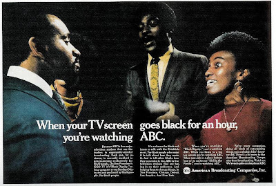
In 1969, this is what passed for racial sensitivity at ABC: Meanwhile, over at the Tiffany Network, CBS took a more sobering, more provocative approach in their 1968 ad on their coverage of similar cultural issues: (The CBS ad, by the way, is the work of legendary designer, Lou Dorfsman .)

Going for the juggler

Image
Think all the fretting over TV shows pushing the envelope in sex and violence is a modern concern? Here's an ad from 1961: "We own Sylvania TV. We're worried about some of the shows you see on our sets." begins the ad, under a depiction of programming types of the era that Sylvania apparently finds objectionable, violent westerns and cop and detective shows prominently featured, along with other programs waiting to implant violent and impure thoughts into the minds of the American viewing public, like medical shows, historical dramas and beauty pageants. And of course, shows that feature jugglers:

More real people, unscrubbed

Image
Back in my first post in January 2008, I showed this ad , as an example of the recognition (and celebration) of "real people" that's been absent in modern advertising (except as a source of humor, over-romanticism and post-modern irony). Here's another ad I recently discovered from that same campaign: Contrast that with this spot two decades later. Similar laundromat setting, a similar depiction of an overweight laundromat lady (around :46) -- but here, she -- and the others -- are just used as visual shorthand for the prim, traditional sensibilities our counter-cultural jeans-washer offends:

Time, for a lesson in headline writing

Image
John T. Elson passed away recently. As Time Magazine's religion editor in 1966, he wrote the cover story for the April 8th issue of that year, the edition that would give Time its biggest newsstand sales in more than 20 years and provoke 3,500 letters to the editor. As the New York Times notes: For more than a year, Mr. Elson had labored over an article examining radical new approaches to thinking about God that were gaining currency in seminaries and universities and spilling over to the public at large. When finally completed, it became the cover story for the issue of April 8, as Easter and Passover approached. The cover itself was eye-catching, the first one in Time’s 43-year history to appear without a photograph or an illustration. Giant blood-red letters against a black background spelled out... Okay, that's not the cover. That's actually the title of the article as it appeared on the inside. For the cover, the editors instead chose the first sentence of the art...

To Heinz and back

Image
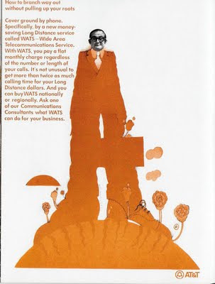
In a post on May 19 of last year, I traced the apparent inspiration for this 1970 At&T ad back to the look of The Beatle's 1968 "Yellow Submarine," movie. The art director behind that movie's graphics, Heinz Edelmann, passed away recently. Interestingly, as the NY Times reports, Despite the huge influence of “Yellow Submarine” on the culture of the time, Mr. Edelmann admitted that he could never quite connect with the 1960s aesthetic. Once the film was complete, he altered his approach to avoid being pigeonholed as a psychedelic artist, becoming considerably less ethereal and decorative... Some examples of Edelmann's (non-psychedelic) poster work can be seen here .

Squeeze Teases

Image
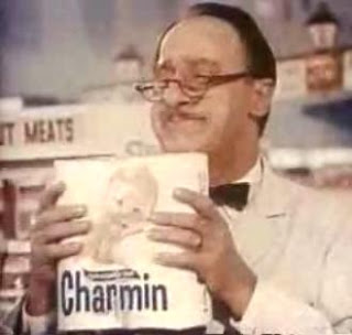
Even back in the '70s, we used to make fun of Charmin's Mr. Whipple and uncontrollable compulsion to squeeze bathroom tissue... But apparently, the problem was more prevalent in grocery stores back then than previously recognized: And yet, just when you think you know the rules, along comes... "Squeeze me." "Don't squeeze me." "Please don't." "Everybody squeeze." Just one more case of American culture sending out confusing mixed messages.