Posts

Showing posts with the label Artists

The eye has it

Image
Not just a vivid poster here. A vivid lesson in the impact of good cropping. I was reading an article on the movie-poster art of Al Kallis for American International Pictures. AIP was, per Wikipedia ,  "the first company to use focus groups, polling American teenagers about what they would like to see and using their responses to determine titles, stars, and story content. … a typical production involved creating a great title, getting an artist such as Albert Kallis who supervised all AIP artwork from 1955 to 1973 to create a dynamic, eye-catching poster, then raising the cash, and finally writing and casting the film.” Kallis had the pedigree. Along with his previous work as a poster layout artist for the influential Saul Bass, Kallis was the son of Maurice Kallis, a famed movie poster artist himself.   Perusing the work of Kallis the younger, I have to assume that his posters were likely more effective at evoking terror and dread than the movies themselves....

I wanted to like this ad, I really did

Image
When I first came across it, I (wrongly) assumed it was the work of Doyle Dane Bernbach, using a very minimalist layout to catch attention and evoke emotion, sort of like they did with the Polaroid ads in the ‘60s . No logo, just a simple headline, and an intriguing illustration that tells you nothing about the product, only the elation it will inspire in the woman in the your life. What an incredible way to portray a woman leaping into the arms of her man, I thought, showing only what’s necessary to imply the situation, spurring the reader to imagine the embrace, the eyes, the kiss.   Brilliant, I thought. Then I read the headline.    “Wear an Arrow Shirt and you'll simply sweep her off her feet!”   No.   No, I don’t believe this ad, even for a minute.    The only way to sell this scenario is if the emotion implied feels true. Even in 1949, it’s hard to imagine anyone got this excited about a dress shirt. Unless he just got home from the service and t...

Rebranding a movie

Image
It’s not unusual for a product to undergo rebranding. In fact, one of the most successful was covered on this very blog .    But in this case, the product in need of a new image wasn’t found on a store shelf. It was projected on the silver screen.   In 1973, United Artists released its movie,  The Long Goodbye  to theatres in Los Angeles, Chicago, Philadelphia and Miami. The movie re-teamed director Robert Altman and star Elliot Gould of the box-office hit  M*A*S*H  three years earlier, in an adaptation of the Raymond Chandler noir novel.    “Nothing says goodbye like a bullet,” the movie poster announced, Elliot Gould brandishing a cigarette and pistol, looking as hard-boiled as Humphrey Bogart’s Marlowe in 1946’s  The Big Sleep.   And the audience stayed away in droves.    When the limited release ended, United Artists pulled the film from its next opening in New York and, baffled by the apathy of audiences (and the host...

Who's at the door? Who's at the sleigh? What animals come after A?

Image
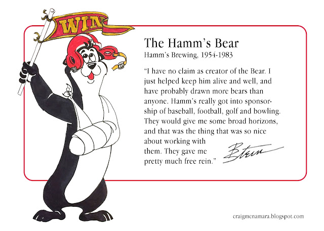
Bigger sizes and smaller prices for my two previous children's books – plus a new book also featuring fun animal illustrations by noted Hamm's Bear illustrator (and my father-in-law) Bill Stein.  Preview and order via craigmwriter.com or here .

Bill Stein: Critters & Creatures

Image
In 2016, I was helping my father-in-law, commercial artist Bill Stein (1923- 2020), prepare for a move by sorting through his flat files of artwork and sketches accumulated over his 60+ year career. Lots of Hamm’s work, naturally, and a drawer filled with Inky Lou posters. But there were other critters and creatures, too – animal and human, whimsical and fantastical.  I hadn't realized how many times Bill had to help brand a company through the personality and antics of an advertising mascot. I put together a booklet for him, "Critters & Creatures," that compiled examples of the characters that Bill had drawn (and in several cases, created), along with his brief memories about each of them. This is my introduction to the collection, along with four of the best-known mascots. * * * In the world of advertising, they’re known as “critters,” the popular pitchmen of the Leo Burnett Company . The Chicago ad agency was behind such 20th Century marketing icons as Tony the Ti...

Brooks' look hooks

Image
One of the goals of an effective ad campaign is a consistent, identifiable look that’s distinctive of the advertiser and can unify the campaign across different mediums and messages. And that can apply to movie posters, too. (And not just for series like Star Wars  and  Indiana Jones .) While reading Mel Brooks' recent autobiography ,   All About Me , which is illustrated with posters of many of his movies, I realized something that I hadn’t, back when the movies came out years apart. Several of the posters for first half-dozen or so movies had a kind of “house-style” to them. In fact, the poster for 1974’s  Blazing Saddles  was the first for designer John Alvin, who would go on to create posters for more than 135 films, including  Blade Runner ,  The Color Purple ,  Beauty and the Beast , and  The Lion King . Alvin di ed in 2008; today, he’s remembered as a “master of the tease,” the image that sells the movie without the hyperbole and hucks...

Things go better with Santa

Image
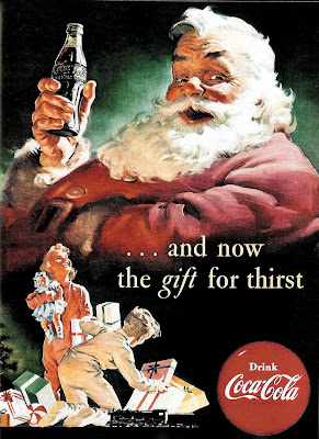
Recognize this jolly gent? If so, you can thank (in part) the Coca-Cola company, whose 1930s holiday ads illustrated by Haddon Sundblom helped popularize the image of Santa as a rotund, ruddy elf dressed in red from head to toe. Thanks for your visits in 2010. The deconstructing will continue in 2011. Happy New Year!

It happened one ad...

Image
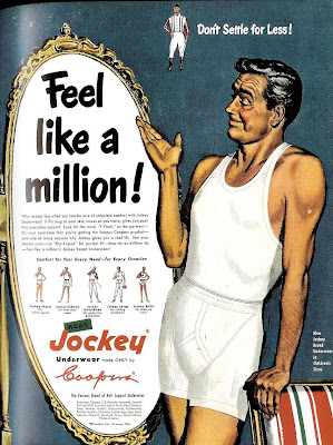
Here's a pretty innocuous, run-of-the-mill 1950 ad from Jockey, with the typical over-inflated claim. But there's something intriguing of about the illustrated model with the weathered but still handsome looks and that insouciant smile. Could it be--? You decide. Here's a side by side comparison between the man from the Jockey ad and silver screen legend Clark Gable : Coincidence? Maybe, but it sure seems an intentional homage, doesn't it? If so, then the question that naturally follows is, why? I'm guessing it was a bit of an in-joke between the illustrator and client, referencing Gable in 1934's " It Happened One Night ." According to pop culture lore, when Gable took off his shirt in that film and revealed a bare chest, undershirt sales supposedly plummeted by 75%. Could be the ad-makers, needing a face for their model, found it funny to show a Clark Gablesque fellow in both undershirt and underwear -- poetic justice, I suppose for his inadver...

Do it like Ditko

Image
Nothing too interesting about the message of this 1959 ad (except that the need to push wood floors as a decorating option seems to be in response to the post-World War II growth of "wall to wall" carpet, plastics and laminate furniture), except for the surreal, deconstructed representation of a home... ...which could well have inspired (or been inspired by) the surreal, deconstructed images of 1950s/60s comic book artist (and later Spider-Man co-creator) Steve Ditko :