Posts

Showing posts with the label art direction

Pop Artifice

Image
Target has been around since 1959, when its first store opened in the Roseville, Minnesota, a suburb just north of St. Paul.  And for much of next four decades, its advertising was practical, safe, and largely forgotten as soon as the ad ended.     But during the mid-90s, things started changing. It began with the chain's very conscious positioning of itself as a “discounter unlike other discounters,” typified by the theme, "Expect more. Pay less." And when Target broke into the East Coast market, opening a store in Menlo Park, New Jersey,  in  1996, they turned to New York agency Kirchenbaum and Bond, who gave them a striking campaign that married household products to fashion, and helped make Target a favorite of fashionistas.   So the stage was set for Minneapolis agency, Peterson Milla Hooks, to make Target's next leap. Dubbed the “ Sign of the Times ” campaign, it turned their red bullseye logo into a design element in all of their advertising, combini...

The eye has it

Image
Not just a vivid poster here. A vivid lesson in the impact of good cropping. I was reading an article on the movie-poster art of Al Kallis for American International Pictures. AIP was, per Wikipedia ,  "the first company to use focus groups, polling American teenagers about what they would like to see and using their responses to determine titles, stars, and story content. … a typical production involved creating a great title, getting an artist such as Albert Kallis who supervised all AIP artwork from 1955 to 1973 to create a dynamic, eye-catching poster, then raising the cash, and finally writing and casting the film.” Kallis had the pedigree. Along with his previous work as a poster layout artist for the influential Saul Bass, Kallis was the son of Maurice Kallis, a famed movie poster artist himself.   Perusing the work of Kallis the younger, I have to assume that his posters were likely more effective at evoking terror and dread than the movies themselves....

I wanted to like this ad, I really did

Image
When I first came across it, I (wrongly) assumed it was the work of Doyle Dane Bernbach, using a very minimalist layout to catch attention and evoke emotion, sort of like they did with the Polaroid ads in the ‘60s . No logo, just a simple headline, and an intriguing illustration that tells you nothing about the product, only the elation it will inspire in the woman in the your life. What an incredible way to portray a woman leaping into the arms of her man, I thought, showing only what’s necessary to imply the situation, spurring the reader to imagine the embrace, the eyes, the kiss.   Brilliant, I thought. Then I read the headline.    “Wear an Arrow Shirt and you'll simply sweep her off her feet!”   No.   No, I don’t believe this ad, even for a minute.    The only way to sell this scenario is if the emotion implied feels true. Even in 1949, it’s hard to imagine anyone got this excited about a dress shirt. Unless he just got home from the service and t...

Making the ad space part of the ad concept

Image
Yes, yes, I know, print advertising is dead, especially newspaper advertising – but ads still use space in other mediums, so apply these observations as you will.   Make the height of the ad part of the concept Look how this 1966 Mobil ad really sells the comparison of car collision at 80 mph with the impact of a car dropped from a ten-story building. You could have used a rooftop shot of the car going over; you could have shown a tighter shot of a car falling past a row of windows; you could have shown the crushed car at the base of the building; but Len Sirowitz of Doyle Dane Bernbach used the height of the newspaper space to show the full size of building, inviting us the imagine the long fall of the automobile and what happens when it hits the ground. And making a static photo feel as dramatic as the same demonstration in the accompanying TV commercial .    (The layout is even more brilliant when you consider that the ad was likely encountered by people reading the ne...

Happiness is a warm television

Image
Authentic. Genuine. Truthful. These are the qualities above all that modern advertising aspires to – or claims to aspire to. Consumers today are too savvy, too cynical, the thinking goes, to be beguiled by unrealistic depictions and unattainable expectations. Yet despite this emphasis on realism, advertising largely remains an aspirational medium. Even the earthiest, unadorned people you see in ads still tend to be stylishly photographed and romanticized, still appealing to how we wish to see ourselves, even if that wish is a bit less lofty.  So unlike the scrubbed, idealized images Madison Avenue sold us during the ‘50s and ‘60s. And that’s largely true – but when it comes to authenticity, nothing I’ve seen in recent years comes close to this mid-1960s campaign for Sony’s new concept of “portable” televisions. Created by the celebrated “Think small”/”When you’re number two, you try harder” ad agency, Doyle Dane Bernbach , these 1965 ads present something that's largely vanished fr...

Lois and Ogilvy on The Big Idea

Image
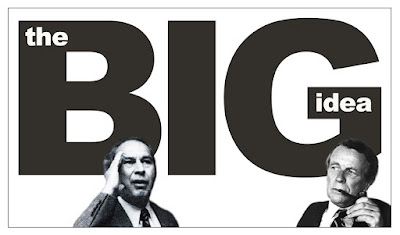
As a panelist on a TV talk show, ad man and creative revolutionary George Lois was once asked to define advertising. After listening to the more scholarly definitions offered up the other ad execs on the panel, George commented, “I think these guys and me are in a different business,” and offered a more blunt, visceral definition.    Lois:  “Advertising is poison gas. It should bring tears to your eyes. It should unhinge your nervous system. It should knock you out.” 1   That’s George in a nutshell. Visceral. Bombastic. But in a less provocative mood, he summed his approach up this way:    Lois:  “The common denominator of all my work is the unremitting quest for The Big Idea, because The Big Idea – a surprising solution to a marketing problem, expressed in memorable verbal and/or graphic imagery – is the authentic source of communicative power … [and] picks up force and speed because its element of surprise changes a habit or point of view.” 2 He capi...

Advertising minimalism: When less communicates more

Image
In the art world, the minimalism movement that flourished in the early 1960s was about exposing the essence of a subject through the elimination all non-essential forms and features,  so the viewer responds only to what’s in front of them.   Minimalist painter Frank Stella summed it up this way: “What you see is what you see.”    Perhaps not surprisingly, as art directors and designers have often found inspiration in fine art, a parallel movement was simultaneously taking root in the world of advertising and design. By leveraging the simplicity of minimalism, ads could reach for a similar kind of honesty, purity, and truth – and hopefully, move some product.   This, of course, was the gold standard of advertising minimalism in the ‘60s, perhaps because a minimalist attitude could be found in the product as well as the designer. Yet despite the unified front most creative teams present to account management and clients, it’s possible that – like the warring spous...