Posts

Showing posts with the label Billboards

Being seen versus being clutter

Image
"How can outdoor advertising avoid clutter and visual pollution in public spaces?"  asked LinkedIn for a recent  collaborative article on their site. "Be creative and context-aware," they advised. "Find ways to integrate your ads with the environment, the culture, and the audience … make your ads more engaging, memorable, and respectful, while avoiding the risk of being intrusive or offensive. As one of the "select group of experts" who were invited to contribute, I added this to the discussion: By definition, you want your ad to be noticed; disrupting the environment is pretty much how it happens. Merging into the background means you’re not being seen. Yes, engaging viewers with a clever idea or visual can make the intrusiveness sting less.    But maybe the question we should be asking is how much the potential for attracting eyes justifies the potential for distracting drivers.    I was once tasked by a highway safety group to write outdoor messag...

Talk about hedging your bets...

Image
An atheist-sponsored  ad campaign that started running on British buses last fall: "Probably?" "Probably?" That bit of uncertainty kind of undercuts the message, doesn't it?  If you disagree, (re)consider these famous ad campaigns:

Not just hyperbole

Image
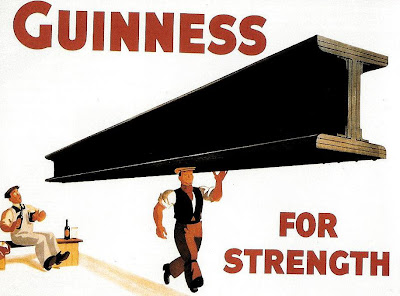
Maybe you've seen this classic Guinness poster, created back in the '30s and assumed that it was nothing more than silly hyperbole: And you'd be partly right. The idea is actually based on the high iron content of Guinness (probably from the water used), though of course, the benefit of this is exaggerated to an unbelievable extent in the poster above. That didn't stop the image from becoming so iconic that a pint Guinness became known as a "girder." The image also inspired this parody from Heinekin some 40 years later (though its likely that many young drinkers never realized its source), that both fit the idea into its own ad format and made the male sexual subtext even more implicit: (Best not to take any of this too seriously, though. In reality, the pictures in the Heinken ad would have to be reversed.)

His way for the highway

Image
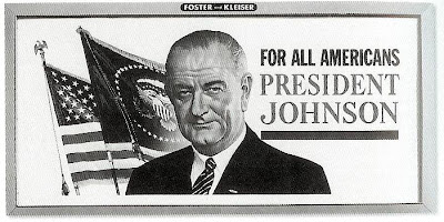
"I want to make sure that the America we see from these major highways is a beautiful America." So proclaimed President Lyndon Johnson in 1965, announcing the America The Beautful Initiative, designed to clean up eyesores along the growing federal interstate highway system. Key to this effort was The Highway Beautification Act, which attempted to control outdoor advertising by prohibiting certain kinds of signs and regulating the places they could be posted. As reported on the Federal Highway Administration web site : The signing ceremony took place 2 weeks after the President had surgery to remove his gall bladder and a kidney stone at Bethesda Naval Hospital. Although he had returned to the White House only the day before, President Johnson seemed to be in an expansive mood as he recalled the drive from the hospital to the White House along the George Washington Memorial Parkway: "I saw Nature at its purest. The dogwoods had turned red. The maple leaves were scarlet a...

Stork choices

Image
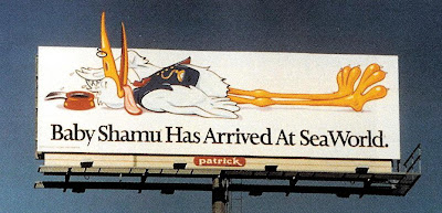
Is that a celebrity cameo on this Seaword billboard from 1994? Actually, no.  It's not the Vlasic Stork , that avian deliveryman first employed in the 1960s to pitch "the pickle pregnant women crave...after all, who's a better pickle expert?"  There are similarities, obviously...the archetypal cartoon-stork's body, the little glasses, the bow tie.  But the SeaWorld stork's cap is different and he's wearing a vest (which the Vlasic stork, though you can't tell by the screen grab below, does not). No, surprisingly, the SeaWorld stork looks a lot more like this fellow: That's the stork delivering "Dumbo" back in 1941.

Nature helps out

Image
This 1950s era billboard (partially shown) for Phillips 66 is pretty typical for the era. In the decade following World War II, most advertising was still pretty unsophisticated, as advertisers slowly came to grips with a marketplace of greatly expanded buying power and increased competition. Here, the idea of "smooth power" is illustrated by a lean swimmer, an analogy that is both vague and irrelevant. And apart from the anguish that seems to be man's expression, the billboard seems pretty forgettable. But it got a lot more interesting when Missouri's Grand River flooded and partially submerged the billboard: (An interesting, 100-year history of American billboards is available  here .) And in case you're wondering , Phillips named its gasoline after a 1927 test on Oklahoma's Highway 66 powered a car to 66 miles per hour; they took the identical numbers as a good omen and used a highway shield as their logo.  It lasted about 30 years in orange and black for...

"Un" Revealed

Image
Outdoor board, 1968 No one channeled the sunny, "if it feels good, do it" spirit of the late '60s like 7-Up's "Uncola" campaign.  Complimenting their message of being different from the dominant cola soft drinks, the graphics themselves were unlike the more traditional, wholesome images Coke and Pepsi favored.  7-Up's billboards (here's another one ) really indulged the counterculture in a way that had none of the condescension that usually marred other advertisers' efforts. You've probably already realized what the billboard graphic above is based on.  If you're under 40, you may need a hint and you'll find it here .