Posts

Showing posts from August, 2022

Brooks' look hooks

Image
One of the goals of an effective ad campaign is a consistent, identifiable look that’s distinctive of the advertiser and can unify the campaign across different mediums and messages. And that can apply to movie posters, too. (And not just for series like Star Wars  and  Indiana Jones .) While reading Mel Brooks' recent autobiography ,   All About Me , which is illustrated with posters of many of his movies, I realized something that I hadn’t, back when the movies came out years apart. Several of the posters for first half-dozen or so movies had a kind of “house-style” to them. In fact, the poster for 1974’s  Blazing Saddles  was the first for designer John Alvin, who would go on to create posters for more than 135 films, including  Blade Runner ,  The Color Purple ,  Beauty and the Beast , and  The Lion King . Alvin di ed in 2008; today, he’s remembered as a “master of the tease,” the image that sells the movie without the hyperbole and hucksterism of classic movie advertising. (Th

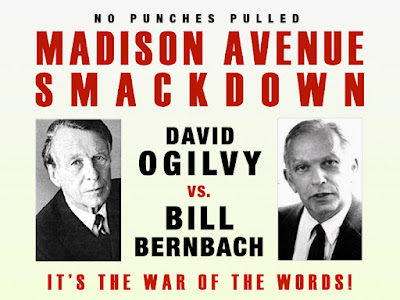
Ogilvy vs. Bernbach

Image
What follows is a completely rewritten version of a post written for this blog over a decade ago; same viewpoint, just better expressed. Appropriately, it's one of the essays in my book, Thinking Too Hard and Rethinking Too Much: Stories and Essays from a Career in Advertising . If there was anything new to be gained from the [then] recent passing of advertising legend David Ogilvy, founder of Ogilvy & Mather, I hope it will be a long-overdue re-evaluation by my generation of his ideas and principles about advertising.     Oh sure, the industry press carried the expected pronouncements of admiration from various creative superstars, but in nearly every case, it ran along the lines of “the quintessential ad man, built up a darn big agency” – backhanded compliments that discredited his actual creative accomplishments, if only by omission.     Trust me, I understand. I was here in the 80’s, the decade of  Ogilvy On Advertising , the book wherein Mr. Ogilvy codified all his immutab

Still waiting for that rejection, 40 years later

Image
I grew up in the WJM newsroom. I had dinners with the Bunkers. I hung out with the wacky doctors of the 4077 th .     Yes, I was a kid raised on  The Mary Tyler Moore Show ,  All in the Family ,  M*A*S*H , and so many, many other classic sitcoms of the era. I knew their characters and their dreams, their homes and their workplaces. I knew them like you know family. Which, in a way, they were.    So during college, when my friend, Jeff, who’d written a movie screenplay, pushed me to try writing one too, I didn’t attempt a movie. Writing a movie from scratch – creating characters and a plotline that could sustain 120 pages of story – seemed intimidating. But being a longtime fan of sitcoms, I had both an affinity for and inherent understanding of the form.    And I knew which show I would choose.  At the time, I was drawn to the nightly reruns of Barney Miller . Set in New York City’s 12 th  Precinct, the show involved a squad room of quirky detectives dealing with one or two crimes (usu

The Other Legacy of Braniff Airlines

Image
Before founding the agency that carried her name,  Mary Wells (later Wells Lawrence) was part of Jack Tinker & Partners , where she was first recognized for bringing a theatricality to advertising, a more cinematic and story-driven approach to her commercials.    Given the fledgling Braniff account, Ms. Wells re-introduced the carrier to the world by breaking out of the dull monochrome world that air travel was circa 1965. She splashed color outside and inside the planes and outfitted the "hostesses" (sorry, the "flight attendant" name was still years away) in stylish Emilio Pucci designs.   It was "The end of the plain plane," as the campaign put it, and it kept Braniff in the news for months on end.     This commercial may not be the showiest example of a Mary Wells Lawrence production, but the announcement it made was strong enough to make up for the commercial's deficiencies (though the droll "cha cha cha" is a nice touch).   Realizi

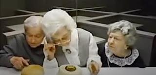
The Customers Get the Last Laugh

Image
It’s not what you put into your ad, it’s what the audience takes away from it In his recent autobiography,  All About Me , writer, filmmaker, and occasional actor, Mel Brooks, talks about the one fight he had with Gene Wilder on the set of their 1974 movie,  Young Frankenstein . It was over the scene where Dr. Frankenstein introduces his creature to the medical community with an absurd song-and-dance to  Puttin’ on the Ritz .   “It was Gene’s idea and I told him I thought it was a great idea and very funny, but it was too far out … I insisted it was too silly and would tear the continuity of the movie to pieces. … we almost got into a fistfight because of it.”   Finally, Brooks agreed to film the scene and test it on a preview audience. When the audience loved it, Brooks happily conceded, “Gene, you were absolutely right. Not only does it work, but it may be one of the best things in the whole movie … it took the movie to another level. We left satire and made it our own. It was new,