Posts

Showing posts from 2024

If two minutes is funny, why not ten?

Image
Last fall, I posted here about having a two-minute (yes, two-minute) play,  Thinking of Elephants , produced by the Minnesota Shorts Festival.    It was a simple idea for what was essentially a quick skit. Taking place in a laundromat, one person’s discomfort at having the “underthings” in her basket seen by a coworker ends in a kind of “mutually assured destruction” scenario; she demands a peek at his own “unmentionables.”   But even for that simple scenario, I wrote too much dialogue and had to throw out many lines to keep it to about two minutes.   But after seeing the two-minute production, I wondered if the idea couldn’t sustain the 10-minute length that most short-play competitions request. The key wasn’t just to add back in my excised dialogue, but to find an emotional core to the story that would make it about more than just embarrassment. Pondering this for a while, I realized that the text of the story – feeling exposed before a coworker – could be su...

Who is Mr. Thomson and why can't he keep his hands to himself?

Image
An oddly intriguing 1960s-era campaign I stumbled across recently.  Let’s handle this part right up front: Obviously, seen through modern eyes, it’s sexist as all get-out – but if you just want to reinforce your disgust at the ads, there are other web sites out there that will indulge you.    Here, I’m more interested in examining these ads as an  ad campaign  – what made them attention-getting, recognizable, and endlessly reproducible, as well as how they channeled the zeitgeist (for better and worse). So who is this Mr. Thomson with the audacity to feature himself as a handsy designer of women’s apparel?    The internet is surprisingly barren when it comes to The Thomson Company , the textile manufacturer behind the ads, the brand, and the exclamation – but digging deep, here’s what I’ve been able to find out and suss out. Though he was the public face (so to speak) of the company, our Mr. Thomson was, in fact, an advertising creation, as fictitious ...

The caveman at mid-century

Image
The mid-century, it seems, was the heyday for advertising that traded on the trope of the caveman dragging off a mate by her locks.  As eye-catching, evocative imagery, it was just too potent for ad men to resist -- especially when it could be presented with an anachronistic twist. Thus, we have this 1949 Arrow ad which gives women the upper hand in the mating ritual, informing us that "A man hasn't a chance in an Arrow White Shirt."    "Correct, young-man-about-to-live-in-a-cave!" the copy confirms, "Their handsome, perfect-fitting collars are irresistible." (And don't worry about their mismatched clothing. By the time she's finished dragging him home, that white shirt will be a memory, in dirty, ragged shreds.) In 1956, the scenario again made an appearance, with men and women back in their traditional roles, this time to cast bone-ribbed girdles as something out the stone age ... or something very much like it. "Come out of the bone age...

"Thinking Too Hard" essay: Zeitgeist brands

Image
What's a Zeitgeist brand? Find out in this essay   –  which you can listen to me read or just read on your own  –  from my book, "Thinking Too Hard and Rethinking Too Much: Stories and Essays from a Career in Advertising." Craig McNamara 3 · Zeitgeist Brands by Craig McNamara Every once in a while, the right brand appears at just the right time, when larger events in the world or culture add a special resonance to the product. To me, they're "Zeitgeist Brands" – after the German word that translates to "spirit of the age." It's one of the most powerful marketing tools available, but almost by definition, it's one of the most unpredictable. Hard to create and usually impossible to duplicate. Sometimes it happens by accident, but it can be planned, too. Apple's 1984 TV spot, for example, played off the cultural fascination with reaching the titular year of Aldous Huxley's dystopian novel. But that was more about making ...

Storytelling in advertising, reincarnated

Image
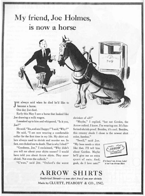
We know storytelling is all the rage now in marketing. And like most fashionable things, there’s usually some precedent in the past. Why else do we have the phrase, “Everything old is new again”? Still, you’re not likely to come across a story today like the one in this 1938 Arrow Shirts ad. If authenticity is all, this is more, well, horseplay: It was written by  George Gribbin  of Young & Rubicam, who was  recalled  as saying,  "One of the great assets of this agency is that a man here feels he can express himself as a writer."  Certainly, he accomplished that here; sixty years later, the ad was still well remembered, ranking 98 th  of the Top 100 Ads according to Advertising Age magazine in 1999. It begins,   Joe always said when he died, he’d like to become a horse.    One day Joe died.    Early this May, I saw a horse that looked like Joe drawing a milk wagon. “I sneaked up to him and whispered, “Is it you, Joe?” ...

The eye has it

Image
Not just a vivid poster here. A vivid lesson in the impact of good cropping. I was reading an article on the movie-poster art of Al Kallis for American International Pictures. AIP was, per Wikipedia ,  "the first company to use focus groups, polling American teenagers about what they would like to see and using their responses to determine titles, stars, and story content. … a typical production involved creating a great title, getting an artist such as Albert Kallis who supervised all AIP artwork from 1955 to 1973 to create a dynamic, eye-catching poster, then raising the cash, and finally writing and casting the film.” Kallis had the pedigree. Along with his previous work as a poster layout artist for the influential Saul Bass, Kallis was the son of Maurice Kallis, a famed movie poster artist himself.   Perusing the work of Kallis the younger, I have to assume that his posters were likely more effective at evoking terror and dread than the movies themselves....

I wanted to like this ad, I really did

Image
When I first came across it, I (wrongly) assumed it was the work of Doyle Dane Bernbach, using a very minimalist layout to catch attention and evoke emotion, sort of like they did with the Polaroid ads in the ‘60s . No logo, just a simple headline, and an intriguing illustration that tells you nothing about the product, only the elation it will inspire in the woman in the your life. What an incredible way to portray a woman leaping into the arms of her man, I thought, showing only what’s necessary to imply the situation, spurring the reader to imagine the embrace, the eyes, the kiss.   Brilliant, I thought. Then I read the headline.    “Wear an Arrow Shirt and you'll simply sweep her off her feet!”   No.   No, I don’t believe this ad, even for a minute.    The only way to sell this scenario is if the emotion implied feels true. Even in 1949, it’s hard to imagine anyone got this excited about a dress shirt. Unless he just got home from the service and t...

Rebranding a movie

Image
It’s not unusual for a product to undergo rebranding. In fact, one of the most successful was covered on this very blog .    But in this case, the product in need of a new image wasn’t found on a store shelf. It was projected on the silver screen.   In 1973, United Artists released its movie,  The Long Goodbye  to theatres in Los Angeles, Chicago, Philadelphia and Miami. The movie re-teamed director Robert Altman and star Elliot Gould of the box-office hit  M*A*S*H  three years earlier, in an adaptation of the Raymond Chandler noir novel.    “Nothing says goodbye like a bullet,” the movie poster announced, Elliot Gould brandishing a cigarette and pistol, looking as hard-boiled as Humphrey Bogart’s Marlowe in 1946’s  The Big Sleep.   And the audience stayed away in droves.    When the limited release ended, United Artists pulled the film from its next opening in New York and, baffled by the apathy of audiences (and the host...