Posts

Showing posts from February, 2011

He is the very model of the modern advertising man (2011 version)

Image
Hawkeye Pierce is so last millennium. Back in 2008, I posited that Alan Alda's portrayal on the M*A*S*H series was the idealized image of how creative people in advertising view themselves: witty, irreverent, iconoclastic, hedonistic, slovenly and eccentric, but also capable and confident, dedicated and dependable, principled, tenacious, and when the chips were down, absolutely brilliant. But really, that was an image taken from an earlier era, when even flawed characters were always primarily defined by their inherent decency. The richer, more complex characters of television today provides an ever better template for those anguished souls battling for creative integrity in ad agencies: Meet Dr. House : Yes, another doctor (because don't we all view the creative process as a matter of life and death?) -- but while Hugh Laurie's Dr. House is as undeniably brilliant, intuitive and typically unshaven as Dr. Pierce, the similarities end there. Dr. Gregory House is impatien

Going the distance and looking backwards

Image
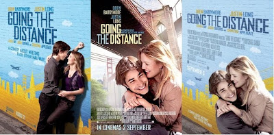
When the Drew Barrymore/Justin Long movie, " Going The Distance " came out last year, it seems the studio couldn't quite make up their mind on the right poster. Was it going to be Drew and Justin getting cozy against a brick wall, hugging under the Brooklyn Bridge, or a combination of the first two options? Well, it's safe to say that none of the options above did much to sell the picture, since it only grossed an anemic $40 million worldwide (versus a $32 million production budget and probably at least half that in marketing costs) during its run -- which is probably why the DVD sports a whole new image that seems to sell it as a more wacky comedy using one of the modern tropes of movie poster imagery... Yes, it's "the bickering people separated by a door" scenario, a setup that promises conflict, frustration, and lots and lots o' laughs (in theory, anyway). It's possible the studio remembered the graphics for 1996's Jamie Lee Curtis/Kevin

Sundown and shadows

Image
Yes, hard liquor is most respectably consumed in the evening hours, but is there something more behind this 1972 Smirnoff ad's imploring headline? Is it a reference to the 1967 racially charged drama, " Hurry Sundown "? Or perhaps the spiritual made popular by folkies Peter, Paul and Mary in 1966? Actually, I'm guessing it's neither, and instead was just a clever intro into the ad's recipe for the "Vampire Gimlet," so dubbed, I suppose, for its eerie green hue and black olive. But that raises a new question, doesn't it? Why a vampire? This was, after all, decades before the romantic vampire imagery of '80s and '90s cinema and television. In fact, Ah, but the clue is in the ad's photo, the modern-but-still-vaguely-gothic appearance of the woman in the window. The drink, as well as the ad, seems calculated to appeal to the youth-adult audience that had helped catapult this unique ABC soap opera -- and its vampiric leading man, Barna