Advertising minimalism: When less communicates more
In the art world, the minimalism movement that flourished in the early 1960s was about exposing the essence of a subject through the elimination all non-essential forms and features, so the viewer responds only to what’s in front of them. Minimalist painter Frank Stella summed it up this way: “What you see is what you see.”
Perhaps not surprisingly, as art directors and designers have often found inspiration in fine art, a parallel movement was simultaneously taking root in the world of advertising and design. By leveraging the simplicity of minimalism, ads could reach for a similar kind of honesty, purity, and truth – and hopefully, move some product.
This, of course, was the gold standard of advertising minimalism in the ‘60s, perhaps because a minimalist attitude could be found in the product as well as the designer.

Yet despite the unified front most creative teams present to account management and clients, it’s possible that – like the warring spouses in "Prizzi's Honor" and "Mr. and Mrs. Smith" – art directors and copywriters are secretly plotting ways to eliminate each other from the creative process. That's one theory, anyway, for the breed of advertising minimalism that doesn't just simplify the visuals and copy, but dispenses with one altogether.
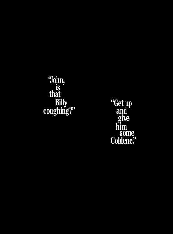
As ad creator George Lois (with partner Julian Koenig) recalls, it was “a visual atom bomb when the readers of Life and Look opened their pages … I simply depicted a darkened bedroom with a sleepy couple being awakened by their coughing kid. Their pre-feminism repartee was the talk of the ad world when it hit the newsstands.”
Sure, you could have shown more, you could have said more. But this is one of those cases where, yes, less is more; where, in fact, less communicates more.
But that all-type ad was more of a rarity. (To clarify, just because an ad is comprised of words alone doesn't make it truly minimalist; by that term, I'm referring to ads where the typeface and placement alone become part of the communication.) More often, it was the visual that carried the message with little or no copy, like this one-picture-replaces-a-thousand-words ad from Polaroid:

As Phyllis Robinson, VP and Copy Chief of Doyle Dane Bernbach, the agency which created this ad (as well as the “Think Small” ad), explained in a 1959 speech, “The whole story is told in the illustration … In fact, the copywriter fought long and hard to keep copy out of the ad.”
Although clarity and simplicity continued to be a goal for smart advertisers, by the late 1980s and early ‘90s, minimalism found a more utilitarian benefit, as the go-to solution for international clients who needed to communicate in different languages simultaneously. Why struggle to say it multi-lingually if you don't have to say it at all? Just marry a striking visual to a very simple (and translatable) sentence of copy.
(It also became the all-purpose tactic for breaking through ad clutter and reaching audiences –and award-show judges – with short attention spans.)

“One Swiss Army knife does the job of a whole tool box” – notice how clunky and dubious those words sound. But visually suggesting that same thought makes the claim seem more credible as well as more memorable.
But this brings up an interesting conundrum. The Swiss Army Knife is recognizable for its memorable color and the iconic cross logo. And the Coldene ad, of course, works the product name into the sparse dialogue.
But how hard should you have to work to identify the sponsor of an ad? According to Dave Saunders in his book, 20th Century Advertising, "One of the strongest human instincts is to want to make sense of what we see. We are intrigued by the unexpected and don't like being left with a mystery ... we are drawn in to solve the visual riddle or to read the copy in search of an explanation."
The question, of course, is how long the average reader will keep searching for that explanation. That's the fine line you walk in minimalist ads.

In fact, this one has a double riddle. Once you realize the bunched-up magazines are forming the image of a brain, the question becomes, "What magazine would claim to be such brain fodder?"
Still don’t know? Haven’t found the logo yet? Here it is:

(Note: This is an expansion on ideas in three posts I wrote back in the early days of this blog.)


Comments