Posts

Showing posts from September, 2011

Read the list! See the movie poster!
Image
A few months back, I noticed there were lists making the way around the web that purported to be "The Greatest Movie Themelines Ever Written" -- actually, it seems to be more or less the same list everywhere. This list is pretty representative of the thinking. I'm not going to go through the choices movie by movie. But if you do, you'll see that most of the themelines chosen are are, at best, just clever wordplays, and at worst, too-clever-by-half puns. They may bring a smile to your face and they might even give you some idea of the subject matter. But by and large, most of these evoke no real desire to see the movie. And shouldn't that be the real yardstick by which you should judge the "greatest" themeline? It's not surprising that truly great themelines are few and far between. After all, it's not every day that someone comes up with "Just when you thought it was safe to go back in the water" or "In space, no one can h

The Man In The Chair

Image
A deceptively simple layout -- minimalist, really -- is one of the things that gives this 1958 ad it's power. Even stripping away the desk that this skeptical business would normally be sitting behind was brilliant. Instead of making seem more vulnerable, it closes the distance between him and viewer, and adds to the reader's feeling of discomfort. And the litany of clipped statements, one after the other, gives us a first-person experience of the stern dressing-down an unprepared salesman would receive from this man... I don't know who you are. I don’t know your company. I don’t know your company’s product. I don’t know what your company stands for. I don’t know your company’s customers. I don’t know your company’s record. I don’t know your company’s reputation. And then comes the final knife, set in an italic font that makes his summation seem even more intimidating. Now--what was it you wanted to sell me? I'm guessing "The Man In The Chair" helped sell a

Embracing (but not squeezing) Mr. Whipple

Image
"It was that easy. In an hour and a half, America's most universally despised advertising campaign was created." That's how Benton & Bowles writer John Chervokas described the process of creating Mr. Whipple and the "Please Don't Squeeze the Charmin!" ad campaign in 1964. Mr. Chervokas died not too long ago, leaving as his legacy an ad campaign that was rated by Advertising Age as the 51st best campaign of the last century. By 1978, Mr. Whipple was named the third-best-known American—just behind former President Nixon and Billy Graham. “Please don’t squeeze the Charmin!” became one of most recognizable advertising slogans ever, identified by eight out of 10 people that same year. And yet, far from celebrating Mr. Whipple, the advertising community frequently derided Mr. Chervokas' brainchild as emblematic of the crass, lowest-common denominator pandering for which the industry was often denounced. (And judging by the title of a popular manual o

I've seen this movie [poster] before...

Image
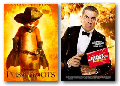
Yes, every summer now brings us a spate of formula movies that we all feel like we've already seen at least one time before. But now it seem that even the movie posters themselves are interchangeable. I've covered one of the more common motifs before here and here . But here are some of the more current poster layouts: The main action-hero character in front of an exploding fireball... The big X... The fragmented, David Hockneyesque photo collage... The mysterious movie-title-only-on-a-dramatic-black-background... The big intriguing closeup with the title stamped over it... The weird two-half-faces joined to make a single face... The action-hero looking battered but unbowed, weapon in hand... A guy slouching in a chair, legs splayed... The shoulder-to-shoulder heroes, with the bigger star out front... The sideways poster with black silhouette and steely blue sky... And finally, the whole gang, striding purposefully at camera... And that's just from a couple recent intern