Posts

Showing posts from March, 2008

Remembering Riney

Image
The ad industry lost another legend this week.  There isn't much I can add to this obituary for Hal Riney , who passed away at the age of 75, except to say that -- in addition to all the success his commercials brought to Saturn cars, the Reagan re-election campaign and Bartles & Jaymes wine coolers, among other clients --  probably the highest compliment he's earned is this:  In advertising circles, during the '80s and '90s, his name alone became synonymous with the style of advertising he was most famous for.  When you'd say to your partner, "let's do a Hal Riney spot," you both knew what that meant -- a montage of warm images of Americana, sweet, soft music and an laid-back announcer expounding on the simple virtues of life  (and that was usually the cue to attempt your best Hal Riney impression, since his distinctive voice narrated many of his best spots). Like this one: Yes, the "Hal Riney" spot, in the hands of its imitators became

Imagine yourself here

Image
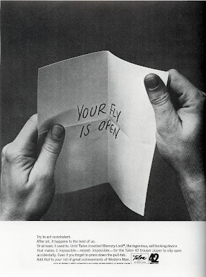
Pulling the reader into your ad as an almost active participant can result in some very effective communication. This 1960s-era ad makes it easy to imagine yourself in the same embarrassing situation:

What hath Joe wrought?

In his commercials for FedEx, Dunkin Donuts, Wendy's and more during the 1980s, director Joe Sedelmaier specialized in hilarious, deadpan portrayals of put-upon time-clock punchers and timid middle-management types, with a humor that was equal parts Bob & Ray, Benny Hill and the Carol Burnett Show. Yet despite our laughing at them, not with them, there was always something human and relatable in his charactatures, a strange affection for the foibles and travails of the common nine-to-fiver. Of course, success breeds imitation, especially in advertising. But like any copy machine, the imitations always seem to duplicate only the surface characteristics,  never the warmth underneath.  Like this recent spot: Ask yourself:  Does this spot make you feel any affinity for CareerBuilder?  (Did they ask themselves that?)

Tell me a story

Image
With its graphic simplicity and bare-bones copy, this 1970 Betty Crocker ad seems about 30 years ahead of its time. But it's more than just the visual puns so common in ads today. The old saying goes that one picture is worth 1,000 words; here, the photo is so evocative in its storytelling, the ad gets by with just twenty-seven: "Everything is in this new buttermilk pancake mix -- even egg and shortening. All you add is water to bake up golden fluffy pancakes or crisp hearty waffles." The unusual setting, the bedraggled figure, the obvious irony and the implied frustration combine for an ad that makes its simple point in a memorable way. One can easily imagine how it stood out alongside the more typical food ads in the pages of Better Homes & Gardens and Ladies Home Journal.

The perfect word

Image
One of the under-appreciated skills of the best copywriting is the precision of the wording, especially in headlines. With so much of current "professional" advertising falling into labored attempts at humor and wordless visual puns, it's good to remember to power of, not just words, but well-chosen words. In the ad above, created sometimes during the '60s by the agency Papert Koenig Lois, George Lois recalls that the initial inspiration for this ad's headline read this way: If your Harvey Probber chair is crooked , straighten the floor." See the difference. In its first generation, the headline is somewhat at odds with the client's message of precision-built furniture. The phrase, "If your chair is crooked" implies that the defect is in the chair. Changing the wording to "If your chair wobbles" is more neutral towards the chair, and helps reinforce the idea that the floor is at fault. Incidentally, the heavy red/brown color sc

Which came first? The movie or the ad? (Part 2)

Image
The British Twix campaign ran in 2005.  America's "Lars and the Real Girl" was released in 2007, but interestingly, was written (by former "Six Feet Under" scribe Nancy Oliver) at least two years previously, when it gained attention as one of the most-liked unproduced scripts in Hollywood.   I'd chalk it up to pure coincidence, though. Ms. Oliver credits her inspiration here as being a "what if" musing, i.e., What if we treated our mentally ill with kindness and compassion? -- two qualities which are not evident in the Twix ad (or, strangely enough, in the movie poster). (Read part one here .)

Is he the father of modern advertising?

Image
That's right.  Him.  David Letterman.  Those of us who are over 40, think about it for a second (the rest of you are going to have to take our word for it).  So much of the post-modern creativity evident in advertising today can be traced back to NBC's "Late Night with David Letterman." The snarky too-cool-for-school attitude; the sarcastic ad-speak; the humor at the expense of the product, the "we all know this is bullsh*t" undercurrents; the knowing winks at the viewer; the lampooning of other commercials; the influence Dave and his group of writers had on the current generation of creative people has been substantial. And don't get me started on the endless Top Ten list knock-offs.

Too long for Benson & Hedges?

Image
Four years after the popular Benson & Hedges campaign broke, the ads were still running, but in culture and fashion, there was a huge difference between 1967 and 1971, as the ad below demonstrates: However, like the hipster above, the concept seems a bit too desperate in its attempt to be fashionable.  Exactly how did this guy's love beads get wrapped around the cigarette anyway?  Was he trying to light his cigarette off his exposed chest hair or what?

The long and short of it

Image
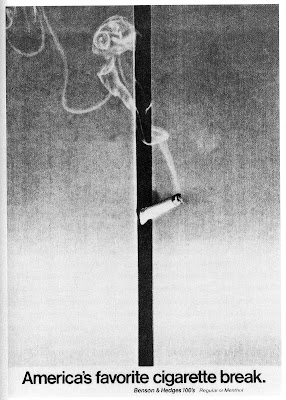
Faced with advertising a "longer than king-size" cigarette, Wells Rich Greene did the unthinkable in cigarette advertising:  they mutilated the product.  Benson & Hedges featured bent and broken cigarettes caused by smokers unaccustomed to the added length.  Humor wasn't new in advertising, but it was in cigarette advertising and best of all, the humor was all based on the product's selling point, so the message always got through.  In print: And on TV:

When hate is better than love

Image
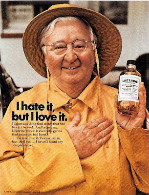
You've got to respect any product that dares to say what consumers really think about it, even if the execution is a bit clunky in this 1971 ad. Instead of dancing around the unpalatable taste, the campaign managed to turn its biggest drawback into its biggest selling point (the brand has since formulated some milder versions). Too bad the message is delivered by some cutesy attempt at "real people." This commercial from the same year is only marginally better (though it does star actor Judd Hirsch of the sitcom "Taxi").

Milking current events

Image
One nifty way to give your ads a little extra bounce is when you can tie into current news or cultural events. Obviously, the more relevant your product is to the event, the better -- but sometimes, all it takes is just the right well-chosen phrase. For instance, can you guess when this ad ran:

Got confused?

Image
This is the California Milk Processor Board campaign, begun in 1993. This is the National Fluid Milk Processors Promotion Board campaign, begun in 1995: Two different clients.  Two different campaigns.  Unfortunately, consumers never did realize the difference.  Fortunately, both clients realized that fighting to differentiate their campaign was counter-productive.  And so in 1998, we started seeing with this: Another example where consumers know best.  Yeah, baby!

Twice the selling power

Image
Here's a little quiz for all you marketing geniuses out there.  Watch the commercial and see if you can you spot the genius behind it? No, I don't mean Speedy Alka-Seltzer, memorable little spokes-imp that he was.  I'm referring to the new strategic message this spot contains, though it's probably not obvious some 50 years later.  As Mary Wells Lawrence explains in her engaging (if a bit schoolgirl-gushy at times) memoir, "A Big Life (in advertising), she realized that Alka-Seltzer needed to move beyond just being seen as a remedy for indigestion and heartburn, and be seen as something to take for a variety of life's aches and pains.  She continues: "We met a doctor...who demonstrated to us that in order for aspirin to break through the pain barrier it often required two aspirins, not one, to do the job.  As aspirin is one of the ingredients that make Alka-Seltzer effective, we asked if two Alka-Seltzers were better than one.   Yes, two would work better t

Show me less

Image
The product demonstration is one of advertising's most venerated tactics, and has taken many forms over the decades.  Here's the latest generation:  One simple photo tells you everything you really need to know about this laptop.  In fact, the headline, while clever, is pretty much superfluous.

Sorry about the apology

Image
If you're going to use a theme line with bad grammer, then just use it already.  Don't apologize for it, as this 1971 Winston ad does: Did Apple apologize for their incorrect grammar in 1997:

Unintended messages

Image
One of the rarely acknowledged risks of creativity in advertising is when, in the pursuit of your muse, you end up sending a message that is the exact opposite of what you've intended -- without ever realizing it.  Take the ad pictured above, created sometime during the 1980s for The Samaritans help organization.   You can easily follow the creative train of thought.   Use a provocative headline that seems to invite suicide in order to draw attention to a serious discussion about the problem of suicides. But here's where the train gets derailed.  According to my wife, the psychologist, for people in desperate state of mind, a headline like the one above -- instead of forcing them to reconsider the idea of suicide -- can actually act as granting them permission to attempt the act.  Similarly, ads for addictive behavior like drinking or gambling that portray this behavior -- even in a negative light -- often end up reinforcing the very behavior they seek to control. In other word

We're just like you (with money!)

Image
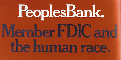
Back in the '70s and '80s, it was all the rage for banks to emphasize their humanity. Maybe it had something to do with our post-Vietnam, post-Watergate loss of faith in our institutions and the rise of the impersonal corporate culture; or maybe it was just the effect of decades of media portrayals of cold-hearted bankers, from Mr. Potter to Mr. Mooney . At any rate, this 1976 People's Bank billboard is one of the simpler, more effective messages. Today, bank ads seem all seem to be more about what their loans and other products can help you achieve. In other words, it used to be all about them. Now it's all about you. I think the ads were better though, when it was all about them.

Find the logo

Image
How hard should you have to work to identify the sponsor of an ad?  According to Dave Saunders in his book, "20th Century Advertising," "One of the strongest human instincts is to want to make sense of what we see. We are intrigued by the unexpected and don't like being left with a mystery...we are drawn in to solve the visual riddle or to read the copy in search of an explanation." The question, of course, is how long the average reader will keep searching. That's the fine line you walk in ads like these. If fact this one has a double riddle. Once you realize the bunched-up magazines are forming the image of a brain, the question becomes, "What magazine would claim to be such brain fodder?" Speaking of which, found the logo yet? Here it is: U pdate 5/6:   New to my site?  Here's some previous posts worth checking out: Who's the father of modern advertising? Is it him or him ? You know about "Got Milk?" but do you know &

They dare you

Image
Western Union's telegram service went the way of the Pony Express recently, but for 145 years, its distinctive yellow messages were virtually synomomous with the idea of urgency. This clever 1960s ad got to the gist of it quickly with a simple, counter-intuitive headline. "Ignore it," Western Union commanded, knowing that no one would.  Point made. By the way, the first telegram, sent by Samuel Morse in 1844, contained the awestruck message, "What hath God wrought?" -- and by pure coincidence, paraphrased in last Thursday's post, here .