Posts

Showing posts from April, 2008

He warned you

Image
One of the most-read writers of post-WWII advertising died recently.  Funny thing is, William H. Stewart didn't work in advertising, or even big business.  As Surgeon General during the Lyndon Johnson administration, Dr. Stewart instituted the health warnings that began appearing on cigarette packages in 1966: Actually, the first of the warnings was a bit dodgier -- "Cigarette Smoking May Be Hazardous To Your Health" -- but the wording was toughened up by 1972, when the warnings became mandatory for cigarette advertising, too.  Those ubiquitous stark white boxes had a prominence that other legal disclaimers could escape, and always seemed to be at odds with the carefree attitude of most cigarette advertising.  Then again, for a few brands  -- the tough cowboys of Marlboro and the pugnacious smokers of Tareyton -- the warnings probably subtley enhanced their maverick images. Today, the warnings are even more blunt -- "Smoking Causes Lung Cancer, Heart Disease, Emphys...

Advertising's Zen koans

Image
For an industry that wants to believe it has all the answers, advertising sure likes to pose imponderable questions.  The Japanese call it a koan, and here's how my MacBook's dictionary explains it: A parodoxical anecdote or riddle, used in Zen Buddhism to demonstrate the inadequacy of logical reasoning and to provoke enlightenment. And since emotion tends to make for stronger brand preference than rational thought, no wonder copywriters love to rely on the irrefutable logic of illogic. (By the way, the ad above was run back in 1999, well before the sub-prime mortgage crisis and its domino effect on the financial markets.  I'll bet E*Trade's not acting so smug now.)

On onomatopoeia

Image
Of all the clever tricks that writers use in headlines, onomatopoeia (words whose sound is associated with the word itself) is relatively rare.  And strictly speaking, the word "competitors" isn't onomatopoeic -- except here, as it's used in this brilliant 1980s (?) ad for Unipart.  Simply by clever repetition, the headline becomes a kind of aural demonstration in itself.

Does ABC stand for Advertising Bogus Claim?

Image
Back in 1997, though the Internet was only just beginning to take off as a cultural force, broadcast television was already seeing its audience erode, as viewers turned to cable channels, video cassettes and video games.   ABC responded by commissioning an image campaign that was a far cry from the typical song-and-dance productions featuring the network's coterie of stars and starlets.  This time, the network would create a brand that was more than just the sum of its shows, a brand that defined the network's appeal and set it apart from all other viewing options.  All well and good -- in theory.  In practice, however, we got messages like this: Yes, ABC's campaign -- which championed not the network as much as the very idea of TV -- was irreverant, satirical and quite contemporary in its humor . And very, very misguided.   If the campaign were for Comedy Central, okay. Or for NBC (which at least still had "Friends" and "Seinfeld" then), maybe. But AB...

Copywriter: Winston Churchill

Image
Once a memorable turn of phrase becomes part of the cultural ambience, it's only a matter of time before it gets appropriated for a headline.  (How many times have there been variations of "Give me your tired, your poor..."?)  This 2005 British ad borrows (with incorrect phrasing) from Churchill's famous 1940 speech to the House Of Commons during the Battle of France in World War II (as I'm sure any of the Rhodes Scholars pictured above could tell you): "We shall go on to the end, we shall fight in France, we shall fight on the seas and oceans, we shall fight with growing confidence and growing strength in the air, we shall defend our Island, whatever the cost may be, we shall fight on the beaches , we shall fight on the landing grounds, we shall fight in the fields and in the streets, we shall fight in the hills; we shall never surrender..." Sixty five years later, Slim-Fast draws another line drawn in the sand.

Patriotism, '60s style

Image
Well, why not?  People have more loyalty to their choice of soft drink than just about anything else.

Saab vs. common sense

Image
Having worked on campaigns promoting safe driving ( here and here ), I find this ad deeply irresponsible.  The other ads in this 1999 series are largely benign -- Saab vs. Oxygen Bars, Saab vs. Steroids.  The one, however, in headline and visual, is actively promoting obviously unsafe behavior, even if the copy is a bit more ambiguous in the kind of passing situations for which its turbocharged engine excels.  And isn't the car way too close to the tanker to even think about lane changing?  (Where's the usual "Professional driver on closed course." disclaimer?) There's a difference between ignoring the unsafe use of your product; acknowledging but not condoning it; and outright encouraging it.  You can get away with the first and preempt problems with the second, but you're asking for trouble with the third.

Tang -- A Zeitgeist Brand

Image
In an earlier post on Virginia Slims,  I introduced the idea of the Zeitgeist Brand, a product whose image and popularity is closely, even indelibly linked to the era in which it was introduced or gained prominence. Here's another one: Though Tang was launched in 1959, it took a launch of a different kind before the orange-flavored breakfast drink by General Foods really took off.  After 6 years of lackluster sales, the powdered drink was chosen by NASA for   the Gemini spaceflights , NASA's second series of manned spaceflights -- 10 in all -- during the years of 1965 and 1966.   It was in the era of public fascination with the space program, and General Foods played up the connection at every opportunity, until the product itself was indelibly known as the orange drink of the astronauts.  To a kid in the 'sixties who dreamed of space walks and moon exploration, Tang brought you one step (or maybe one sip) closer to your heroes. Of course, as public interest in the space e...

Gorilla, meet guerilla

Image
While writing Monday's post , it reminded me of an interesting error I've seen made more than once in this business. In emails or memos that reference the tactic of "guerrilla marketing" -- eschewing traditional media for unconventional, attention-getting and relatively cheaper message placements -- the unknowing writer has spelled it as "gorilla marketing." That, ironically, brings to mind the old "800-pound gorilla" designation for the biggest, most powerful brand in a given industry -- one whose advertising budgets dwarfed their competitors' miniscule marketing dollars and thus had little for need for the subtlety of guerrilla advertising. The term, incidentally, was coined by author Jay Conrad Levinson in his 1984 book, "Guerrilla Marketing."  Conrad based it, of course, on the concept of guerrilla warfare, i.e, small independent groups using ambush, surprise and mobility to effectively battle against larger forces.  Going back ...

One man's guerilla advertising is another man's public vandalism

Image
Really, in this age of fragmented audiences, I do understand the ingenuity required to get your message in front of (on in this case, below) the most receptive consumers.  But isn't it enough that almost everything is for sale as an ad medium these days -- can't we just leave alone the precious few places that aren't?

Workin' the angels -- I mean, angles

Image
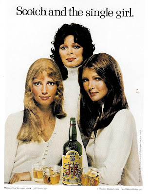
Of all the messages you could probably read into this 1971 ad for J&B Scotch, the most obvious would be the allusion to the 1962 best-seller, "Sex and the Single Girl."  Written by (former ad executive) Helen Gurley Brown , the somewhat autobiographical book challenged the then-prevailing notion of the single woman as unfulfilled and whose only true goal was to become a wife and mother.   To the contrary, Ms. Brown extolled the virtues of the single life, and encouraged women to assert their independence, financially and otherwise.  The book's success prompted Hearst to lead their effort in reviving its flagging Cosmopolitan magazine.   Under her editorship, circulation soared as Cosmo became a leading voice of feminism, woman's liberation and the sexual revolution. But what I see most when looking at that ad is a curious presaging of the "Cosmo-Girl Cops" that were still 5 years away:

The eye has it

Image
I'm sure the client loved the idea of literally putting a happy face on the idea of being an organ donor, but somebody at the agency should have realized that this creepy ad from 1991 kind of falls into the area of sending the opposite message they intended .  Instead of easing the creepiness factor of donating your innards, this ad makes it seems like they're going to start harvesting your organs while you're still alive (and you're supposed to be happy about it).

And the world is changed forever...oops, maybe not

Image
In early 1990s, this radio spot for a local auto dealership didn't just break the mold of hyperbolic sales managers hyperventilating for their sale prices -- it chipped away some of the hucksterism that has helped give car salesmen one of the least trusted professions in America (the ad biz is never far behind, but that's a topic for another day). As delivered in a thoughtful deadpan, the commercial took on one of the most prevalent and ridiculous sales gimmicks of car dealers. The genius of the spot is how benign it sounds, yet how lacerating the words truly are. Recently, Jim Paul of Valley Olds Pontiac GMC was driving to work when...he noticed a large inflatable gorilla floating above another dealership.  He'd noticed several of these inflatable devices floating above car dealerships lately and he asked himself some questions.  Did anybody ever go into that dealership and say, "Great gorilla.  Makes me feel like buying a car."  Why don't other businesses u...

Visual seeks headline; object: matrimony

Image
It's been over 4 decades since the creative revolution in advertising started putting writers and art directors in the same room to create more synergistic ad concepts, but you might not know it from this campaign for Club Med. Attention-getting graphics -- creating a topographical image of a smiling woman's face using some exotic locale -- but what does that really have to do with the writer's line (It's not where you go, it's who you meet.)? Maybe it's Gaia, the mother-spirit of the earth you're meeting. And don't try to tell me that this is the face of a local resident. What am I supposed to assume this is? A couple of mermaids? It happens. Every once in a while the art directors comes up with a "cool" image that the writer can't find the words to make relevant. Or the the writer falls in love with a headline that the art director has trouble visualizing. Those are the cases where you'd better hope your inspiration is so powe...

Everything new is old again

Image
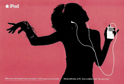
No doubt you've seen this: But if it were 1972, you'd be seeing this: David Ogilvy summed it up this way in his book, "Ogilvy On Advertising": When you don't have a story to tell in your photograph, make your product the subject of your illustration. These are about as literal as interpretation as you can get of that dictum without just showing the product alone. But along with drawing your eyes to the product, the silhouettes in both ads actually contribute to the emotional benefit that underlies the desire for both products.

He is the very model of the modern advertising man

Image
For those ad agency creative people who grew up in the seventies or early eighties, nobody better exemplified the way we thought of ourselves early in our careers than Hawkeye Pierce of the TV show, "M*A*S*H." As played by Alan Alda, Hawkeye had all the traits to which we aspired. He was witty, irreverent, iconoclastic, hedonistic, slovenly and eccentric, but also capable and confident, dedicated and dependable, principled, tenacious and when the chips were down, absolutely brilliant. Able to drink himself into a stupor the night before, and still muster self-righteous indignation to those who ignorantly stood in the way of our doing our best work. Yep, too often, that's how we saw ourselves. Like M*A*S*H's "meatball surgery," it was "meatball advertising" we were doing, working desperately to patch together award-winning ads while toiling under insane deadlines and stifling superiors. You can imagine how difficult we made life for all the Hen...

Watch yourself

Image
Back in 1990, Timex ran a nifty series of ads that returned to their classic "takes a licking but keeps on ticking" position but in a new context of quirky human interest stories. Like the watches they're modeling, the featured people also took a licking and kept on ticking, though the ads sometimes seemed more like tributes to recklessness, lucklessness, carelessness and in at least one occasion, cluelessness. Among others, the campaign profiled a man who fell out of an airplane, a woman who had a bowling ball dropped on her head from three stories, a guy who attached weather balloons to an aluminum lawn chair and floated up 16,000 feet, even a dog who was buried after being mistaken for being dead. And then there's the tale of the guy pictured above: Could have happened to anyone, right? Nevertheless, a very engaging ad campaign.

Going topless

Image
Is it bad cropping? The work of a careless installer? No, just another example of creative use of the outdoor board medium. In this case, literally cutting off the top of the Beetle to suggest their new convertible model. Sometimes what you don't see is more powerful than what you do.