Posts

Showing posts from July, 2008

5 ads that feature robots like those in movies of the last 6 years -- part 4

Image
(And if you've noticed that I've skipped mentioning any robot-themed movie for 2006, that's because there were none that year. Shocking, huh?) The, ahem, transformed athlete of this Nike ad from 2003... ...looks like a potential recruit for the "Transformers" movie of 2007:

5 ads that feature robots like those in movies of the last 6 years -- part 3

Image
(Day 3 and we're not out of examples yet!) The clunky but charming robot made of cookies in this 1999 ad... ...would seem to fit quite nicely among the lovable, junkheap characters of 2005's "Robots:"

5 ads that feature robots like those in movies of the last 6 years -- part 2

Image
(Yes, I'm serious.  Sort of.) Today, its an 2001 ad for engine lubricant that pairs a mechanical body with a creepily humanized visage: ...and has an eerie similarity to the mechanical men of the 2004 Will Smith movie, "I Robot:"

5 ads that feature robots like those in movies of the last 6 years -- part 1

Image
(How do I come up with these topics?) First off: From 2008, comes this science fair ad with a sleekly humanoid robot of shiny, flowing metal. Remind you of anything? Yes, it looks like another of the liquid metal assassins from from the "Terminator" series (the latest installment appearing in 2003):

Sleeping on the job

Image
Leo Burnett, the Chicago ad agency, had already spent years burnishing Maytag's reputation for reliability in print ads; when the washing machines began advertising on television starting in 1967, the agency created a personality every bit as distinctive, memorable and enduring as the agency's other characters, like Tony the Tiger and The PIllsbury Doughboy. In fact, this guy was a little doughy, too: That's character actor Jesse White as the lonely sad sack indentified only as The Maytag Repairman.   Through a succession of TV spots and ads, "Ol' Lonely" waited in vain for the phone to ring, telling him he was needed to fix a broken Maytag.   Jesse White got the part (beating out comic actor Phil Silvers, among others) and played the character until 1989, before relinquishing the role to a succession of actors since.  In recent years, with dependability becoming perceived as more of a parity quality among competing brands, Maytag has tweaked the character a

Waiting to exhale

Image
It's really too easy to play "hindsight is 20/20" and have a few cheap laughs at the expense of ads of bygone eras, especially when the subject is cigarettes and smoking.  This 1926 Chesterfield ad, however, is too politically incorrect by today's culture not to give it special note here: There's more to this scene than just a romantic appeal to women, though.  Back then, showing women smoking in ads was frowned on as much as women smoking in public.  Instead, consumers of the '20s were given coy come-ons like this one: Is she enthralled by the man -- or the cigarette?  Only her tobacconist knows for sure.

Squidvertising

Image
I suppose you could say this is the epitomy of the "sticky" idea, and apparently, so obvious, every tire manufacturer's ad agency eventually thinks of it. 2002 2002 At least Toyo found a new way to illustrate the analogy (though it ends up looking like something out of Odd Rods or Wacky Races ). 2008 (And yes, I know, a squid isn't the same as an octopus, but I liked the title, so I used it.  Just be happy I didn't do some pun on how these ads "suck.")

The Monday funnies

Image
Here's a decidedly comic approach to advertising: This type of comic strip -- using photos instead of drawings -- are known as Fumetti (after the Italian term for the same, though they also included drawn comics). The Fumetti style was always more popular abroad than here in America; for some reason, it always seemed to combine the worst aspects of each medium -- leaden, expository dialogue and the images of vigorous overacting. That, of course, made it ideal for 70s advertising, especially in ads targeted to the less educated; appropriately, those ads were often found in comic books of the era. (Another Fumetti of somewhat higher quality was recently highlighted in this posting .)

The last home you'll ever own (?)

Image
Houses for the Atomic Age! trumpets this 1955 ad.  But are they referring to the sleek, geometric styling of era?  Not exactly. To get the full picture, read into the copy a bit: The blast-resistant house design is based on principals learned at Hiroshima and Nagasaki...a rigidly integrated house that the engineers calculate will resist blast pressures 40% closer to bursts than conventionally built houses.   Only 40%?  Oh, wait, there's more: A special shelter has been provided in the basement to protect occupants from blast pressures expected at distances as close as 3,600 feet from ground zero of a bomb with an explosive force equivalent to 20,000 tons of TNT...affords protection from radiation, fire and flying debris as well. This certainly paints a different picture of suburbia than the usual illustrations of the time: But it's understandable, given that just underneath the surface of shiny optimism about the promise of nuclear energy to reshape our society... ...was the lo

What's the story?

Image
Today, a humdrum, run-of-the-mill shirt ad: Or at least, it would be, but for the addition of-- well, see for yourself: Stunning, isn't it, how just putting an eye patch on the fellow creates a stronger interest in the ad? Suddenly the man seems more mysterious, edgy, worldly. And what is it about those shirts he wears... Creator David Ogilvy credits this "story appeal" to researcher Harold Rudolph. As Ogilvy explains in "Confessions of an Advertising Man," "...the more of it you inject into your photographs, the more people will look at your advertisements ... I concocted eighteen different ways to inject this magic ingredient. The eighteenth was the eye patch." In 1952, Ogilvy confided to Time Magazine that he was inspired by pictures of ex-Ambassador Lewis Williams Douglas, who wore an eye patch after a fishing accident robbed him of the sight in one eye. The rest is history, right? Not quite: "At first we rejected it in favor of a mor

Not just hyperbole

Image
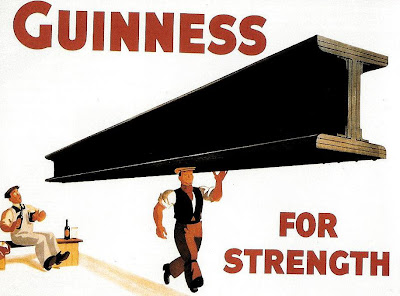
Maybe you've seen this classic Guinness poster, created back in the '30s and assumed that it was nothing more than silly hyperbole: And you'd be partly right. The idea is actually based on the high iron content of Guinness (probably from the water used), though of course, the benefit of this is exaggerated to an unbelievable extent in the poster above. That didn't stop the image from becoming so iconic that a pint Guinness became known as a "girder." The image also inspired this parody from Heinekin some 40 years later (though its likely that many young drinkers never realized its source), that both fit the idea into its own ad format and made the male sexual subtext even more implicit: (Best not to take any of this too seriously, though. In reality, the pictures in the Heinken ad would have to be reversed.)

Meet The Unswitchables

Image
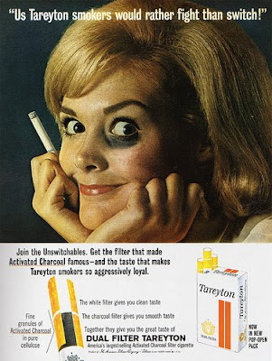
Mangled grammar aside, you gotta give Tareyton Cigarettes 1963 campaign points for chutzpah: With the competition of cigarette brands heating up, Tareyton's slogan was designed to push the loyalty of their smokers. The words, though, would probably have not as been as effective had they not been accompanied by the photos of proud Tareyton smokers -- both men and women -- sporting black eyes.   (Yes, it was just makeup, but even so, looking back with forty-five years of hindsight, it's still hard not to look at the above image and think of domestic violence.  It probably occurred to some readers back then, too -- though few people probably voiced any concerns publicly.) By the way, the same ad man who gave us this admittedly clever mnemonic -- James Jordan , who died a couple of years back -- also was behind Wisk's well-remembered (if screechy) "Ring around the collar" slogan.  Ring around the collar.  Ring around the eye.  I sense a pattern here. TV spots turned

A real Swinger

I liked this spot when it first ran in 1965 and, seeing it again after 40-plus years, I have to marvel at the multiple audiences the spot courts simultaneously. First of all, we start with a gal sauntering in a bikini bottom, guaranteed to appeal to youth and middle-aged men alike (each group naturally interested in swinging, though perhaps in different meanings of the word).  Then there's the guitar heavy jingle, contemporary enough for the kids, but middle-of-the-road enough for mom and dad -- and irresistibly catchy with the female singers' yeah-yeah's and their repetition of the product name.)  And just when you think the spot is just getting a little too wholesome in its depiction of modern teens, here comes the musical bridge for some jangly rock-and-roll, wild dancing and lots of cavorting on the beach (with a big "YES" as one couple is photographed getting friendly in the sand).  Then the whole thing is wrapped up with an all-ages romantic shot of a couple

Shuffle

Image
Following the release of the mariachi-influenced band's 3rd album, released in 1964, Herb Alpert and the Tijuana Brass soared to new heights of popularity, selling millions of albums and cementing their place in popular music.  And of all the songs on the album, the best-remembered is surely "The Mexican Shuffle." But it's not remembered as that:

Swiping Peanuts

Image
Around 1959, amid the first wave of "Peanuts" merchandising (whose millions in profits would forever change how the business of comic strips), Ford came to creator Charles Schulz with a lucrative offer of an annual licensing fee in return for Charlie Brown and company to serve as "spokeskids" for their new Falcon model.   Under Schulz's close supervision, Ford gave the Peanuts characters their first TV exposure in animated spots like this one from 1964: The awkward, stilted dialogue is of course, a horrible fit with the cast, with none of the substance, easy verbosity and wit of future productions like "A Charlie Brown Christmas."  But it worked well enough to help the Falcon become a huge success for Ford. When some newspaper industry professionals accused Schulz of excessive profiteering, he responded this way (as detailed in his recent biography ): "The duty of the comic strip is to bring readers to the newspaper as a whole... If that is not f