Posts

Showing posts from February, 2008

Never trust any ad over 30

Image
Sure, this 39-year-old ad wanted you to believe it was on your side, but it was really snickering at you behind your back. And it's still snickering at all you now-middleaged, would-be non-conformists with the usual leather bomber jackets, black tee-shirts and tattoos.

What hath George wrought?

Image
In 1959, George Lois, the pugnacious, somewhat self-aggrandizing (and very creative) ad man, ruffled quite a few agency feathers with his ad for Kerid ear drops. It was solidly based on research that found that most people cleaned their ears by poking bobby pins and whatnot into them, but the imagery was said to be too graphic and offensive. Lois justified it this way in his book, "$ellebrity": "There is imagery that shocks people for shock's sake -- and imagery that can attract and hold attention because of a meaningful and memorable message." Of course, 49 years later, it seems rather tame. In 2043, will we feel the same way about this 1994 ad for Kadu surfing shorts:

Woody Allen: the fading brand

Image
At first glance, there's nothing special about the movie ad above (I can't vouch for the movie itself, either; I haven't seen it). The usual mashup of star closeups, an intriguing line of ad copy ("Family is family. Blood is blood.") and lots of gushing blurbs -- "Intense!" "A Chiller!" -- topped off by the near-hysterical headline, "The New York Times IS RAVING! and five lines excerpted from its review. A bit excessive, sure, but still pretty commonplace in movie ads. If anything is really surprising about this ad, it's the sentence under the title, identifying this as a Woody Allen film. Yes, Woody Allen, the long-time favorite of the critics, the art-house crowd, and occasionally mass audiences -- and that's really the problem. Through the late '70s, throughout the '80's and into the early '90s, Woody has had a special place in the American cinema; in a sense, he was his own brand; though the content of his...

Fill in the blanks

Image
One of the more effective ways in getting your point across is to invite the reader's involvement in your messaging. If you can get them to mentally "close the loop," it can help them internalize and remember your message longer. One big caveat, though: When you're overly familiar with the brand image, it's easy to lose your perspective and end up with an ad that's more obscure than illuminating.  ( An art director I work with refers to those misguided attempts as "ads for people who were at the brand meeting.") The two ads above do a terrific job at avoiding that pitfall. Simple, straightforward headlines coupled with images (or in the second ad, lack of images) that are slightly at odds with the assumed visuals -- cubes of crushed metal instead of cars, blank space instead of kids -- but not so confusing that your mind can't quickly reconcile the dissonance and appreciate the implied benefit.

Visualizing the idea

Image
Advertising creative people like to say the idea is everything, but we know how much ideas succeed or fail by their execution.  There are so many variables to consider in producing any ad or commercial.  Yes, some of them end up being just creative preference, but often, these decisions can greatly impact the effectiveness of the communication. Consider this simple ad from Volkswagon, run during the oil shortages in 1980.  The writer and art director had a concept.  They had a headline.  The question was, how best to illustrate it? They could have hired a professional illustrator.   They could have hired a photographer and shot a picture.  But instead, seeing something compelling in the art director's drawing, they went right from his sketchpad to the layout.   Would the ad still have worked with a photo or professional illustration?  Probably.  Would it have worked as well? Probably not.  The looseness of the drawing gives it an immediacy that the other techniques wouldn't pro...

The Zeitgeist Brand: Virginia Slims

Image
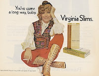
Every once in a while, the right brand appears at just the right time, when larger events in the world or culture add a special resonance to a product.  To me, they're " Zeitgeist Brands " -- after the German word that translates to "spirit of the age." It's one of the most powerful marketing tools available, but almost by definition, it's one of the most unpredictable.  Hard to create and usually impossible to duplicate. Sometimes it happens by accident, but it can be planned, too.  Apple's 1984 TV spot, for example, played off the cultural fascination with reaching the titular year of Aldous Huxley's dystopian novel.  But that was less about branding and more about making an introductory splash; although it helped create the Macintosh computer's image of a user-friendly device, the spot was a single-event phenomenon.   Here's a better example. In 1968, Phillip Morris introduced Virginia Slims, a spinoff of their Benson & Hedges bra...

I'll show you mine if you show me yours

Image
It's hard to remember back when laptops weren't so ubiquitous in life, but just 12 years ago,although the market was growing rapidly, they were still a bit of a novelty item.   Apple responded to the success of its redesigned Powerbook computer the year before with its "What's on your PowerBook?" 1996 ad campaign. Each ad gave us a look into the hard drive contents of two very different individuals, the underlying idea being how the Powerbook itself was an expression of your own life and interests.  The pairings alone were kind of interesting, but it was the fun of rummaging through their personal files that made the ads so irresistible -- even though the contents invariably ended up not being particularly provocative, like sneaking a peek inside someone's diary and reading, "Today I got up and brushed my teeth."  Yes, your desktop computer could hold all the same information, but this campaign is emotionally, not rationally based. In the ad above (...

Shiny new ad

Image
"Double your room height."  suggests this 2004 British ad for the Australian-made Mr. Sheen floor cleaner.  Simple, effective and (appropriately) clean layout.  A message with timeless appeal, although the loft setting of painted brick, factory windows and restored wood floor certainly locks it into the modern era.   Mr. Sheen is not to be confused with America's Mr. Clean , by the way.  Mr. Clean is, of course, a smiling bald genie; Mr. Sheen is a smiling bald man.  Except in Britain, where Mr. Sheen is WWI-era biplane pilot.  And where Mr. Clean is known as Mr. Proper.  And where there's another cleaning product called Mr. Muscles.  Got all that?

Is this the greatest ad campaign ever?

Image
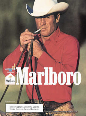
You can quibble about the aesthetics (and hiss at the product itself), but impact of Leo Burnett's ads and TV commercials can't really be overstated; it may not be the greatest ad campaign ever, but it's easily the greatest product re-positioning in history. Tying the product to iconic images of the American West and the rugged individualism of the cowboy was an inspiration, but perhaps an obvious one; after all, the campaign was created at the height of TV's cowboy craze.   But in all likelihood, no one at the time probably realized how long-running and resilient the campaign would prove to be.  In fact, as the campaign evolved through the '60s, with cinematic photography and the epic sweep of Elmer Bernstein's theme from "The Magnificent Seven," it only grew in power and imperviousness.  Even as the dangers of smoking grew in awareness, along with the size of the Surgeon General's warning, the always silent, manly cowboy seemed to belay the se...

And that's the way it was...

Image
I guess when your client is "the most trusted newsman in America," you can get away with this 1964 ad.  Still, it shows quite a level of confidence and daring by CBS to quote their star anchor's commitment to hustling for the story -- "Nothing replaces two feet in motion." -- under a photo that pictures the exact opposite.  Yet there is something undeniably compelling about seeing the paterfamilias of network news in this candid, unglamorous pose (he even has a pipe in his mouth, though it's hard to tell at this size).  The copy, of course, goes on for some length about Walter Cronkite's credentials, before finally assuring us, "As for those feet on the desk, don't be misled.  He's just recharging his batteries."  

Underselling the product

Image
It's easy to snicker at advertising from the 1950s. Riding the post-war wave of optimism and consumerism, it seems like every ad featured ecstatic homeowners and/or grandiose promises well out of proportion to what was being sold.  And at first glance, the 1953 ad above seems like just another example.  But read the headline again -- It Will Add To Your Happiness!  Cadillac isn't promising to change your life, just to add to whatever happiness you already have.  That little understatement may not seem so revolutionary, but consider the kind of car commercials we see today, forever promising to make you something you're not -- more attractive, more outgoing, more successful.  Happiness may be the end result, but all too often, today's ads seem to assume that you're starting with nothing.

Uneasy writer

Image
Here's another example of advertising referencing youth culture with all the awkwardness you'd expect from a bunch of middleaged guys at their wood-veneer desks. Obviously, this isn't the real audience for United Van Line's services -- hence the snarky swipe at those dropouts who don't wash, don't shave, don't dress nicely and don't respect the World War II generation's values. As is probably obvious (at least to those of us over 40), this 1969 ad's imagery draws directly on the movie "Easy Rider," released that same year. To a society whose window to American youth was mainly Frankie & Annette and Gidget movies, it was the having your previously cleancut kid come home from college as a long-haired radical. The movie's story of two hippies unburdened by American materialism who hit the road "in search of America," was about as far as you could get from United's message of responsibly moving your possessions fro...

Computer chip on its shoulder

Image
For those of you who think the generation gap-tinged clashes between computer companies are a relatively recent phenomenon, this 1963 ad says "forget it, man!"   Burroughs Corporation was always a distant second to IBM, which probably did give them a bit of a defensive posture and the attitude of a young upstart. The headline plays off the so-called "Angry Young Men" films of the early '60s, socially conscious British films centered on working-class protagonists. But it's really an old codger just playing the part of a young whippersnapper. Burroughs actually began life back in 1886, selling adding machines until it got into computers around 1953. So by the time this ad ran, this "angry young" company was about 77 years old, actually two years older than IBM. Burroughs finally cashed in its computer chips in 1986, merging with the Sperry Corporation to form Unisys.

Another Jane campaign

Image
Before we move on to other subjects, here's one more brilliant 1970s-era campaign from advertising legend, Jane Trahey .  Not every woman could afford her other client, Blackglama, but Jane made sure they (and Dynel itself) didn't have to feel inferior because of it.   "It's not fake anything.  It's real Dynel." defined the product in a boldly unapologetic fashion that, but for its synthetic-sounding name (which just doesn't have the same futuristic appeal as when the folks at Union Carbide thought it up) could probably be just as effective in today's fur-averse culture.

Got mink?

Image
Long before the milk campaign , there was "What Becomes A Legend Most" for Blackglama mink. The long-running campaign began in 1968, the creation of Jane Trahey , a bit of a legend herself in the advertising industry, though largely overlooked by the industry today.  Named Advertising Woman of the Year in 1969 by the American Advertising Federation, Jane had a knack for catchy themelines ("Danskins Are Not Just For Dancing." and for Echo Scarves, "The Echo Of An Interesting Woman") that captured the essence of a product and gave it an irresistible appeal. After making her mark in the advertising departments of Carson Pirie Scott and Nieman Marcus, she started her own agency, Jane Trahey & Associates and continued to make fashion and cosmetics advertising her speciality.  On the side, she wrote magazine articles and books, including the autobiographical novel that was the basis for the 1966 film, " The Trouble With Angels. " But the Blackglam...

And now we come to this book

Image
In the movie biz, it's first-time filmmakers making films about first-time filmmakers. In the ad world, it's people escaping ad agencies to publish novels about people trapped in ad agencies. I've already covered one of those -- and there's still a few more to get to, including this one by (as if I had to tell you) a former copywriter, Joshua Ferris. But what can I tell you about "Then We Came To The End" that you probably haven't already read in the numerous year-end lists that picked it as one of the best books of 2007?  I will admit to being a bit surprised by the accolades, but I did enjoy the book. Its run-on, chatty, stream-of-consciousness style perfectly captured the industry mind-set, the oddball charaters that people agencies and the pointless turf wars.  But in many ways, it's a pretty universal workplace cynicism that's been mined in both movies ("Office Space") and TV ("The Office") in recent years.  Strange a...