Advertising minimalism -- art director version
Yesterday's all-type ad was more of a rarity. (By the way, just because an ad is composed of words alone doesn't make it truly minimalist; by that term, I'm referring to ads where how the type itself is set helps create the whole communication.)
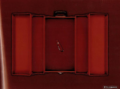
More often, minimalist ads take the form of a self-explanatory photo or graphic, such as the ad pictured above. I chose this particular one over the dozens that are in books for a perhaps not so obvious reason. Most minimalist ads suffer from lack of ambition, settling mainly for a visual pun or other non-verbal gag that really accomplishes little more than calling attention to itself and raising awareness of the product.
More often, minimalist ads take the form of a self-explanatory photo or graphic, such as the ad pictured above. I chose this particular one over the dozens that are in books for a perhaps not so obvious reason. Most minimalist ads suffer from lack of ambition, settling mainly for a visual pun or other non-verbal gag that really accomplishes little more than calling attention to itself and raising awareness of the product.
But Victorinox ad above tells you everything you need to know about its product with the better known name and distinctive appearance. One Swiss Army knife does the job of a whole tool box -- notice how clunky and dubious those words sound. But visually suggesting that same thought actually makes it more credible as well as more memorable -- and more proof that sometimes (yes, here it comes) less is indeed more.


Comments