Advertising minimalism - copywriter version
Although clarity and simplicity has always been a goal for smart advertisers, true minimalism seemed to evolve out of Europe's need to communicate in different languages simultaneously; why struggle to say it multi-lingually if you don't have to say it at all. Thus, the one-picture-equals-a-thousand-words approach that married a striking visual to a very simple (and translatable) sentence of copy. Gaining prominence in the late '80s and early '90s, it became the all-purpose tactic for breaking through ad clutter and reaching audiences (and award-show judges) with short attention spans.
Yet, despite the unified front most creative teams present to account management and clients, its possible that -- like the spouses in "Prizzi's Honor" and "Mr. and Mrs. Smith" -- art directors and copywriters are secretly plotting ways to eliminate each other from the creative process. That's one theory, anyway, for the rise of minimalism in advertising that doesn't just simplify the visuals and copy, but dispenses with one altogether.
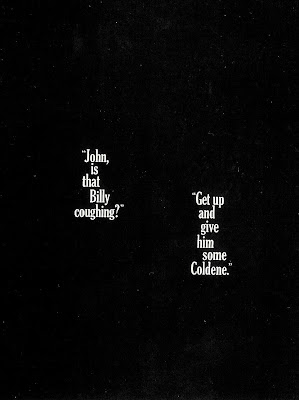
Above is an early example (1961) of the trend. Just two sentences on black...but those well-chosen words (and their placement on the page) not only precisely suggests an entire scenario, it also communicates a surprising amount of information about the product, its users and its benefit. Sure, you could have shown more, you could have said more. But this is one of those cases where, yes, less is more.
Yet, despite the unified front most creative teams present to account management and clients, its possible that -- like the spouses in "Prizzi's Honor" and "Mr. and Mrs. Smith" -- art directors and copywriters are secretly plotting ways to eliminate each other from the creative process. That's one theory, anyway, for the rise of minimalism in advertising that doesn't just simplify the visuals and copy, but dispenses with one altogether.
Above is an early example (1961) of the trend. Just two sentences on black...but those well-chosen words (and their placement on the page) not only precisely suggests an entire scenario, it also communicates a surprising amount of information about the product, its users and its benefit. Sure, you could have shown more, you could have said more. But this is one of those cases where, yes, less is more.


Comments