Posts

Showing posts from June, 2008

Maidenform exposed

Image
According to ad lore, Maidenform's "Dream" campaign was launched in 1949 in response to a study that found that women had "exhibitionist tendencies."  To say nothing of a pre-women's liberation desire for traditionally male-dominated occupations.  These women just never seemed to show up at church or the PTA meeting in their skivvies. By the 1960s, the ads got more fanciful, more punny and even more less self-conscious: These women weren't just dreaming about exposing themselves in public, now they were reveling in it. The campaign went dormant in 1971, but eight years later, it returned, this time balancing the outrageousness of the scenario with a steely, no-nonsense woman.  It managed to turn what was previously a girlish fantasy into a bizarre statement of female empowerment. ...but one that just helped prepare us for this lady in the coming decade: Yes, "I dreamed I was a world-famous, envelope-pushing pop star...in my underwear."

Context is everything

Image
That's probably as good as explanation as any of why nobody remembers this Kotex ad from 1970: But for those who were around in 1975, this is unforgettable: (Quick remedial history lesson here , if you need it.) Elsewhere:  Check out AdBroad for her answer to the inevitable question, "How can I work in advertising?"

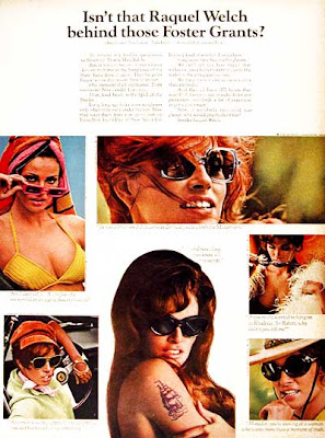
Behind the Foster Grant campaign

Image
In 1965, Foster Grant, then the leading U.S. marketer of moderately priced sunglasses, debuted the campaign that would earn it the 68th spot on Advertising Age's Top 100 Brands of the 20th century: Although known as the "Who's That Behind The Foster Grants" campaign, that actually wasn't the headline that appeared in the ads: No real mystery here, is it?  But if you read the copy, you'll see that surprise wasn't really the point: "...our Foster Grant sunglasses have done it again.  They've given Raquel a new dimension.   Several in fact.   One moment she's capricious.  Then contented.  Now candid.  Even coy." Captions under the photos are meant to exemplify her many moods; mostly they're just silly, but the one under Raquel in a bikini top seems prescient: "Am I doomed, C.B., to play the sex symbol in an age of flower children?" ("C.B." seems to refer to Cecil B. DeMille, the producer/director known for his star-st

Hooked on Bass

Image
Before we move on from yesterday's subject about graphic inspirations and The Smithereens, let's check out the cover of another of their albums: Yes, that's the work of innovative graphic designer, Saul Bass .  Even if you don't know the name, you've probably seen some of his work -- stark and iconic, with a child-like sophistication (to use an oxymoronic phrase): More examples of Saul's movie poster artwork here .  You can see some very familiar corporate logos that he designed here.    Here's the actual title sequence for "Anatomy of a Murder:" And, just for the heck of it, here's a recent parody of the Saul Bass style that's just too clever to pass up including here.  No disrespect intended to the late Mr. Bass. Elsewhere : Marketing guru Seth Godin describes the fallacy of "One Fell Swoop" thinking here .

Eleven x 3

Image
In this week's issue, Entertainment Weekly lists the poster for the 2001 remake of "Ocean's Eleven" as one of the most perfect posters of the last 25 years. I like it. In fact, I even liked it when it as the cover of the Smithereens' third album eleven years earlier: But the homages run both ways.  On this web site , Smithereens member Pat DiNuzio talks about the inspiration to him and fellow band member, Dennis Diken: "When Dennis and I walked into a used bookstore and found a paperback book tie-in for Ocean's 11, that sparked our imagination to call our record Smithereens 11 and re-create the image of the paperback cover on our album." He's referring to the original film of 1960, of course.  In fact, the album's liner notes include thank-yous to "Frank, Dean, Sammy and all of Ocean's Eleven."  Here's the paperback they must have happened upon:  Among other similarities, you'll notice that the little silhouettes of

Bugging out

Image
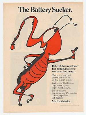
By 1968, Avis' powerfully blunt "We try harder" campaign had been effectively checkmated by Hertz, forcing Avis' ad agency, Doyle Dane Bernbach, to settle for a softer approach: "Just one of 47 bugs we're trying to get rid of at Avis," the ad says.  In previous ads, Avis had never flinched at admitting responsibility for any problems; now the ads were creating humorous culprits to take the blame; the change in attitude couldn't be more stark. And it probably didn't help that Essolube that run essentially the same campaign three decades earlier: And if those illustrations seem vaguely familiar, yes, they're by Theodore "Dr. Suess" Geisel; long before he starting regaling children with tales of Horton, The Grinch and The Cat In The Hat, Geisel was a successful magazine illustrator, editorial cartoonist and advertising artist. (Lots of other Dr. Suess-illustrated and concepted ads here .) UPDATE 4:30 P.M. : Apparently, Shell also bea

His way for the highway

Image
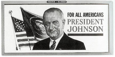
"I want to make sure that the America we see from these major highways is a beautiful America." So proclaimed President Lyndon Johnson in 1965, announcing the America The Beautful Initiative, designed to clean up eyesores along the growing federal interstate highway system. Key to this effort was The Highway Beautification Act, which attempted to control outdoor advertising by prohibiting certain kinds of signs and regulating the places they could be posted. As reported on the Federal Highway Administration web site : The signing ceremony took place 2 weeks after the President had surgery to remove his gall bladder and a kidney stone at Bethesda Naval Hospital. Although he had returned to the White House only the day before, President Johnson seemed to be in an expansive mood as he recalled the drive from the hospital to the White House along the George Washington Memorial Parkway: "I saw Nature at its purest. The dogwoods had turned red. The maple leaves were scarlet a

Stork choices

Image
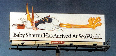
Is that a celebrity cameo on this Seaword billboard from 1994? Actually, no.  It's not the Vlasic Stork , that avian deliveryman first employed in the 1960s to pitch "the pickle pregnant women crave...after all, who's a better pickle expert?"  There are similarities, obviously...the archetypal cartoon-stork's body, the little glasses, the bow tie.  But the SeaWorld stork's cap is different and he's wearing a vest (which the Vlasic stork, though you can't tell by the screen grab below, does not). No, surprisingly, the SeaWorld stork looks a lot more like this fellow: That's the stork delivering "Dumbo" back in 1941.

Inspiration doesn't get more divine than this

Image
Back in 1988, an anonymous donor challenged a Florida ad agency to come up with a billboard campaign that challenged readers to consider their relationship with God.  The agency creatives came up with a series of supposed quotes from The Almighty that tended to be clever puns... Borscht-Belt one-liners.... Questions that sounded like they were translated by the cast of "Friends"... And a few that indulged in speculation about God's politics... The billboards proved so popular and intriguing, that the campaign was spread to over 200 U.S. cities in 1999, and throughout the web since then.  One of the messages frequently cited as a favorite is this one: But what are we to make of this message?  Since when is The Second Coming a threat of punishment?   And can we really forestall Judgement Day just by cleaning up our act?  Or is this just another case of the Creative Department losing track of the client while in pursuit of a clever message?   Oddly, it's the one message

Nature helps out

Image
This 1950s era billboard (partially shown) for Phillips 66 is pretty typical for the era. In the decade following World War II, most advertising was still pretty unsophisticated, as advertisers slowly came to grips with a marketplace of greatly expanded buying power and increased competition. Here, the idea of "smooth power" is illustrated by a lean swimmer, an analogy that is both vague and irrelevant. And apart from the anguish that seems to be man's expression, the billboard seems pretty forgettable. But it got a lot more interesting when Missouri's Grand River flooded and partially submerged the billboard: (An interesting, 100-year history of American billboards is available  here .) And in case you're wondering , Phillips named its gasoline after a 1927 test on Oklahoma's Highway 66 powered a car to 66 miles per hour; they took the identical numbers as a good omen and used a highway shield as their logo.  It lasted about 30 years in orange and black for

"Un" Revealed

Image
Outdoor board, 1968 No one channeled the sunny, "if it feels good, do it" spirit of the late '60s like 7-Up's "Uncola" campaign.  Complimenting their message of being different from the dominant cola soft drinks, the graphics themselves were unlike the more traditional, wholesome images Coke and Pepsi favored.  7-Up's billboards (here's another one ) really indulged the counterculture in a way that had none of the condescension that usually marred other advertisers' efforts. You've probably already realized what the billboard graphic above is based on.  If you're under 40, you may need a hint and you'll find it here .

Advertising history repeats itself

Image
Mercedes Benz, 1996 How the person who owns the snowplow company gets to the snowplow company.  So what's the deal with this irrelevant headline? What do we care about what the person who owns a snowplow company drives to work on presumably already plowed streets (he is the owner, after all; he's not coming in at 4 a.m.). Well, if you have a long memory, you might recall this famous Volkswagon ad from back in the '60s (obviously, the writer of the Mercedes ad did): (Here's a better transfer, but the announcer's in German:) Still unanswered:  Is it wise for Mercedes Benz play off a 30-year-old commercial that few non-advertising professionals would probably recall?  And for those who don't remember the commercial, what does the ad say to them?  That the company's snowplows aren't doing their job?  That the average snowplow company owner is rollin' in dough? File this under "Ads for Award Show Judges."  And sure enough, it was a One Show wi

Groovy man

Image
Alton Kelley , the artist best known for his 1960s concert posters for the Grateful Dead, Jimi Hendrix and others, died recently at 67. His warping typefaces, posterized graphics and lush, neo-art-deco style helped bring the psychedelic counterculture in to visual terms and was an obvious influence on his fellow artists and graphic designers.   And obviously influenced a lot of advertising art directors as well. (That same desire to prove you're "with it" than by your outward appearance resulted in balding, middle-aged men in bell-bottoms and love beads. ) Neutrogena, 1968 KS AN, 1976 And Kelley's influence is probably stronger than ever in today's graphic culture which samples and swipes from everything.  This homage, of course, is a natural: Roots Revival Society, 2007 But in a way, this earlier usage is even more appropriate: 1977

Is the long-copy ad dead?

Image
Contrary to the conventional wisdom of our short-attention-span culture, the long-copy ad isn't obsolete... City Gallery, 1997 Folha de S. Paulo Newspaper, 1998 Yellow Pages, 1996 ...except now, long copy is just another design element.

Sole mates

Image
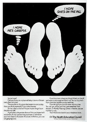
These feet sure get around.   Ironically, though the visual first gained prominence as an appeal for contraceptive use, with each subsequent iteration, we seem to be getting further away from a message of responsibility and more toward a celebration of hedonism. (Just like real life, I suppose.) Health Education Council, 1979 GQ, 1994 Story Gossip Magazine, 1998 Wrangler, 2001 Leave it to this footwear ad to inadvertently get us back on message: Pony, 2004