Posts

Showing posts from 2009

Take it from the top

Image
Here's a zeitgeist-y ad from 1970 that reflects not one, but I'd guess, two elements of the era's popular culture: I suppose, after a few shots of rum, some women can be talked into anything, but actually, it was fashion designer Rudi Gernreich who was the inventor of the scandalous but popular -- (though rarely worn in public) " monokini " in 1964. And by inventor, I mean he just followed through on the same thought all bikini-ogling males of the era probably had when eyeing women in their two-piece swimsuits. What's more interesting to me, however, is the look of the woman "Ron Rico" is about to expose. Despite modeling a swimsuit, she looks mousey, prim, mortified -- and with that limp pixie-cut, she looks a lot like she was intended to suggest a younger version of the prim, mousey "Gladys" portrayed by Ruth Buzzi on the late-'60s hit TV show, " Laugh-In ."

Dress for the trip

Image
This 1969 ad for a line of jeans doesn't just speak the visual language of its intended audience, along with the Vaughn Bode -like graphics and griffiti-inspired typefaces, those hipsters at LB lay it on the line with this barely-veiled reference: Indeed.

The few. The proud. The mistresses.

Image
I had no idea that being somebody's mistress was so demanding. I thought you just had to put up with sporadic, last-minute trysts and holidays and birthdays spent alone. But apparently, you've got to have a passion for Fibber McGee and own an ocelot, among other things. This whole 1974 ad bears reading. I guess its somebody's idealized image of a mistress, but even with tongue-in-cheek (I assume), the insecurity and cruelty of the situation for women is perhaps unintentionally touched on with the line about her "seeing a psychiatrist by your giggling at her striptease." It's almost like a "scared straight" thing for The Other Woman. Click on it to enlarge:

Do it like Ditko

Image
Nothing too interesting about the message of this 1959 ad (except that the need to push wood floors as a decorating option seems to be in response to the post-World War II growth of "wall to wall" carpet, plastics and laminate furniture), except for the surreal, deconstructed representation of a home... ...which could well have inspired (or been inspired by) the surreal, deconstructed images of 1950s/60s comic book artist (and later Spider-Man co-creator) Steve Ditko :

They don't make ads like this anymore...

Image
...because they can't -- not with today's cookie-cutter car models. From 1957:

Racial sensitivity in 1969

Image
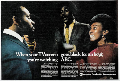
In 1969, this is what passed for racial sensitivity at ABC: Meanwhile, over at the Tiffany Network, CBS took a more sobering, more provocative approach in their 1968 ad on their coverage of similar cultural issues: (The CBS ad, by the way, is the work of legendary designer, Lou Dorfsman .)

"Bureau, Wool Bureau."

Image
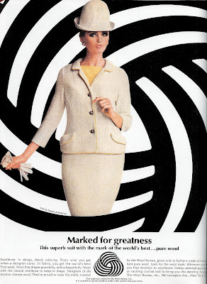
I know I should just chalk this up to a coincidence, or a parallelism that only I see, but come on! The veddy British fashion, the converging lines of the background, and the year of this advertisement, 1964... ...isn't it possible, just possible that the designer was inspired by the opening credits of this movie franchise, in its third installment by that same year:

Weird about beards

Image
The wording is a bit confusing (is Dad talking about himself?), but that's the least of the curiosities in this 1969 ad for Oneida: Once again, Madison Avenue attempts to engage the counterculture , with the awkwardness typical of the time. Here, the beau with the neatly trimmed beard seems neither beatnik nor hippie. In fact, his facial hair seems almost professorial; it's the Beatlesque mop atop his head that would seem more likely to raise Dad's hackles. But while the copy insists "what a groovy guy he is," the kid seems more like a budding member of The Establishment than a Timothy Leary devotee, considering That he was captain of the soccer team for three years straight and worked on the Cultural Center Committee. So in the end, it's not a plea for understanding of the younger generation, it's just another reinforcement of the values of the older generation, dressed up in a "can't judge a book by its cover" homily. And if Dad is suc...

Going for the juggler

Image
Think all the fretting over TV shows pushing the envelope in sex and violence is a modern concern? Here's an ad from 1961: "We own Sylvania TV. We're worried about some of the shows you see on our sets." begins the ad, under a depiction of programming types of the era that Sylvania apparently finds objectionable, violent westerns and cop and detective shows prominently featured, along with other programs waiting to implant violent and impure thoughts into the minds of the American viewing public, like medical shows, historical dramas and beauty pageants. And of course, shows that feature jugglers:

More real people, unscrubbed

Image
Back in my first post in January 2008, I showed this ad , as an example of the recognition (and celebration) of "real people" that's been absent in modern advertising (except as a source of humor, over-romanticism and post-modern irony). Here's another ad I recently discovered from that same campaign: Contrast that with this spot two decades later. Similar laundromat setting, a similar depiction of an overweight laundromat lady (around :46) -- but here, she -- and the others -- are just used as visual shorthand for the prim, traditional sensibilities our counter-cultural jeans-washer offends:

A darn good question

Image
This headline from this 1969 ad is surprisingly effective in stopping the reader, even after all these years. Usually, when advertising poses a question, the answer is obvious. Not this one: An intriguing question, with no clear answer. When you're talking cranium protection for pro football players, we know the stakes are high. And likening the construction of football helmet to a that of a hair dryer is a dramatic comparison. But what answer are they hinting at? There are two possibilities: 1) That competitive helmets are made of a plastic material more suitable for hair dryers and that the one being advertised here is much stronger; or 2) That the helmet being sold here is amazingly impact-resistant, given that it's made from the same material as women's hair dryers. Here's the entire ad: Even if your eye jumps down to the "Deacon does." subhead, I'll bet most readers took a few seconds to scan the copy for details like these: ...all the NFL teams...

Time, for a lesson in headline writing

Image
John T. Elson passed away recently. As Time Magazine's religion editor in 1966, he wrote the cover story for the April 8th issue of that year, the edition that would give Time its biggest newsstand sales in more than 20 years and provoke 3,500 letters to the editor. As the New York Times notes: For more than a year, Mr. Elson had labored over an article examining radical new approaches to thinking about God that were gaining currency in seminaries and universities and spilling over to the public at large. When finally completed, it became the cover story for the issue of April 8, as Easter and Passover approached. The cover itself was eye-catching, the first one in Time’s 43-year history to appear without a photograph or an illustration. Giant blood-red letters against a black background spelled out... Okay, that's not the cover. That's actually the title of the article as it appeared on the inside. For the cover, the editors instead chose the first sentence of the art...

The Stepford Ads

Image
Another entry in the "Where Do They Get Their Crazy Ideas?" Department, and this one is relatively easy to explain. I saw this poster over the weekend, advertising an upcoming movie: As images go, this one is cleverly arresting. Your eyes immediately to the woman's Angelina Jolie/Megan Fox-type features, while mostly registering the rest of her typically modelesque pose peripherally. Then the position of the hands draws your eyes toward the inevitable bared tattoo and that's when the stripped midsection with its metallic spinal column hits you. And although the merger of fleshy and blood with steely machinery should be abhorrent, the woman's physical perfection and cold demeanor seem almost robotic anyway. And in fact, pretty much the same commentary* fits this ad that appeared just a year and a half ago: (*Yes, after glimpsing the face, your eyes drift down to something else besides a tattoo, but it has the same effect.) Of course, the whole Sexy Female Robo...

Dead Spokesman Pitching

Image
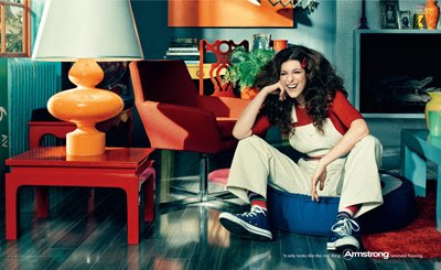
Probably seemed like a slam-dunk to the creative team. Resurrect a popular countercultural celebrity, put her in close proximity to the product and let the amused double-takes begin: So how come so many people seemed a bit put-off by the faux-Gilda Radner ad in Armstrong's It Only Looks Like The Real Thing campaign. It's not the clumsy wording, which seems to refer to a beloved entertainer as an "it;" there's something more going on here, a reaction unprovoked by their other ads which paired laminated flooring with celebrity impersonators like Lucille Ball and James Dean: Then, probably because the client realized that they'd fallen into a rut using SpokesImpersonators stuck in the 1950s, at attempt was made the "freshen" the campaign with a more modern icon -- at least as modern as a late-1970s icon could be. Gilda Radner (of Saturday Night Live's original cast, for those who don't know) probably came to mind as a complement to Lucy's...

To Heinz and back

Image
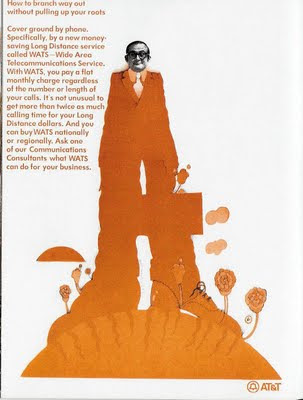
In a post on May 19 of last year, I traced the apparent inspiration for this 1970 At&T ad back to the look of The Beatle's 1968 "Yellow Submarine," movie. The art director behind that movie's graphics, Heinz Edelmann, passed away recently. Interestingly, as the NY Times reports, Despite the huge influence of “Yellow Submarine” on the culture of the time, Mr. Edelmann admitted that he could never quite connect with the 1960s aesthetic. Once the film was complete, he altered his approach to avoid being pigeonholed as a psychedelic artist, becoming considerably less ethereal and decorative... Some examples of Edelmann's (non-psychedelic) poster work can be seen here .

What you really need to know about branding is right here:

Image
In its obit for John S. Barry, the exec who's credited with making WD-40 the lubricant found in 80% of American homes, the NY Times says Mr. Barry acknowledged in interviews with Forbes magazine in 1980 and 1988 that other companies, including giants like 3M and DuPont, made products that closely resembled WD-40. “What they don’t have,” he said, “is the name.”

Squeeze Teases

Image
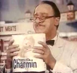
Even back in the '70s, we used to make fun of Charmin's Mr. Whipple and uncontrollable compulsion to squeeze bathroom tissue... But apparently, the problem was more prevalent in grocery stores back then than previously recognized: And yet, just when you think you know the rules, along comes... "Squeeze me." "Don't squeeze me." "Please don't." "Everybody squeeze." Just one more case of American culture sending out confusing mixed messages.

Wishful thinking?

Image
Well, they tried, I'll give them that. But you have to wonder how successful Gillette was in selling young adults a shaving kit back in 1967, the era of the hirsute beatniks and hippies, popularized several years earlier by Maynard G. Krebs : (And who just may have been the inspiration for the Gillette lad above.)

Where have I seen this before?

Image
From Monday's NY Times :  California's new National Ignition Facility where 192 lasers will combine in an attempt to create the core of a tiny star and its thermonuclear energy... ...and the chamber of Cerebro, the mutant detecting technology of the X-Men movies. The NIF facility cost $3.5 billion.   They probably could have borrowed the set from 20th Century Fox for a lot less.

Advertising the unmentionable

Image
As discussed in a previous post about the Maidenform's memorable  campaign , ad agencies played armchair psychologists, exploiting women's supposed "exhibitionist tendencies" with ads that featured women unabashedly displaying their foundation garments in public. Must have been a confusing time to be taking your social cues from advertising, what with other marketers playing up the fears of ridicule for having even the slightest hint of your "unmentionables" exposed before your peers: (This worked for  men , too, by the way.) Then again, this 1956 ad wants to have it both ways:  You may suffer an embarrassing display in public, but with the right girdle, at least you won't be displaying too much : That ad, by the way, seems to owe at least some of its inspiration to this iconic wind-driven revelation: (Of course, there's probably some degree of male voyeurism behind most of these images.  I don't think we need a psychological study to know that, ...

Unravelling The Snuggie

Last week, in the New York Times Sunday Magazine , columnist Rob Walker tries to unravel (yes, that's a pun) the "Snuggie" phenomenon. A quick refresher (as if you really needed one; The Snuggie has become as culturally ubiquitous as pet rocks of the 1970's): Walker begins: Perhaps you’ve heard of the Snuggie — you know, the blanket with sleeves. Or rather, a blanket with sleeves: the Slanket, the Freedom Blanket, the Book Blanket are all quite similar, and all predated the Snuggie. But why the Snuggie? Surely no one thought that the startling success of this oddity — sales topping $60 million — was a story of innovation, or an engineering or design breakthrough. One theory is that the Snuggie has caught on because it’s comforting — as if, in these recessionary times, we have become a nation of Linuses... A second theory holds, more prosaically, that when rates for television commercials fell as mainstream advertisers started pulling back, infomercial-style peddlers ...

Old wine ad in a new bottle

Image
When an art form -- even an "illegitimate" one, like advertising -- has been around long enough, imitation and appropriation can happen unknowingly and probably, inevitably. Case in point: This 1952 wine ad, employing an artistic illustration to impart sophistication and distinctiveness: An approach surprisingly similar to the ads of Absolute Vodka some 30 years later:

The Small Business Computer, 1956

Image
  Let's see that compact workstation close up: Look!  It no longer takes up a whole floor!  Now that's progress!

Moonvertising?

Image
Those who decry the encroachment of advertising on public spaces (and public surfaces), may have been particularly disheartened when this commercial began appearing last March: Rolling Rock Moonvertising: Launch - Watch more Funny Videos Not to worry, though.  This time, it was all a gag -- unlike, sadly, the selling of naming rights of stadiums.  However, as the New York Times later pointed out, "moonvertising" wasn't as far-fetched as it seemed: According to Jim Garvin, the chief scientist at NASA’s Goddard Space Flight Center, moonvertising is possible, if impractical for a number of reasons. While scientists have bounced lasers off the moon, they illuminated an area only about the size of a tennis court. “In order for an advertisement to be seen by people on earth,” Garvin says, “the laser light would need to cover an area about half the land size of Africa,” a challenge because the moon’s surface is dark and fairly nonreflective. So, all things considered, this 198...

John and Yul

A survivor of lung cancer in 1964, John Wayne went on to record a series of spots in the next decade for the American Cancer Society... Yul Brynner went him one better though, with an anti-smoking spot that ran posthumously:

Talk about hedging your bets...

Image
An atheist-sponsored  ad campaign that started running on British buses last fall: "Probably?" "Probably?" That bit of uncertainty kind of undercuts the message, doesn't it?  If you disagree, (re)consider these famous ad campaigns: