Posts

Showing posts from 2008

When Hal met Adelle...

Image
Interesting parallel here, but in all likelihood, unintentional, and ultimately, meaningless.  Still... This photo, from today's NY Times article on the travails of computer maker, Dell: Remind you of anything?  Perhaps the shutting down of HAL in " 2001: A Space Odyssey: " Or maybe photographer Erich Schlegal is just a fan of the movie.

Ernie, Meet Irv

Image
"Is This the Best Ad Ever Written?" asks a 1990s self-promotional ad for Singapore's Ball Partnership ad agency.  A small torn-out classified ad reads: MEN WANTED for Hazardous Journey.  Small wages, bitter cold, long months of complete darkness, constant danger, safe return doubtful.  Honour and recognition in case of success. -- Earnest Shackleton . Talk about painting a bleak picture.  But you may be surprised to discover that, when that ad ran in 1900, arctic explorer Shackleton found himself inundated with replies.  "Isn't the sheer strength of that advertisement, then, in its simplicity?  Isn't its sheer power in its honesty?" the copy further proposes (leading of course, to an endorsement of the agency's own advertising principles). I thought back to Shackleton's ad this week when I read the New York Times obit for venerated comedy writer Irving Brecher .  His career began in the early 1930s, when, as a 19-year-old movie theatre usher, he

Which ad becomes a legend most?

Image
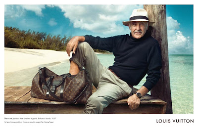
"There are journeys that turn into legends" asserts this Louis Vuitton ad, presumably celebrating, albeit obliquely, Sean Connery's career.   (click to enlarge) Look closely and you may notice that the place/time copy following the headline seems to contain a little in-joke, Bahamas Islands, 10:07 -- 007, get it?   Despite the weathered charm of Mr. Connery, the ad seems pretty generic and awfully weak on any real connection to the product being sold.  Not like this one from the beginnings of his journey, over four decades ago: (Although, as noted here , this ad has its own drawback.)

Who's alive now?

Image
In   "A book about the classic Avis advertising campaign of the 60s," (yes, that's really the title), the author details not only the beginnings of the "When you're #2, you try harder" Avis philosophy (first presented in the ad at left),  but also its decline. As a competitive strategy, it probably seemed bulletproof to some; after all, when you're not challenging the market leader for the #1 position, how much of a response should they really make?  Conventional marketing wisdom says that when you dominate the marketplace as Hertz did, acknowledging the competition only enhances their status. And for over four years, Avis used their ads to both raise their image and indirectly undermine the perceptions of Hertz (never even mentioning Hertz by name), without a real counterattack. That, however, changed in 1967, when Hertz switched agencies to Carl Alley, Inc., a shop as revered for its creative approach to advertising as Avis' agency, Doyle Dane Ber

Advertising's Hero Worship (part 7; Conclusion)

Image
You've been wondering when he'll show up.  Finally, we get to the greatest of indignities that modern advertising has heaped upon the greatest of superheroes. Superman.  Kal-El of Krypton/Clark Kent of Smallville.  Sole survivor of a doomed planet.  Faster than a speeding bullet, more powerful than a -- well, you know the rest.  Waging a never-ending battle for truth, justice and the American way... ...which technically, includes the right to wear women's clothes if you so desire.  (Does Lois know about this?) Tomorrow:  A big announcement.  Be here.

Advertising's Hero Worship (part 6)

Image
Is there no end to the ways advertising can trample on the nobility of comic book heroes? Actually, there's just two more, as we'll see today and tomorrow. Captain America, Living Legend of World War II. Previously, Steve Rogers, a scrawny Army reject beefed up through an experimental Super Soldier Serum (and frozen in suspended animation from the late '40s until our era, if you're wondering how he can still be so dang youthful today). He's dead now -- but when he makes his inevitable resurrection, I think, given all he's been through, that we can forgive him if he goes on another bender like the one this beer ad is implying:

Advertising's Hero Worship (part 5)

Image
Continuing our exploration of the ways that America's comic book paragons of perfection and nobility are reimagined with all-to-human flaws in modern advertising:  Today:  Wonder Woman, a.k.a. Princess Diana from an isle of Amazons.  Basically, a distaff Superman, she was said to be "beautiful as Aphrodite, wise as Athena, swifter than Hermes, and stronger than Hercules." But apparently, she was also more hedonistic than Bacchus or at least careless as all get-out, as evidenced in this AIDS-prevention ad:

Advertising's Hero Worship (part 4)

Image
You think comic book heroes don't always translate well into movies?  Let's continue our look at the rocky history they've had in modern advertising: Today:  Marvel's own jolly green giant, The Incredible Hulk.  Scientist Bruce Banner, transformed by gamma radiation into, if not quite a hero, then an anti-hero.  A creature who fought less for justice than to just be left alone.   Given that, it's really only natural he'd quit the business the first chance he got... ...but of course, there's always some "puny humans" (like those of this investment firm) to hound him about that temper of his...

Advertising's Hero Worship (part 3)

Image
In which we discover that modern advertising's superhero cynicism isn't limited only to those heroes of the past. Case in point: Elasti-Girl from 2004's "The Incredibles."   Secret identity:  Helen Parr, part-time crimefighter, full-time wife and mother, and -- according to this ad for a foreign film festival -- occasional gumshoe: (By the way, the headline translates to "Annoyed with Hollywood cliches?")

Advertising's Hero Worship (part 2)

Image
Continuing our look at the often irreverent, sometimes cynical treatment that today's advertising creatives gives to the superheroes of its youth: Today, Batman -- the Dark Knight, or as he was known in simpler, more innocent times, the Caped Crusader and one-half of the Dynamic Duo.  We all know the legend by now:  Young Bruce Wayne, permanently traumatized by witnessing the murder of his parents, devotes a lifetime of training -- and a tool-belt full of gadgets -- to waging an endless war on crime. But apparently, despite all that skill and battle-tested fighting techniques, he's still no match for a kid with a few jiu-jitsu classes, as this ad implies:

Advertising's Hero Worship (part 1)

Image
What is it about creative people that they love to incorporate into their ads the comic book heroes of their youth -- but rarely depict them in a respectful way? Maybe it has something to do with the need for former fans to show that they're above hero worship now, to repudiate their childhood fascination by forcing these iconic characters into the "real world" and all that implies.  Maybe they're trying for attention by warping a cultural icon.  Or maybe they're just going for an adolescent joke.  Whatever. Here's Spider-Man. Created in 1963 and eternally young (though he did age from a high schooler to an indeterminate 20-something over the course of 500 issues).  Still, in actual years, he'd be around 60 years-old today. ...and apparently, swinging from skyscrapers and battling super villains isn't quite enough to stave off that middleaged paunch and bad knees, as evidenced in this healthclub ad:

5 ads that feature robots like those in movies of the last 6 years -- part 5

Image
(You didn't think I could stretch this out for a week, did you?) Finally, we juxtapose this crude, boxy, childish robot for a 2007 Jazz Festival... ...with this crude, boxy, childish robot from 2008: COMING ON MONDAY:  Something new!  Something...super!  Don't miss it!

5 ads that feature robots like those in movies of the last 6 years -- part 4

Image
(And if you've noticed that I've skipped mentioning any robot-themed movie for 2006, that's because there were none that year. Shocking, huh?) The, ahem, transformed athlete of this Nike ad from 2003... ...looks like a potential recruit for the "Transformers" movie of 2007:

5 ads that feature robots like those in movies of the last 6 years -- part 3

Image
(Day 3 and we're not out of examples yet!) The clunky but charming robot made of cookies in this 1999 ad... ...would seem to fit quite nicely among the lovable, junkheap characters of 2005's "Robots:"

5 ads that feature robots like those in movies of the last 6 years -- part 2

Image
(Yes, I'm serious.  Sort of.) Today, its an 2001 ad for engine lubricant that pairs a mechanical body with a creepily humanized visage: ...and has an eerie similarity to the mechanical men of the 2004 Will Smith movie, "I Robot:"

5 ads that feature robots like those in movies of the last 6 years -- part 1

Image
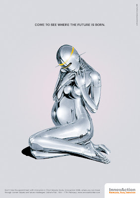
(How do I come up with these topics?) First off: From 2008, comes this science fair ad with a sleekly humanoid robot of shiny, flowing metal. Remind you of anything? Yes, it looks like another of the liquid metal assassins from from the "Terminator" series (the latest installment appearing in 2003):

Sleeping on the job

Image
Leo Burnett, the Chicago ad agency, had already spent years burnishing Maytag's reputation for reliability in print ads; when the washing machines began advertising on television starting in 1967, the agency created a personality every bit as distinctive, memorable and enduring as the agency's other characters, like Tony the Tiger and The PIllsbury Doughboy. In fact, this guy was a little doughy, too: That's character actor Jesse White as the lonely sad sack indentified only as The Maytag Repairman.   Through a succession of TV spots and ads, "Ol' Lonely" waited in vain for the phone to ring, telling him he was needed to fix a broken Maytag.   Jesse White got the part (beating out comic actor Phil Silvers, among others) and played the character until 1989, before relinquishing the role to a succession of actors since.  In recent years, with dependability becoming perceived as more of a parity quality among competing brands, Maytag has tweaked the character a

Waiting to exhale

Image
It's really too easy to play "hindsight is 20/20" and have a few cheap laughs at the expense of ads of bygone eras, especially when the subject is cigarettes and smoking.  This 1926 Chesterfield ad, however, is too politically incorrect by today's culture not to give it special note here: There's more to this scene than just a romantic appeal to women, though.  Back then, showing women smoking in ads was frowned on as much as women smoking in public.  Instead, consumers of the '20s were given coy come-ons like this one: Is she enthralled by the man -- or the cigarette?  Only her tobacconist knows for sure.

Squidvertising

Image
I suppose you could say this is the epitomy of the "sticky" idea, and apparently, so obvious, every tire manufacturer's ad agency eventually thinks of it. 2002 2002 At least Toyo found a new way to illustrate the analogy (though it ends up looking like something out of Odd Rods or Wacky Races ). 2008 (And yes, I know, a squid isn't the same as an octopus, but I liked the title, so I used it.  Just be happy I didn't do some pun on how these ads "suck.")

The Monday funnies

Image
Here's a decidedly comic approach to advertising: This type of comic strip -- using photos instead of drawings -- are known as Fumetti (after the Italian term for the same, though they also included drawn comics). The Fumetti style was always more popular abroad than here in America; for some reason, it always seemed to combine the worst aspects of each medium -- leaden, expository dialogue and the images of vigorous overacting. That, of course, made it ideal for 70s advertising, especially in ads targeted to the less educated; appropriately, those ads were often found in comic books of the era. (Another Fumetti of somewhat higher quality was recently highlighted in this posting .)

The last home you'll ever own (?)

Image
Houses for the Atomic Age! trumpets this 1955 ad.  But are they referring to the sleek, geometric styling of era?  Not exactly. To get the full picture, read into the copy a bit: The blast-resistant house design is based on principals learned at Hiroshima and Nagasaki...a rigidly integrated house that the engineers calculate will resist blast pressures 40% closer to bursts than conventionally built houses.   Only 40%?  Oh, wait, there's more: A special shelter has been provided in the basement to protect occupants from blast pressures expected at distances as close as 3,600 feet from ground zero of a bomb with an explosive force equivalent to 20,000 tons of TNT...affords protection from radiation, fire and flying debris as well. This certainly paints a different picture of suburbia than the usual illustrations of the time: But it's understandable, given that just underneath the surface of shiny optimism about the promise of nuclear energy to reshape our society... ...was the lo

What's the story?

Image
Today, a humdrum, run-of-the-mill shirt ad: Or at least, it would be, but for the addition of-- well, see for yourself: Stunning, isn't it, how just putting an eye patch on the fellow creates a stronger interest in the ad? Suddenly the man seems more mysterious, edgy, worldly. And what is it about those shirts he wears... Creator David Ogilvy credits this "story appeal" to researcher Harold Rudolph. As Ogilvy explains in "Confessions of an Advertising Man," "...the more of it you inject into your photographs, the more people will look at your advertisements ... I concocted eighteen different ways to inject this magic ingredient. The eighteenth was the eye patch." In 1952, Ogilvy confided to Time Magazine that he was inspired by pictures of ex-Ambassador Lewis Williams Douglas, who wore an eye patch after a fishing accident robbed him of the sight in one eye. The rest is history, right? Not quite: "At first we rejected it in favor of a mor

Not just hyperbole

Image
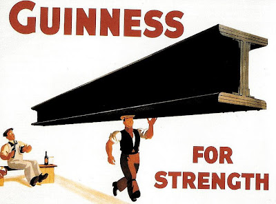
Maybe you've seen this classic Guinness poster, created back in the '30s and assumed that it was nothing more than silly hyperbole: And you'd be partly right. The idea is actually based on the high iron content of Guinness (probably from the water used), though of course, the benefit of this is exaggerated to an unbelievable extent in the poster above. That didn't stop the image from becoming so iconic that a pint Guinness became known as a "girder." The image also inspired this parody from Heinekin some 40 years later (though its likely that many young drinkers never realized its source), that both fit the idea into its own ad format and made the male sexual subtext even more implicit: (Best not to take any of this too seriously, though. In reality, the pictures in the Heinken ad would have to be reversed.)