Posts

Showing posts from May, 2008

Ideas of Titanic proportions

Image
"Comedy is tragedy plus time." That's how Alan Alda's character explained it In Woody Allen's movie, "Crimes and Misdemeanors." As an example, he used jokes about Lincoln's assassination, but I suppose he could have just as easily used advertising's frequent riffing on the sinking of the Titanic. That billboard, of course, more clever than disrespectful.  The Audi ad is more of the "hindsight is 20/20" genre: Similar to the ad above, this one from Citroen actually posits an alternate history, where the Titanic apparently avoided the iceberg and completed her journey, arriving in New York City (and thus sparing us from this overwrought 1997 epic ): Considering the more than 1,500 people who lost their lives on that early morning in 1912, you can't help but wonder if other more recent events of such catastrophic magnitude will ever reach such iconic and desensitized status. Can you imagine the following ad, for instance, with the ...
Dirty car

Image
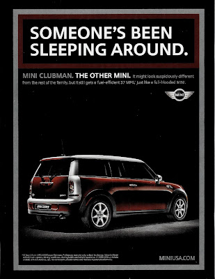
I get the point -- that this is a MiniCooper unlike the other models -- but why any advertising manager would want to imply their car is a bastard is beyond me. What's doubly curious about this recent ad that appeared on the back cover of this week's Entertainment Weekly is how -- with the same background black and use of silver -- it almost seems to be intended as one big spread, an odd juxtapostion of the innuendo-laden headline with the cover blurb mentioning singer Usher's "wild past." NOTE: Maybe you've noticed the new title for my blog. I've been trying to come up with something that better encompasses the type of postings I specialize in, and this seems pretty good to me. Same web address, though -- no need to change bookmarks (you have bookmarked this site, right?).

Brain strain

Image
Concluding our special few days of Fun and Games: Today: Visual brain-teasers. Click on the ads below to enlarge them and try to make sense of what you see. Okay, fun time's over. Back to serious (and by that I mean, seriously entertaining) postings tomorrow. See you then!

Mesmerize Your Eyes

Image
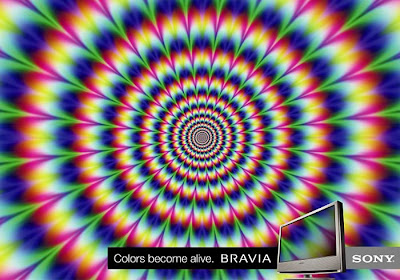
Continuing our special few days of Fun & Games: Today: Dizzying optical illusions. Click on the ads to enlarge them and hang on to your desk tightly.

Lose yourself

Image
It's Fun & Games Week here at Craig McNamara's advertising blog! Since it's a holiday week, let's take a break from the arduous work dissecting ads and just relax for a few days. Today: Lose yourself in some mazes. Click on the ads to enlarge them and go to it.

Beautiful concept

Image
It may seem a bit cruel to pick on Marty Feldman just to make your point, but the pairing was inspired in more ways than one:

Grace Jones and the Advert-Garde

Image
She's largely vanished from both pop culture and advertising, but for a while there in the '80s, Grace Jones was everywhere. Though she was a singer in the New Wave genre, and an minor actress in a series of forgettable films (including one of the worst James Bond pictures, "A View To A Kill"), she's best remembered purely for her image and style. Andy Warhol first was fascinated by her appearance, and following her makeover to her flat-topped, aggressive, androgyous look, the rest of the world took notice as well. With her sleek, sinewy body, feral expressiveness, penchant for exotic clothing -- and her apparent willingness to be treated as more as a prop than a person -- she became visual shorthand for the edginess and "coolness factor" of which so many advertisers (or more often, their ad agencies) aspire. Call it the Advert-garde , if you will, the leveraging of the boundary-pushers in art and culture for the purposes of marketing. Motorized vehic...

Simply Super

Image
Think your product is super? Don't say it. Show it: The secret identity behind all these mild-mannered homages is (as if I had to tell you), Superman -- more specifically, the "S" shield upon his chest. Easily one of the most recognizable logos around the world, as this site explains, it actually wasn't the first insignia the Man of Steel wore on his chest. In his earliest 1939 appearances, it appeared as the triangular shape at right. It slowly evolved over the next 4 years, until Superman's publisher, National (now DC) comics, realized that to trademark the character they first had to finalize and standardize the design. With Superman #26, the "S" was now in the familiar shield design that we've all come to know over the past 60-some years, although its real power as an cultural icon probably came with 1978's "Superman: The Movie," and this iconic image (also used as a stunning teaser billboard at the time): With its simple shap...

"Beam...Jim Beam."

Image
A 1966 holiday ad for Jim Beam in anticipation of the upcoming James Bond film, "You Only Live Twice": Where to begin, where to begin? How about with the awkward pairing of couplets (Should I be buying a gift for Sean Connery? Did I draw him in the Secret Santa?).   It was, apparently, an ill-advised spinoff of a previous ad: That ad, at least has the virtue of simplicity and clarity of message.  But did it occur to anyone at Jim Beam that the adult beverage that James Bond is most associated with is the vodka martini?  In truth, according to t his web site , Bond does partake in whiskey more often in several books and some of the film versions, but it's Jack Daniels or Haig & Haig -- never Jim Beam.  Still, Jim Beam is fighting the tides of pop culture if they think Bond will ever be identified with any other drink.  Thanks to the conspicuousness of Smirnoff's vodka martini -- a relatively new, and thus, exotic, alternative to the gin martini -- in the first Bo...

Tune in, turn on, dial out

Image
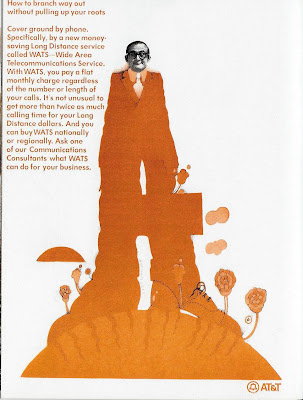
Beneath the exterior of every Organization Man lies a flower child yearning to breathe free.  Or so seems to be the subtext to this strange (even for 1970) ad from AT&T. What AT&T was really going for with this incongruous approach is anybody's guess. It's doubtful that the staid, conservative Corporate Cogs of the era were going to be charmed by an illustration that looked like it was done on a side of a VW bus by a bunch of hippies. And it's equally doubtful that AT&T thought there was a huge untapped market among the counter-culture for a WATS line ("Tune in, turn on, dial out" perhaps). Most likely, it was just another misguided attempt to create a "hip, cool" ad for an audience that appreciated neither. The graphics appear to be influenced by Peter Max, the widely known artist/graphic designer who came to prominence in the late '60s/early '70s, with trippy artwork that was thought to be inspiration for this 1968 hit movie...

Avis Analysis - part 5

Image
Concluding our look at the hits and misses during the seminal years of Avis' famous "We Try Harder" campaign. Throughout the initial "We Try Harder" campaign, Avis avoided any mention of who was #1 to their #2 status.  Everyone knew who #1 was, of course, and back then, it was almost unheard of for any company to name their competitors.  It may also have had something to do with knowing that, with its much larger ad budget, Hertz could squash Avis in any direct competition.   This ad, coming late in the campaign, was one of the more obvious, though still veiled, references to their larger rival: If you were watching TV back in the mid 1960s, you'd get the reference.  If not, here's a typical Hertz spot from that era.  Watch for the visual mnemonic at the end: "I feel all we have done is awakened a sleeping giant," Japanese Admiral Isoroku Yamamoto  is reputed to have said following the attack on Pearl Harbor.  Whether Hertz was sleepwalking th...

Avis Analysis - part 4

Image
Continuing our look at some of Avis' hits and misses during the seminal years of the famous "We Try Harder" campaign. Today, Avis gets a little too cute for its own good. Did Avis really gain anything by subverting their "We try harder" message with one that seems to say, "We try harder to seduce you"? And just when you think the ad couldn't get further off track, along comes the last two sentences to raise the possibility that the Avis girl's winks may indeed be suggestive of more than a getting you into a car.  Not that they were alone in their sexism at the airport: (And for the other half of the whore/Madonna complex...) Avis only did marginally better with their earlier ad below.  Even with a message that (presumably) wasn't meant to be suggestive, they end up there anyway.  "...strip her..." it begins and goes downhill from there: The fourth paragraph:  "When you wear a button that says "We try harder," an...

Avis Analysis -- part 3

Image
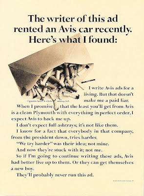
Continuing our look at some Avis' successes and misfires during the seminal years of its famous "We Try Harder" campaign. Today, Avis takes a detour from ads talking focused on the customer to one focused on the ad agency: Oh, it's clever, and the copy at least stays mostly on message, and its an interesting admission that sometimes Avis does mess up, but they're trying. Kind of raising and lowering expectations at the same time. But in the end, it seems more concerned with exulting the ad writer at the expense of the client. After all, Avis is the one whose failed in their duties, but the writer refuses to be a "paid liar" and gets to lecture the client about living up to these ads. "Or they can get themselves a new boy." (Must be a junior writer. They love to get on their high horses.) I don't know if that's the first appearance of the "ad about the guys making the ad," but in the years since, it's become a worn-ou...

Avis Analysis -- part 2

Image
Continuing our look at Avis' hits and near-misses during the seminal years of its "We Try Harder" campaign. Today, we look at an ad whose effectiveness comes from its blunt acknowledgment of who holds the power in their relationship with customers: "We need you, you don't need us."  That's pretty much true of most businesses in the post-WWII era, but -- like admitting you're not the industry leader -- most companies would be loathe to say it in public.  But even now, reading it some 28 years later, you can feel a surge of empathy for Avis, don't you?   Interestingly, the pointing finger visual and the first sentence -- "Avis Needs You." -- brings to mind James Montgomery Flagg's famous World War 2-era recruiting poster: Intentionally or not,  for the generation that responded to this poster, Avis' ad could have evoked the same call to duty, if only on a subtle level.  And speaking of patriotism and subtley, what are we to make o...

Avis Analysis

Image
The original Avis "We try harder" campaign is rightly revered among ad professionals (and consumers with long memories) for its wining combination of straightforwardness, candor, self-deprecating humor and of course, underdog determination. Even so, its easy to underestimate its impact in the marketplace, particularly its counterintuitive claim of being #2 (to the much larger Hertz) -- back in the early '60s, the prevailing wisdom was more "If you can't say you're #1, then don't say anything." Interestingly, unlike most successful campaigns (the phrase and the button it appeared on) is better remembered than any of its executions. But as with any long running campaign -- and this one is still in use some 40 years later -- there were misfires as well as successes. Admittedly, more successes than misfires, but even the initial work occasionally less than soared. Here's one from 1965 that, according to Avis CEO Robert Townsend, "got plenty o...

The Rise of Ladvertising

Image
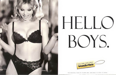
Why does this 1994 Wonderbra ad, ostensibly aimed at women, seem designed more to appeal to men (especially in the come-hither tone of the headline)? The obvious answer:  because it was written by a man, and is a prime example of what I'm calling "Ladvertising." Or perhaps more accurately, "Laddie-vertising" -- advertising in the spirit of what the Brits call "laddie mags" (in America, we just call them "men's magazines").  Typified by the best-selling Maxim , these periodicals target 20-something males with a focus on cars, electronics, alcohol, women, women, women and sex, sex, sex.  All delivered in a editorial voice that can be worldly, smirky and loutish. And with creative departments staffed by those same 20-somethings ever striving to be "edgy" and to "push the envelope" -- and living in a media culture that's becoming ever more permissive -- even is it any wonder that same sensibility has crept into thei...