Tune in, turn on, dial out
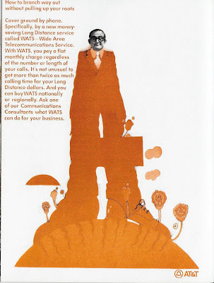
Beneath the exterior of every Organization Man lies a flower child yearning to breathe free. Or so seems to be the subtext to this strange (even for 1970) ad from AT&T.

What AT&T was really going for with this incongruous approach is anybody's guess. It's doubtful that the staid, conservative Corporate Cogs of the era were going to be charmed by an illustration that looked like it was done on a side of a VW bus by a bunch of hippies. And it's equally doubtful that AT&T thought there was a huge untapped market among the counter-culture for a WATS line ("Tune in, turn on, dial out" perhaps). Most likely, it was just another misguided attempt to create a "hip, cool" ad for an audience that appreciated neither.
The graphics appear to be influenced by Peter Max, the widely known artist/graphic designer who came to prominence in the late '60s/early '70s, with trippy artwork that was thought to be inspiration for this 1968 hit movie's animation:...but Peter Max actually had nothing do with "Yellow Submarine;" the animation style was, in fact, set by Heinz Edelmenn and Milton Glaser, two other prominent artists of the psychedelic pop style. And just for the record, the AT&T art was done by versatile artist Kim Whiteside.
(I know what you're thinking about this post by now: What a long, strange trip it's been.)


Comments